HOME | DD
 1201 — In need of a few heroes

Published: 2005-01-10 09:45:52 +0000 UTC; Views: 1720; Favourites: 31; Downloads: 284
Redirect to original
Description
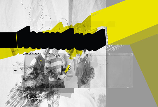
i dont dig uniform grid alignment.Related content


Comments: 15

oww shit i might have to fave AGAIN.
i love this. the font is great even though its so simple.
👍: 0 ⏩: 0


another FAV... great work again.. this time the message is a plus
👍: 0 ⏩: 0


I like yr style.
You indeed have an 


Okay. got to go work~! 
Have a great day ahead and may the viewers of yr gallery increases enormously each day.


👍: 0 ⏩: 0


make the "BE A" bigger so there's no/less space under it.
also don't really like the +'s...
otherwise this is badass.
👍: 0 ⏩: 0

thats genius and brilliant. I usually dont like yellow, but this is so twisted that I love it! Awesome!
👍: 0 ⏩: 0

Makes me want to go watch "Deathwish" for some reason, but seriously I love this. 

👍: 0 ⏩: 0

apart from the blinding yellow this piece is great  (Smile)")
👍: 0 ⏩: 0


