HOME | DD
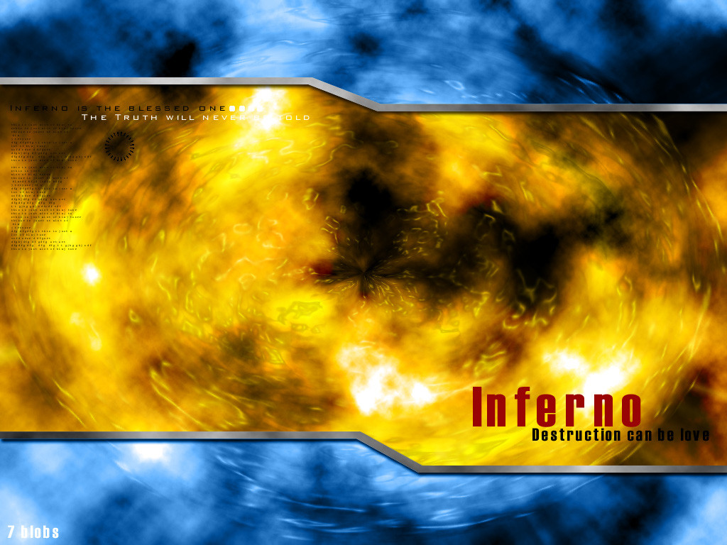
 7blobs — Inferno is blessed
Published: 2002-02-13 15:28:36 +0000 UTC; Views: 471; Favourites: 1; Downloads: 95
Redirect to original
Description
Just played around with some Photoshop filers.Related content


Comments: 10

yah that's preety cool. Bit easy though. Or at least i think. Clouds... some kind of radial blue and looks like a pinch or something in the middle And then a plastic wrap. Sounds easier than it is... just thinking it up takes skill. Nice job, I also agree about the colors.
-----
Things are starting to make sense again..
Time to to up the medication !!!
👍: 0 ⏩: 0

Thanks for all the comments.
I usually dont do this kind of computer grafix, so this was mainly an experiment from my part.
I agree that the color selections might not have been the best for a wp.
If i decide to remake the pic ill repost it.
Thanks all.
👍: 0 ⏩: 0

I must disagree with the comments about changing colour, think they match perfectly. Keep it up dude
👍: 0 ⏩: 0

Pretty nice look, but I don't really like the colors - a bit to big a contrast between them.
Nice work tho ... looking good.
-----
+ Latest Deviation: https://www.deviantart.com/deviation.php? id=182547
+ profanity.dk : www.profanity.dk
+ Kwan Studios Denmark: www.kwanstudios.com
👍: 0 ⏩: 0

i agree about changing the colours ... just flip them around, blue inside, red out ...
and make the lines textured ... metal of some sort ...
and defenetly do something about that type in the lower right part ... it's just plain ugly like this
-----
👍: 0 ⏩: 0

i like the colors........natural compliments always make for great art
keep it up
-----
::::::::::::::::::::::::::::::::::
::::::----....fokus....----::::::
::::::::::::::::::::::::::::::::::
👍: 0 ⏩: 0

it's have nice color, and what the small text tell ?
👍: 0 ⏩: 0

Yes, this is really pretty cool. If I were to make this, I would change the colors (If it was to be a wp).
-----
-Chris L. Harkins http://www.oculus.250x.com
👍: 0 ⏩: 0

I like it, although it seems most of the new art is based around lines and angles and techy type stuff, for me it is getting kinda old. But I use that same kinda effect on my own art. I think its easy to do, but makes a great effect on digital art.
👍: 0 ⏩: 0

Its very nice, i admit. ^_^
-----
leave me to die i am no more
leave this rose upon my grave
https://eezkiel.deviantart.com shoot me comments anyday.
👍: 0 ⏩: 0