HOME | DD
 7shadows — AI WORLD
Published: 2002-08-31 23:30:28 +0000 UTC; Views: 5532; Favourites: 29; Downloads: 733
Redirect to original
Description
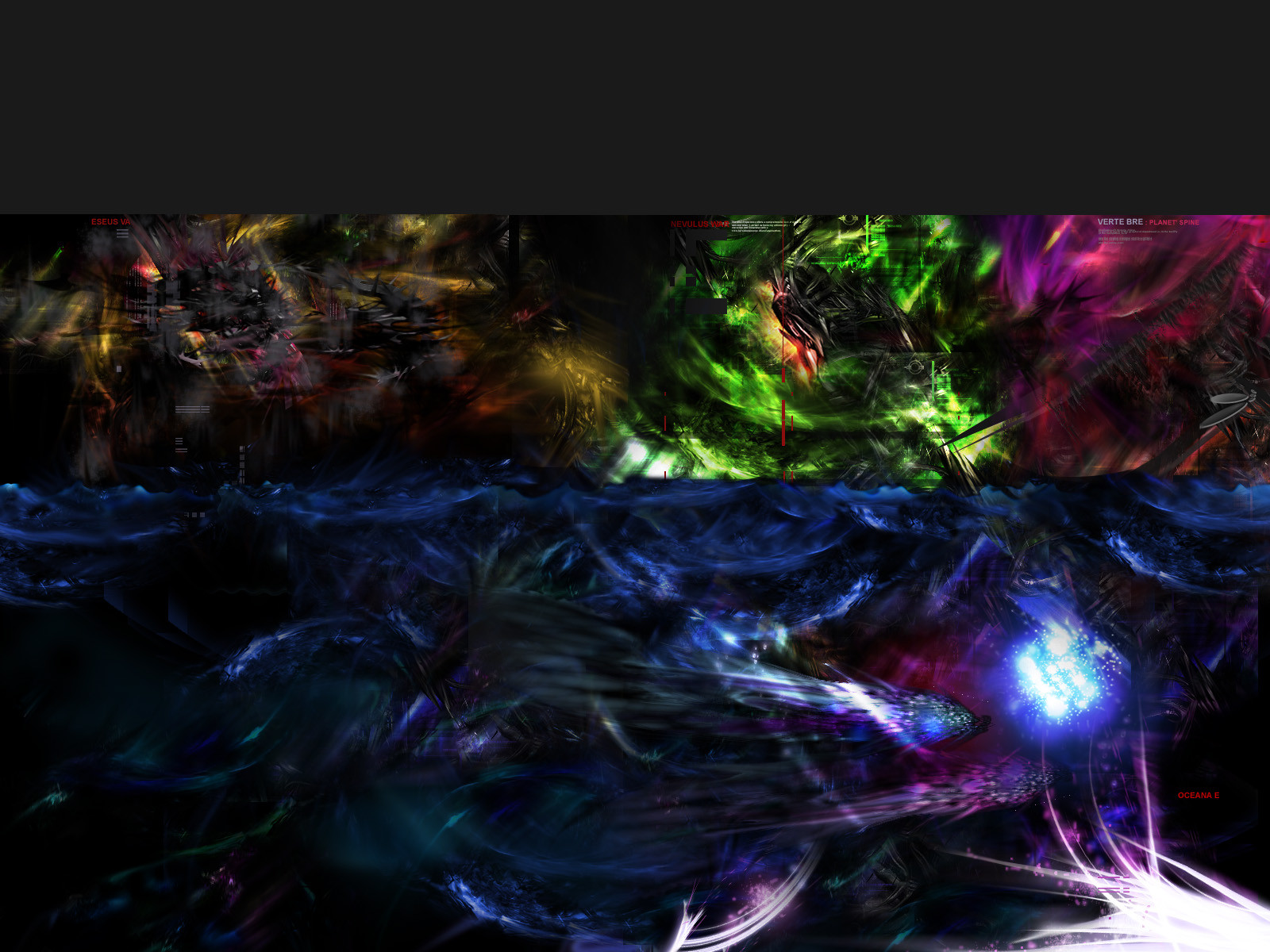
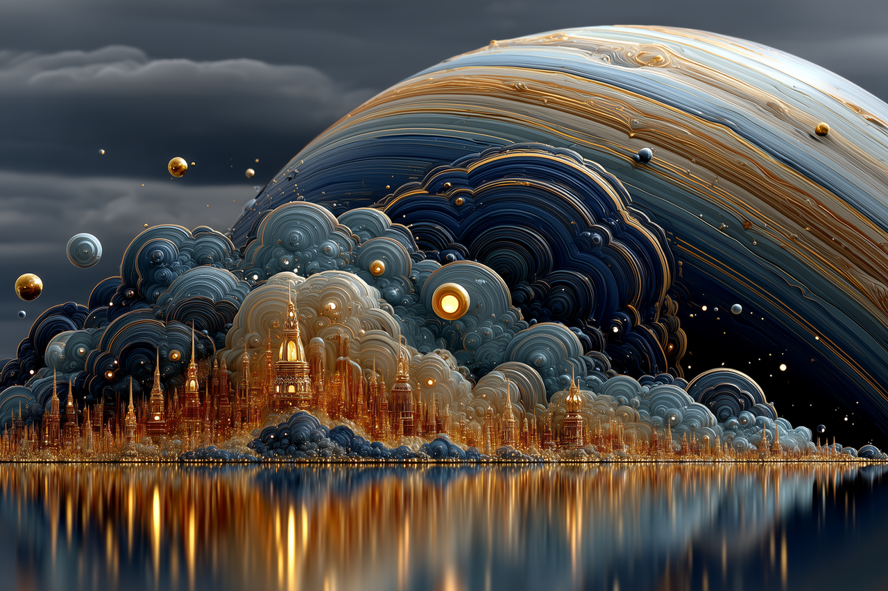
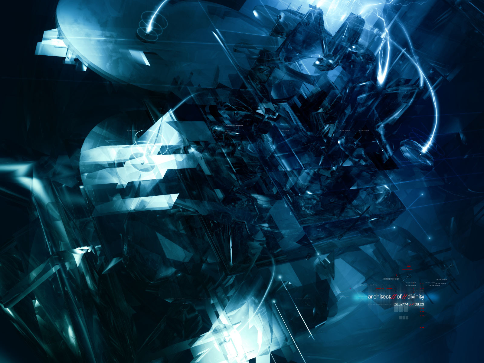
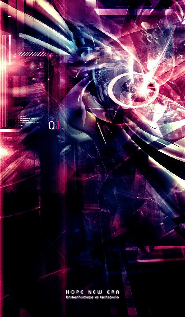
-- ai. world --. alien planet, sky, ground and under water. visit the new 'coming soon' ai splash at [link]
. enjoy
Related content


Comments: 75

whoa, too much here to look at. its not hurting my eyes, its just really confusing me. i dont know whats what, or anything, I LIKE IT . seriously tho, i like the use of colors in here. i like how its noticable yet confusing. there are so many things in it, its inumerable. its like a the very thoughts of the human mind. way too complicated to be able to explain. good work
.
"if you hit alt, shift, tab, it screws up your caps lock when talking in aol instant messanger."
👍: 0 ⏩: 0

Very different work. Concept is really tight, and was executed well.
👍: 0 ⏩: 0


nice composition, i like the range of colors displayed, but i think you could've worked on making the transitions between a little smoother , right now it looks a little busy and not completely finished , looks good anyhow
👍: 0 ⏩: 0

It's great work, but I really weird and confusing.
👍: 0 ⏩: 0

nice work but i prefer the other ai wps ... to much colors here
👍: 0 ⏩: 0

Mother of god!
those colors and that composition... bah! there freaking with my head! ahh!
youz be a krazy man!
👍: 0 ⏩: 0

Id say take the piece apart and make a bigger more detaild versions of all the parts. But still amazing!
👍: 0 ⏩: 0

.
don't get me wrong. YOU are on my watchlist for a serious reason. because you are of the best. hands down. and i like this piece for its vibrant colors and brightness... except organic subjects have a commonality to me... that is that things tend to blend to each other. rarely do the sharp contrasts exist- there is too much contrast in extremes in this study that distracts me, i think, from your intent. but you know my thoughts on opinion and art- everyone's got one and nobody's right.
.
👍: 0 ⏩: 0

Nicely done man, however it seems to choppy and doesn't seem to have much flow to it. Not something i'd totally expect from you. I hope that maybe you can find an interesting and appealing way to make the colours blend into eachother a bit better. Other then that though, it's well done. Good job.
👍: 0 ⏩: 0

arent you getting bored of reading 200+ comments on each piece?
👍: 0 ⏩: 0

ummm...does no-one else think he accidently moved the layers down too far and accidently saved it?
That black/grey at the top does NOT look right...This would be really good if it didn't look like the paintin slipped off the easle.
👍: 0 ⏩: 0


there isn't enough contrasts between elements and your colour scheme is too varied. cut down and simplify to achieve a better effect.
👍: 0 ⏩: 0

i love it, it's great, i could spend ages just staring at it, trying to figure out what everything is supposed to be!
👍: 0 ⏩: 0


Alienish...
smdo;fjvoseptnvpx;odiurtnhselxm,;roeuiwnchtlsdivuhtndozxhlb!!!!!!*
traduction: WTF?? Amazing Pic!!!
👍: 0 ⏩: 0

It's kind of overwhelming, but also refreshing from the 3d trendy art thats going around now. I especially like the vivid colors of the landscape. I wish my screen was larger so I could take it all in at once
👍: 0 ⏩: 0

seperatley they look awesome, but as one image it is too cluttered. awesome job anyways!
👍: 0 ⏩: 0

Wow, this is serious eye candy. Thanks for making it
DuN
👍: 0 ⏩: 0


This looks like absolute shit. I've seen noobs do better then this bullshit.
You can do better dude, I've seen you do it.
👍: 0 ⏩: 0


Nice.....but i dont like how this looks separated into 2 boxes and doesnt flow. the colours all clash....great 3d though./
👍: 0 ⏩: 0

somewhat dislike the gray at the top, but its simply fantastic nonetheless.
👍: 0 ⏩: 0

shadowness.....rox as always! amazing talent you have w/ blending! and the colors are beautiful! nice work!
👍: 0 ⏩: 0


The blue airbrushed ball in bottom right looks too n00bish and boring. But the colours and rest is awesome.
👍: 0 ⏩: 0

Awesome work! Although it does seem a bit cluttered at some parts of it, overall its very well done
👍: 0 ⏩: 0


great to see some new and highly original work from you again my friend!
👍: 0 ⏩: 0


i don´t really want to judge this one since no matter how much or less i like this particular image i see that u are relentlessly struggling to explore completely nu graphical dimensions.
ur art has come a long way and i´m sure it will go an even longer way.
the path u chose to take ain´t an easy one (as seen by all the blah bla i preferred your old work comments) but it could lead you to real big art!
plz don´t come off your way, and work the hardest u can.
👍: 0 ⏩: 0


Nice touch man. I really like the blue slashing across the bottom of the screen. I wouldn't expect anything less from 7shadows.
👍: 0 ⏩: 0
| Next =>