HOME | DD
 7shadows — EEVO

Published: 2002-08-22 22:01:29 +0000 UTC; Views: 57518; Favourites: 222; Downloads: 20124
Redirect to original
Description
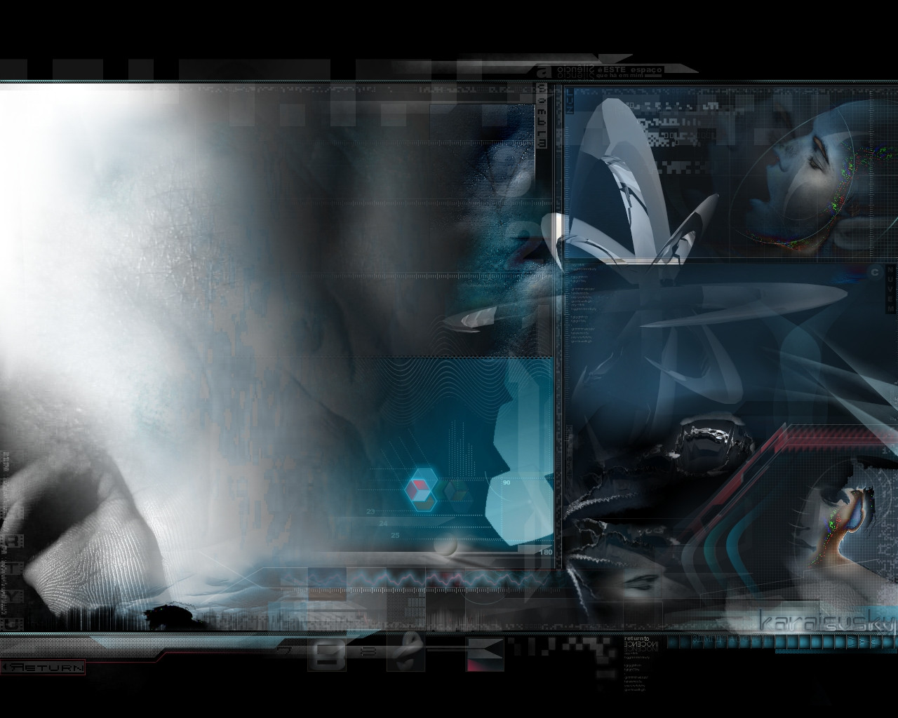
EEVO. angelic shadow, innovative style, futuristic contradictions. EEVO logo is revealed - EEVO is the white body of Shadowness v3.
. [link] / some news that some
supporters might want to know.
. edited
journal . some explanations about this piece.
lost wallpapers . reuploaded.
. i am not truly gone.
-- thanks --
Related content


Comments: 202


nice but the angles arent right dawg. i mean does she only have 1 leg? and one boob or wat?
👍: 0 ⏩: 0


Her body's balance is off, but this is still a great work.
👍: 0 ⏩: 0


BEST THING I HAVE SEEN IN A WHILE. AND WHEN I SAW IT I KNEW IT WAS EEVO. +fav and +watch...i love this work
👍: 0 ⏩: 0


This is an awesome art piece.
The rendering of this is fantastic!
Fine composition

👍: 0 ⏩: 0

very nice.
i simply love the cold, professional slick feel to this. the white shapes behind the girls back definitely adds alot to the picture, and so does the minimal typo. the selection of colors are wonderful, and the whole piece's composition is very sweet.
however there are some parts that aren't too appealing imo. like the face. frankly the two contrasting shades on the face looks rather wierd. the eyes would look better if you added a white glow to them to me. on the body, some of the shapes overlayed over the body are too prominent to the extent that the detail of the anatomy is reduced, making it look flattened. this applies especially the breasts and shoulder area. the blurring of certain regions isn't too good too.
nice work overall, keep it up.
👍: 0 ⏩: 0

 (Smile)")


WHAWWW
it's so nice, perfect, gorgeous,, cant think of any suitable words for this great one-of-a-kind art!!!!
u rock!!!!!!!!!!!!!!!!
👍: 0 ⏩: 0


Instand fav, Fav wallpaper of all time
new wallpaper ofcoarse
👍: 0 ⏩: 0

One has to admire an artist that constantly pushes the limits and explores different styles. This is probably as smooth as it gets.
👍: 0 ⏩: 0


Amazing work!! love the colour scheme. Keep it up!!
👍: 0 ⏩: 0

Fav num. 92!
hehe its no regret that i add uin my devlist..
Great work to insipred on!
👍: 0 ⏩: 0

i like this a lot . . .could you tell me some of the techniques that you used to make this!
please?
👍: 0 ⏩: 0


ncie piece of work man, i love it, ur 2d shit is the shit, lol
Badass image man +Favs
👍: 0 ⏩: 0

very impressive and superb. like the outcome. keep up the good work.
👍: 0 ⏩: 0


wow this is freakin awsome i love the color dodge look it kinda has where there is little bursts of purple kinda coming out at yeah +fav good job man
👍: 0 ⏩: 0


Gah.. dude.. you never fail at stunning me.. that color scheme is magnificant and the composition is stunning and you never cease to amaze me. Bah!
👍: 0 ⏩: 0

I havent seen any of your other work yet but this looks pretty awesome. It somehow has an eerie, mysterious feel to it. Very nice!!
👍: 0 ⏩: 0


I like this piece. but ik have a question dont you think that the logo kind of looks like a twirled swastika???
👍: 0 ⏩: 0


great work man, glad youre back!! now to check out shadowness
👍: 0 ⏩: 0


this is great just as all your other pieces are. love the blending in this piece and being able to pull it off with a white bg. nice.
[ [link] NEWEST PIECE AFTER 3 MONTHS OF INACTIVITY---NEW HORIZONS--- ]
👍: 0 ⏩: 0


i like what you've got going on in the left side of the image... the logo/circular object and the color theme is good... i don't know whats going on in the right side though...
👍: 0 ⏩: 0
| Next =>