HOME | DD
 7shadows — expectations

Published: 2002-10-12 08:06:23 +0000 UTC; Views: 8027; Favourites: 52; Downloads: 974
Redirect to original
Description
i rarely experiment and publish, but this time is an exception. when i want to express my thoughts and very own reasoning.i feel to study more. since time has changed.
Related content
Comments: 81

those are the most wonderful notes i ever read. thank you for telling me that there are other people like me, too.
thank you
👍: 0 ⏩: 0

I like the unique touch you have given the image. Definetly a 
👍: 0 ⏩: 0

Interesting 'chopped' images in this, the silky white really enhances it.
👍: 0 ⏩: 0

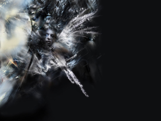
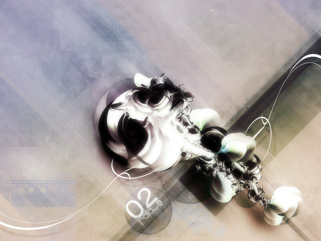
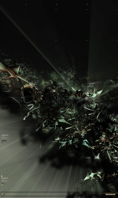
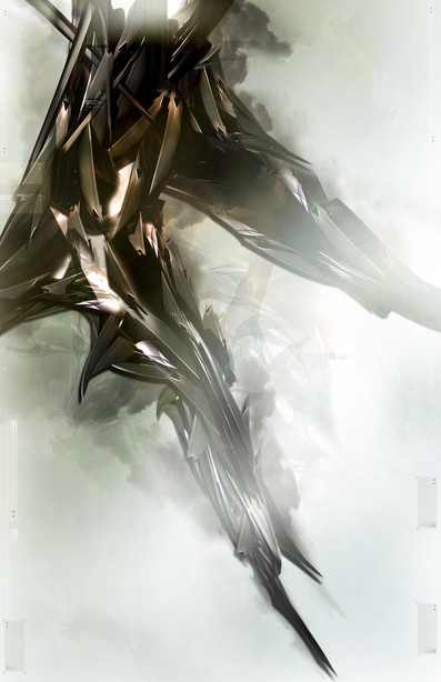
i love it, its so sharp, so vibrant...as always, such detail. your incredible, i like the part under the words intensify is really cool, it looks like one of two things. it could either be (to me anyway) the inside of a dragons mouth, or the inside of a futuristic old style builing castle like thingy with wierd cool looking windows. n the sky behind it looks sorrowfull, as if the feeling that something was lost. i like it. then theres the part with the sword like designs flying out from the center machine type object thingy, its cool, i realllly like that part. n the part on the bottom under "inspire" is wicked cool. its sooo impossible to tell what it is, and it looks sooooo fucking cool. any part i didnt mention, is awesome, and perfect. the detail is great...i like how it expresses more of a depressive view than an angry view (okay, so its depressive in my opinion, it has a depressive, chaotic touch. its amazing how they both flow together perfectly, especially the way u portray it.)
LOVE IT, another fave....
"wisdom does not come from a long life, but from a long chain of lifes."
👍: 0 ⏩: 0

always in the borderline hein?
Like some parts a lot, the bootom is particulary beautifull.
👍: 0 ⏩: 0

nice Work
7shadows
--------
visit my deviantart porfolio :: [link] ::
👍: 0 ⏩: 0

That's very neat man. I really like the overall piece, but i'm a bit hung on the way you've kind of sectioned off the pieces. I think it'd look a whole lot better if everything was blended in a bit better. Other then that though, this definetly shows skills. Great work.
👍: 0 ⏩: 0

very cool man, and the colours rock, not much else to say really, wckd.
👍: 0 ⏩: 0

Getting sick of this anime wall that I had.. I'll use this. It's extremely good my friend. Nice work.
👍: 0 ⏩: 0

very nice, and nice trying too~
but it's not precise enough as there is some jagginess. overall it's quite cool~
👍: 0 ⏩: 0

Yay... something good on the daily top favs... very good.... very very good..... etc.
👍: 0 ⏩: 0

The contrast between elements is badss, as is the composition. If all the sections were as good as 'explore' then this would be amazing, but i think some of the others are lacking. Damn fine piece tho
👍: 0 ⏩: 0

nice, the blending of all the different elements into one piece is a great idea.
👍: 0 ⏩: 0

vivid design, i really liked the thought put into this
👍: 0 ⏩: 0

you definitely should post more experiments... this one is great... shows your mind paths in some weird way begining and the end... or just nor quite yet
👍: 0 ⏩: 0

Sweet. A little too bright for my taste, but other than that, very cool!
👍: 0 ⏩: 0

Now that's great. I always wanted to make some similar stuff in 3DsMax but I never figured out how
👍: 0 ⏩: 0

i like the "explore" part best. the outher parts look little unstructured and cutted.
the overlay above the objects is crossing in diffrent angles, that whats make it "cutted".
👍: 0 ⏩: 0

Absolutely great wallpaper. Love the different parts added together. Great idea! Cool!
👍: 0 ⏩: 0

this looks juuuuuuuuuuuuuuust great,
in a thumb, for a moment, i recognized a female face up above in the right angle??
guess you can imagine anything ... and that's the beauty!
not to mention the estetics
👍: 0 ⏩: 0

reminds me of my motion studies image except with no girl cools though favs
👍: 0 ⏩: 0

typo is great, as usual theres wayyy too much going on, but thast just me I like rather "simpler" pieces.
Great colors and composition though
rams
👍: 0 ⏩: 0

this is terrific! refreshingly different! LOVE it!!!
👍: 0 ⏩: 0

Couldnt agree more with the first coment. I love its informative wave, like some kind of brain commercial!! Its fantastic and its a fav!!
👍: 0 ⏩: 0
| Next =>
