HOME | DD
 AagaardDS — Same Earth - Two Worlds
Published: 2008-03-24 11:14:28 +0000 UTC; Views: 10419; Favourites: 245; Downloads: 305
Redirect to original
Description
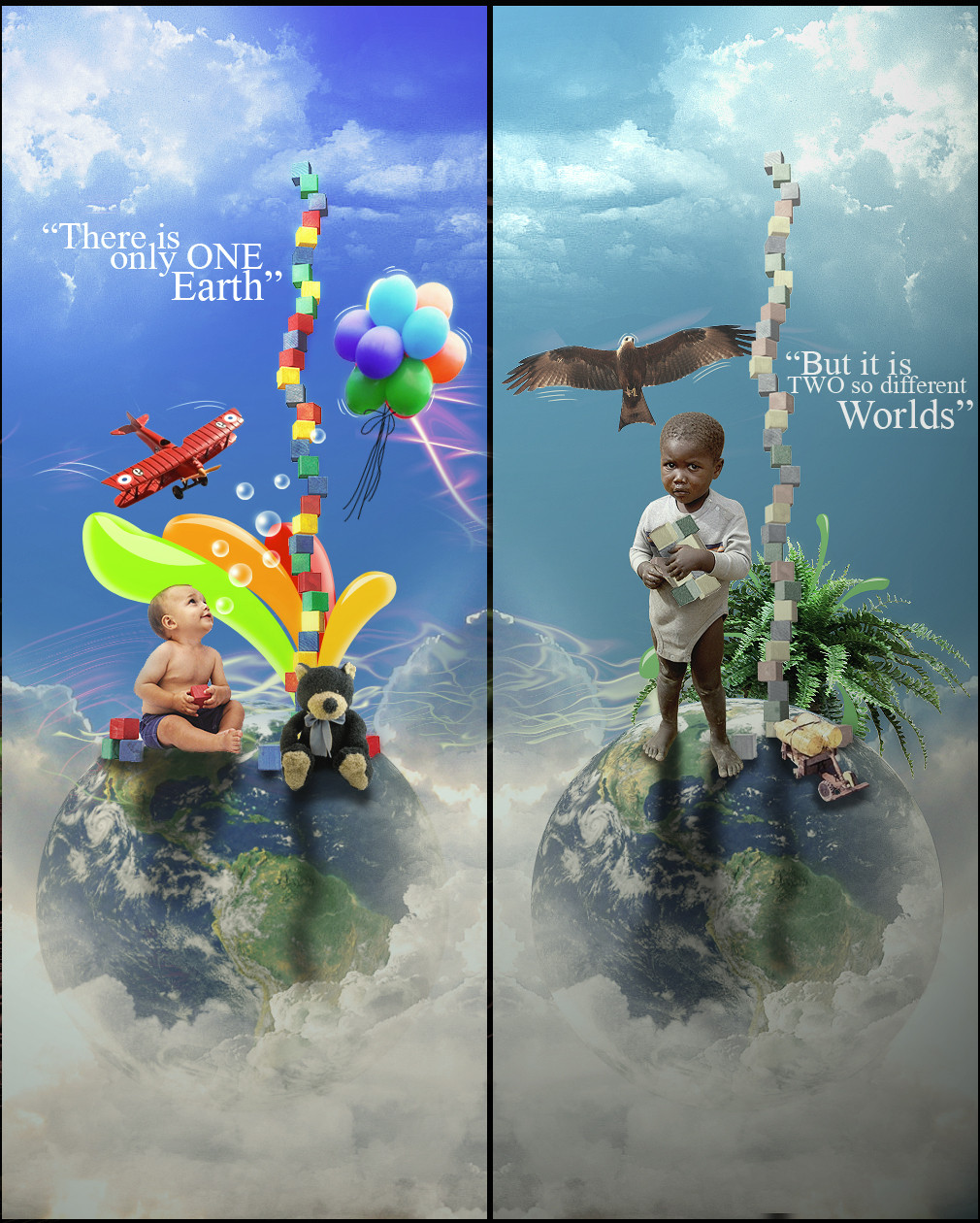
I dont use to make conceptual pictures, like this! But on the danish photoshop community "Comashop" there is a contest names POTM, the theme is earth/world, and then i thought it was a good idea to express this theme/concept!It a very sad concept, but the its even more sad that its a real concept/story!
Related content


Comments: 83

")

")


nice job man! both the concept and the application are great
👍: 0 ⏩: 1


Jeg har en række kritikpunkter.
1) Kvaliteten på himlen skulle være bedre.
2) Udklipning og især skygger.
3) Der skulle være mere kontrast mellem de to billeder. Især billedet til højre ser lidt for idyllisk ud. Hvis du vil afspejle fattigdom så syns jeg du skulle gøre det mørkere, mere grumset og beskidt i sit udseende. Sådan at der kommer en hvid kontra sort kontrast.
4) Teksten lyder ikke så cool. Ville være federe med "One planet. Two worlds" eller sådan noget.
Giver dig en del kritik for tiden, men ellers bliver man jo ikke bedre vel?  (Wink)")
Idéen er ganske glimrende.
👍: 0 ⏩: 0


its nice, but as someone said the speed lines are not that good ")
👍: 0 ⏩: 0

Great idea... Portrays a big truth; the contrast of colors, making darker the african children, helps to it. Very nice manipulation...
👍: 0 ⏩: 1

as usual, i would agree with this strange girl!
👍: 0 ⏩: 1
Who the bear are you? ...Hmmm.... Anyway, I also agree with this strange guy!
👍: 0 ⏩: 0


Kan godt lide konceptet, og idéen. Udførelsen er også okay, men en ting jeg synes du sagtens kunne gøre bedre:
Stregen der adskiller de to verdener kunne du godt lave anderledes - jeg ved ikke hvordan - men prøv med noget andet. Den sorte streg er for kedelig
Den bliver add'et til fav!
... du fik det på dansk, da mit engelsk ikke er i topform her i ferien
👍: 0 ⏩: 0


incredible
you are great  (Smile)")
👍: 0 ⏩: 0

Very sad but definitely true, a moving and beautiful photomanip.
👍: 0 ⏩: 1


its a very good concept, blending could be better on some places.. but still nicely done ^^
👍: 0 ⏩: 1

great work. good idea and well realized.
2 little things that could've been left out in my opinion:
the "moving lines" at the plane and the eagle,
and the water/ smoke effect at the middle right of the left part [> middle left part of the right part].
the whole work comes out very well though^^
👍: 0 ⏩: 1

wow. that really shows how things are in this world really well. i admire you work and would definately love to get a few tips from you.. keep up the good work
👍: 0 ⏩: 0
<= Prev |