HOME | DD
 aajohan —
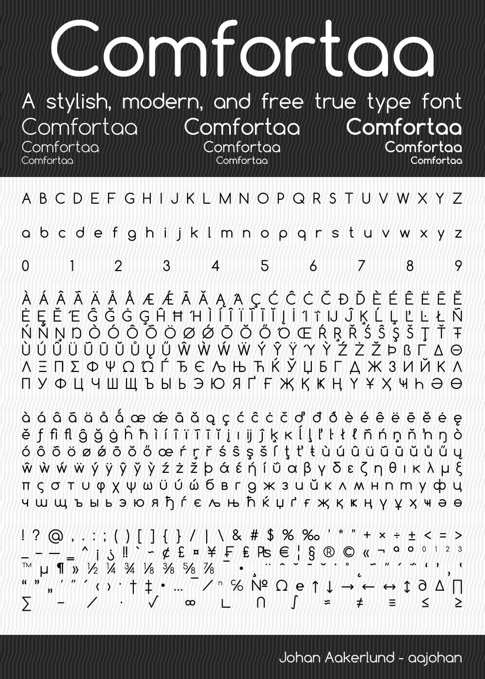
Comfortaa - font
aajohan —
Comfortaa - font
Published: 2008-12-04 15:03:53 +0000 UTC; Views: 812997; Favourites: 3990; Downloads: 369053
Redirect to original
Description
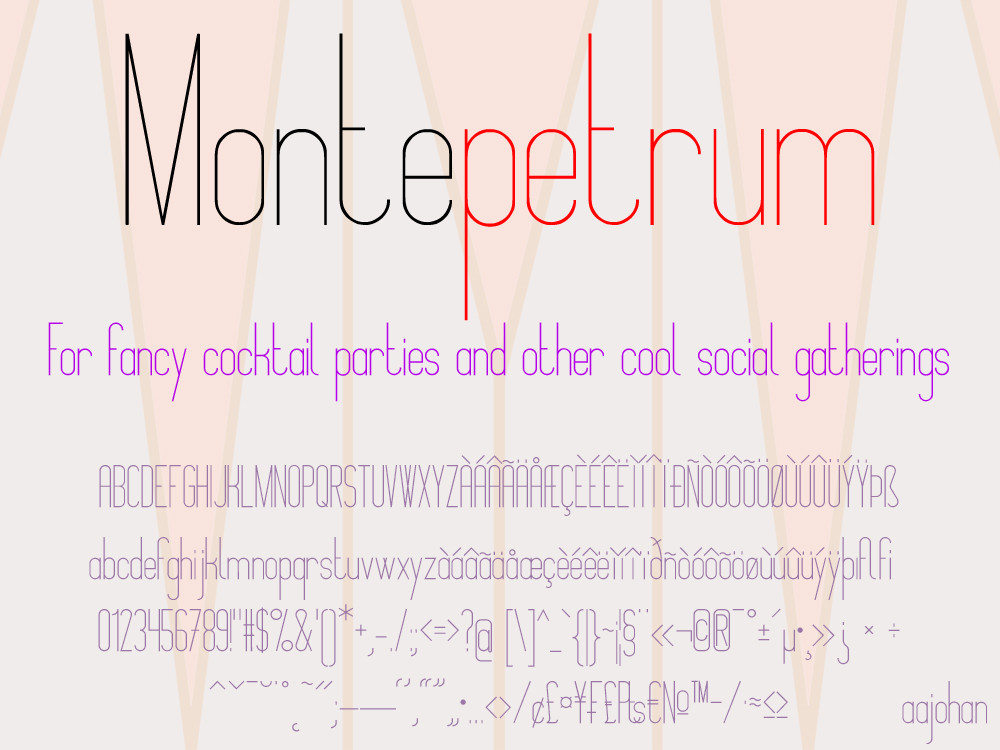
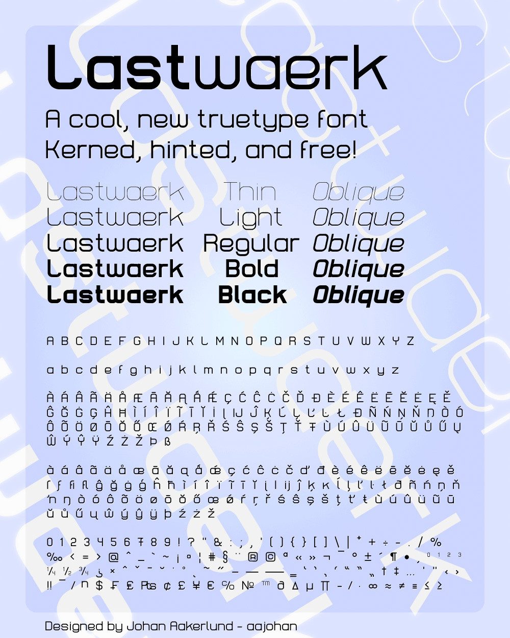
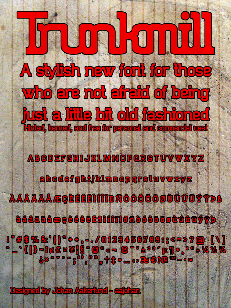
This is the latest version of Comfortaa: v3.001-Check out my three other fonts: Montepetrum: fav.me/d2if3uu Lastwaerk: aajohan.deviantart.com/art/Las… and Trunkmill: aajohan.deviantart.com/art/Tru… -
Comfortaa is a simple, good looking, true type font with large number of different characters and symbols. You can see most of them in the preview.
It is absolutely free, both for personal and commercial use.
It is licensed under the SIL Open Font License, Version 1.1 - For most uses, you don't have to worry about this at all as it is a license with very few restrictions, but you can always read the license file (OFL.txt) included in the download folder if you want.
You don't have to give me credit if you use it in your work, but you are very welcome to do so if you want.
If you download it and like it please fav it (but obviously only if you like it). You are also more than welcome to comment about anything you want (I'm open to critique)
I hope you will enjoy using my font!
I obviously would love to see how my font is being used, so feel free to comment with a link to your work, or send me a message
Edit:
v3: Comfortaa has been improved as part of the Google Font Improvements Project. This includes minor or major changes to all characters and support for vietnamese.
Edit:
Cirylic character set added!
Edit:
Note that the font license has been changed to a less strict one.
Edit:
Version 2.000 Released! All characters (yes all) have been redone / re-thought at a higher quality. Especially people using Comfortaa at large sizes will appreciate this. Spacing and kerning has also been re-thought. Some characters have changed more than others - you may notice changes to especially "s" and "f". The Cyrillic character set has also been greatly improved. Overall the quality of the font has just gone up a notch
 (Smile)")
Related content


Comments: 1177

👍: 0 ⏩: 0

Love this font ! I'm thinking about using it in my watermark, to put a link to my DA page.
I also love to use it when making slides for my studies.
👍: 0 ⏩: 0

👍: 0 ⏩: 0

👍: 0 ⏩: 0

The font is clean and nice on the eyes. Outstanding!!
👍: 0 ⏩: 0


👍: 0 ⏩: 0

Hi, I have installed the font Comfortaa (from Google and from this site), but there seems te be a bug in it. The VaribleFont:wght gives an error. Can you fix this?
👍: 0 ⏩: 0

quick question the download here has Bold, Light and Regular, but on other places there are other thicknesses available like on Google fonts you can also get Semibold and Medium or on Fontsquirrel you get a thin (thinner than light) version in addition to normal and bold.
are those also from you or are those fakes?
👍: 0 ⏩: 1

Hi
The Medium and Semi-bold are Google's derivatives, but they are completely up to standards.
Fontsquirrel keeps the old version of Comfortaa, which had a thin instead of a light - so theres nothing fake about it but it doesn't completely match the latest version of the font.
👍: 0 ⏩: 1

I truly love your font! I want to use it for my logo for my new clothing brand. Would that be okay with you?
👍: 0 ⏩: 1
Thank you! And yes, that is more than okay
👍: 0 ⏩: 0

I like the font and want to use it on my webpage. Right now I'm trying to figure out a nice styling for the typography. Are there any recommendations about CSS attributes if I use e.g. font-size 12pt (16px) for line-height, letter-spacing, paragraph margins, weight, etc.? I guess I could scale them easily to the different HTML categories (h1, h2, ... p, etc.) but a hint would be appreciated.
👍: 0 ⏩: 1
I know next to nothing about CSS (and HTML for that matter) so I'm afraid I can't give you adequate advice. Perhaps you can see how it is configured per default in Google Fonts and use that as a guideline?
👍: 0 ⏩: 0

Faved! Excellent font set. I love the styles and multilanguage of it, especially Greek. Thanks for making this.
👍: 0 ⏩: 1

This font is so great. I absolutely love the roundness and soft feel. I'm so excited that it's part of Google fonts, I'll definitely be using it in my upcoming website revamp.
👍: 0 ⏩: 0


Thoroughly like this font. I like the roundness and the general feel. I've adopted it for my website and am considering using it for all the text in my app. CaptainMoneyPants.com, if you'd like to see the website. Moneypants is the name of the app in the App Store.
The only thing holding me back from completing adopting the font are the numbers. They are a little too close together. I have to use numbers in my app and on my web page, and I find myself having to user other fonts for that, and it messes with the design sensibilities.
Can you change the spacing on the number 1 to be just a little wider, please? That would make this font really work for me. Everything else is perfect!
👍: 0 ⏩: 0

Wonderful font - I use it as often as I can because I enjoy looking at it. here's my latest project using it - www.cusponline.com.au - the font works perfectly with the messaging in my opinion - professional without being too stern. Great job!
👍: 0 ⏩: 1
Thank you so much! And awesome work on the website - it looks great!
👍: 0 ⏩: 1

by all means beautiful font indeed. I did notice the 'f' and 'i' in a small letter are converging when spelled out "fi", was that intended?
👍: 0 ⏩: 1
Yes that's intended - it's called a ligature when two such characters are merged. "fi" and "fl" are very common in fonts. You can usually turn off ligatures, but how you do it depends on where you are using the font (what software, etc.). I recommend you try googling how to turn off ligatures for your use scenario if you can't live with them.
👍: 0 ⏩: 0
You're very welcome! I know how annoying it is when you find a font you like only to find out it's missing the special characters of your language (in my case; æøå)
👍: 0 ⏩: 1

Maybe you should contact Google Fonts and get them to update too
👍: 0 ⏩: 1
They are included in the google fonts version as well. Remember to include "Latin Extended" characters.
👍: 0 ⏩: 0

You did a great job, thanks for this beautiful font, i really like it!
👍: 0 ⏩: 0


Hello.
I found the starting point of "C" and "G" in a capital letter looks a little bit weird?
I checked the "c" in a small letter.
The starting point is different with a capital letter.
My English is terrible.
Please excuse me.
And thanks a lot for your work!
👍: 0 ⏩: 0


Hi Johan,
Your font is absolutely wonderful. Why does it not surprise me that you are Danish?
I adore writing from the human hand, having grown up with perfectly scripted postcards from my Dad. I was marked down in my English schools for fooling around with my letters too much. One aspect makes me curious about your font... the specific reason you chose not to curve the tail of the "y" the way you do the "g". To me it's the only anomaly.
I hope we find a way to use your magnificent artistry or should I say calligraphy?
Be well, cheers, Garry
👍: 0 ⏩: 1
Hi Greg
Thank you very much!
If you use Comfortaa on your website using the Google Fonts Service it shouldn't matter if readers have installed the font or not.
fonts.google.com/specimen/Comf…
As for the "y" I personally think it makes great sense to give it a relatively "sharp" appearance. Semantically I closely relate x, y, z, v, w and wanted to give them a similar "sharp" feeling. I think, making a typeface, is a balance between making letters look alike and in the same style, while keeping them clearly distinguishable and different. Making a few quirky details also helps give the font a bit of soul I think
Also that's just the way I have always written y's haha
Best regards,
Johan
👍: 0 ⏩: 1
Hi Johan,
Many thanks for your design insights. All makes sense to me too now. Wonderful!
Using the Google Fonts Service is fascinating! Passed it on to my designer.
Thanks again, cheers, Garry
👍: 0 ⏩: 0


Thank you very much for this font. It is wonderfully clear and precise. I have changed my default settings to Comfortaa. It makes all the correspondence more impressive. Thank you once again and happy creating on your future projects. Philip
PS: It would be lovely if you could create the 'Indian Rupee symbol'. It is very difficult to get a decent one. Once again warmest regards from a hot and distant India!
👍: 0 ⏩: 0

Thanks for this wonderful font! I'm using it as the primary font in my upcoming game, I love how clean and readable this is.
Also, does comfortaa have a monospace variant (with fixed width for all characters)? I've been seriously considering using this for my text editor but the variable width makes it a little hard to read because of all the periods and semicolons.
👍: 0 ⏩: 0

Not sure if you knew, but this font was used in the game Niche! You can check it out on Steam. Beautiful font.
👍: 0 ⏩: 1

Like I don't have enough fonts already (nearly 3,000)!!! Couldn't resist it, though. You were thoughtful enough to include a lot of special, even obscure, characters that I find very useful. Good work, sir!
👍: 0 ⏩: 1
One can never have too many fonts! I'm glad I can add to your collection
👍: 0 ⏩: 0


It's lovely and clear, which is great for my students. I particularly like the round "a", because it's more like a hand-printed one rather than the more type-ical (pun intended) spun-upside-down mini-g. This makes it easier to spot for new adult readers/writers.
👍: 0 ⏩: 0

It's a very lovely font! I had a chance to work with it for practice. Highly recommend.
👍: 0 ⏩: 0

The download button doesn't work for me (dA gives me error 404)
")
👍: 0 ⏩: 0


| Next =>