HOME | DD
 aajohan —
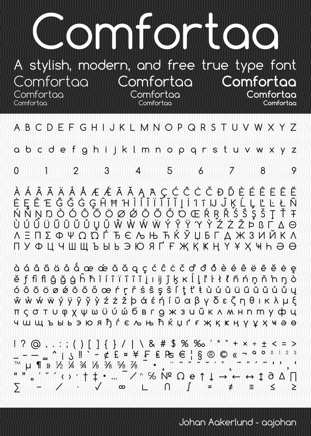
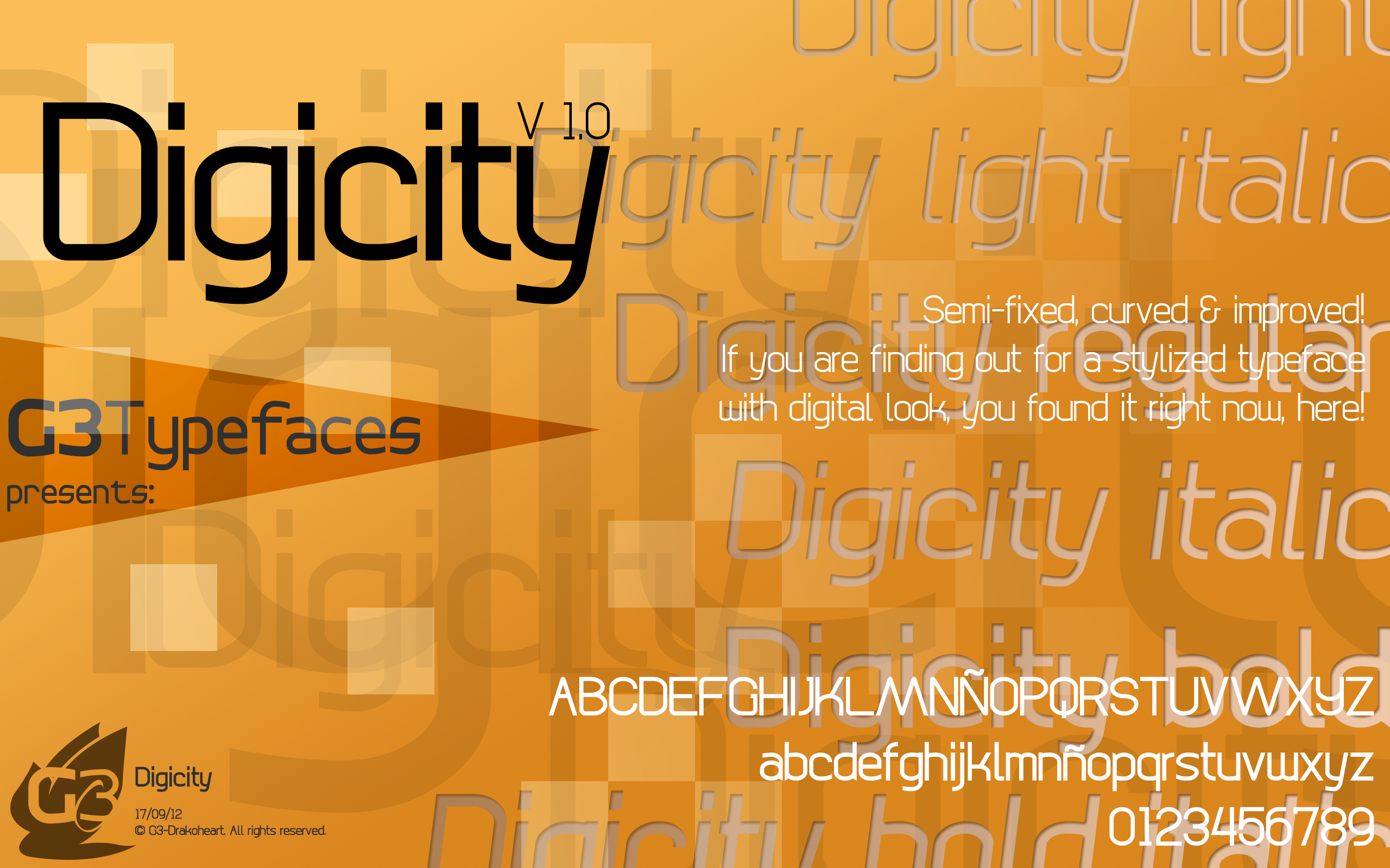
Comfortaa - font
aajohan —
Comfortaa - font
Published: 2008-12-04 15:03:53 +0000 UTC; Views: 813092; Favourites: 3990; Downloads: 369055
Redirect to original
Description
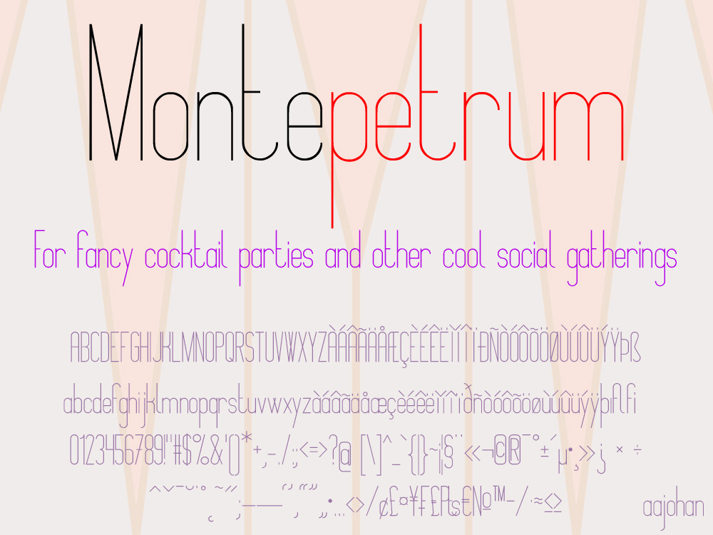
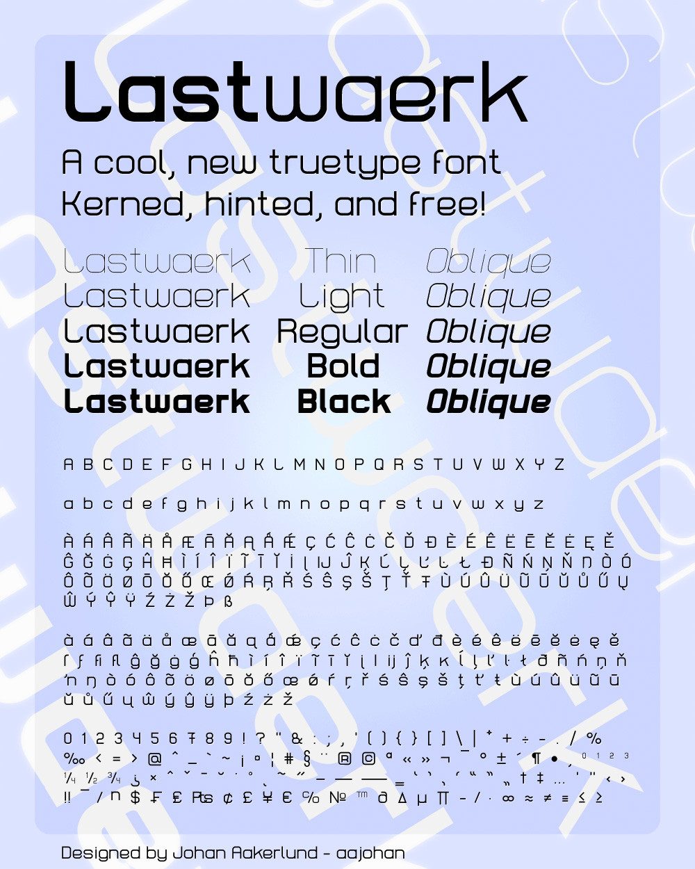
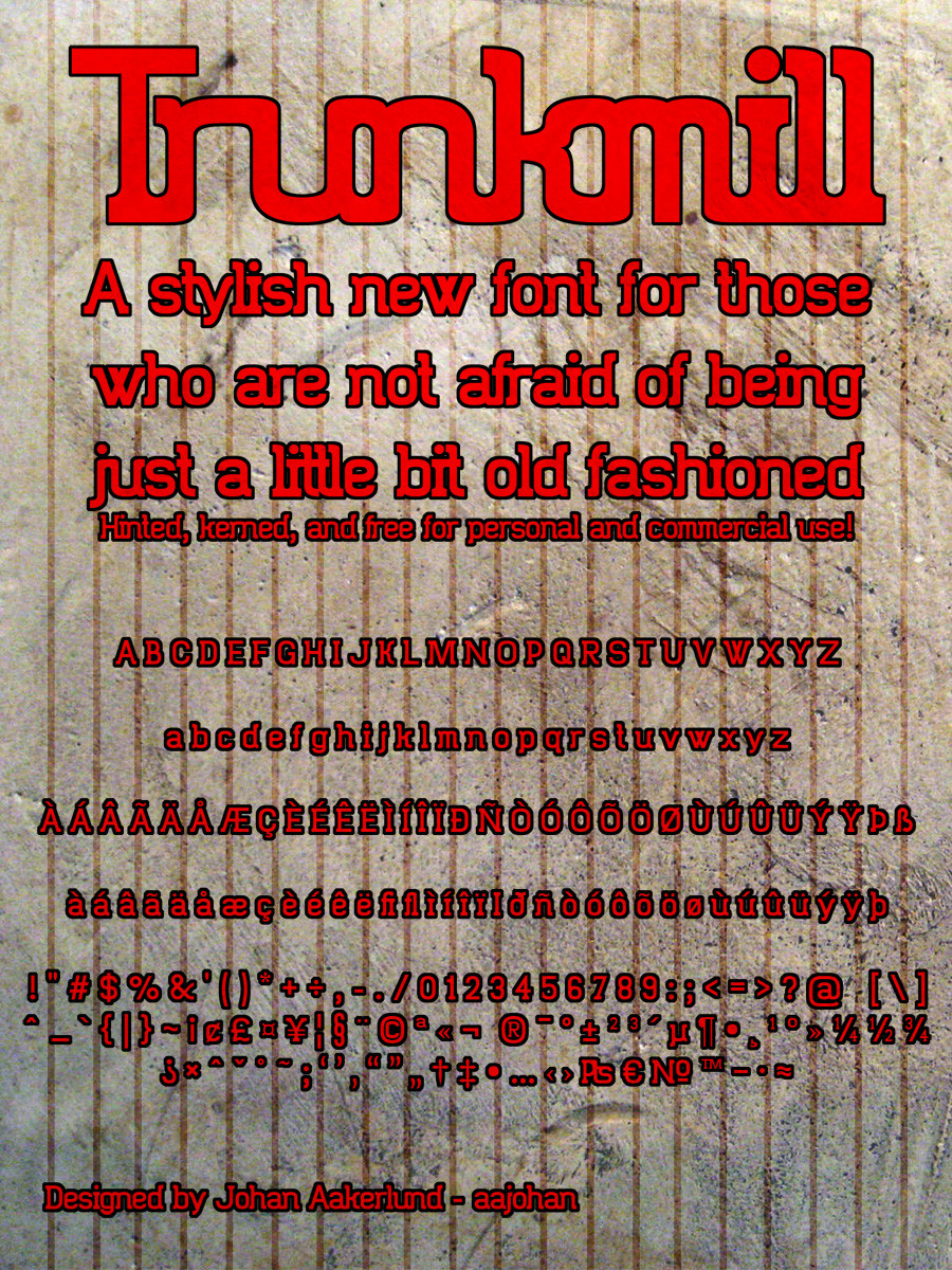
This is the latest version of Comfortaa: v3.001-Check out my three other fonts: Montepetrum: fav.me/d2if3uu Lastwaerk: aajohan.deviantart.com/art/Las… and Trunkmill: aajohan.deviantart.com/art/Tru… -
Comfortaa is a simple, good looking, true type font with large number of different characters and symbols. You can see most of them in the preview.
It is absolutely free, both for personal and commercial use.
It is licensed under the SIL Open Font License, Version 1.1 - For most uses, you don't have to worry about this at all as it is a license with very few restrictions, but you can always read the license file (OFL.txt) included in the download folder if you want.
You don't have to give me credit if you use it in your work, but you are very welcome to do so if you want.
If you download it and like it please fav it (but obviously only if you like it). You are also more than welcome to comment about anything you want (I'm open to critique)
I hope you will enjoy using my font!
I obviously would love to see how my font is being used, so feel free to comment with a link to your work, or send me a message
Edit:
v3: Comfortaa has been improved as part of the Google Font Improvements Project. This includes minor or major changes to all characters and support for vietnamese.
Edit:
Cirylic character set added!
Edit:
Note that the font license has been changed to a less strict one.
Edit:
Version 2.000 Released! All characters (yes all) have been redone / re-thought at a higher quality. Especially people using Comfortaa at large sizes will appreciate this. Spacing and kerning has also been re-thought. Some characters have changed more than others - you may notice changes to especially "s" and "f". The Cyrillic character set has also been greatly improved. Overall the quality of the font has just gone up a notch
 (Smile)")
Related content


Comments: 1177


One of my favorite fonts! I love the clean lines and modern feel.
👍: 0 ⏩: 1

Thank you so much! I'm glad you like it!
👍: 0 ⏩: 0

Nice font, I have a project android production free for user. So Can I use font for own project?. Thank you so much because you create this font. I loved it in see the first.
👍: 0 ⏩: 1
Yes of course you can use it - thank you!
👍: 0 ⏩: 1

Beautiful font, which is also listed in the Web Fonts set in Adobe Creative Cloud ... print and web in sublime harmony
👍: 0 ⏩: 1
Cool, I didn't know! Thank you so much!
👍: 0 ⏩: 0


I'm using this for a book cover to match a client's spa website. Thanks for keeping it free! <3
👍: 0 ⏩: 1
Cool thanks!
👍: 0 ⏩: 0

")
You're quite welcome! And thank you
👍: 0 ⏩: 0

Hi, I am currently working on a logo in which I would like to use the font of your creation. I have to ask, would it be possible, for the purpose of my project, to alter some of the specific letters? I am only talkig about a few, slight changes in order to make my work consistant. In the meantime I would like to congratulate on your work, it really is a great font. Thanks in advance
👍: 0 ⏩: 1
Thank you! And yes, you are more than welcome to alter the letters as you like!
👍: 0 ⏩: 0

Excellent font, thank you very much!
👍: 0 ⏩: 1
Thank you! You're very welcome!
👍: 0 ⏩: 0

I really like this font and I'd like to use this. Unfortunately I can't get it installed. Is it windows 8.1 compatible? Otherwise it's just me...
👍: 0 ⏩: 1
Thanks!
Yes it's as compatible as a font can be (completely standard .ttf format). You should be able to install it just by right-clicking the files and choosing "Install", or putting them in the font folder (C:\windows\fonts\) - if it doesn't work, try some windows troubleshooting site - when it comes to windows you're never the only one who's had a particular problem, so I'm sure there is a solution out there
👍: 0 ⏩: 0


Thank you very much! And you're quite welcome
👍: 0 ⏩: 0


Love the font. Question: is it intentional that some of edges don't line up? For example, in the lower case g the tip of the bottom does not line up vertically with the left edge of the upper 'o' part of the letter.
👍: 0 ⏩: 1
Thanks!
I have designed each character to look the way I thought would be best, and best fit the overall style of the font - so if something doesn't line up completely then it's probably on purpose. In your example, I wanted to retain the same curve for the bottom part of the g, as the o-part of the letter, and still keep some clearance between the tip of the bottom part and the bottom of the o-part - so that's why they don't completely line up vertically. But I have to say, you have to be a bit nitpicky to notice it
 (Wink)")
👍: 0 ⏩: 1
Thanks for the explanation, and yes, it comes with the job
👍: 0 ⏩: 0


I ought to mention that I used this in a game I made . Nicely done!
👍: 0 ⏩: 1

Thank you! You're very welcome!
👍: 0 ⏩: 0

Hi Aahjohan, thank you for creating this. It was my first choice for my game's text font. I can't voice my appreciation any further so once again, really, thank you.
👍: 0 ⏩: 1
Hi Raphael,
Thank you!
👍: 0 ⏩: 0


Very good and so interesting font. I liked it more than other fonts you published (Montepectrum has not good readability)
How i can get it?
👍: 0 ⏩: 0


Nice fonts! Thank you! I'm using it for a cooking banner event
👍: 0 ⏩: 1

<= Prev | | Next =>