HOME | DD
 aajohan —
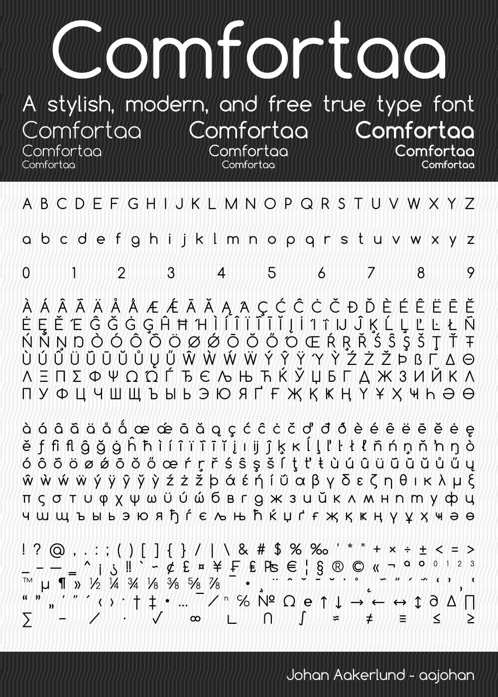
Comfortaa - font
aajohan —
Comfortaa - font
Published: 2008-12-04 15:03:53 +0000 UTC; Views: 813104; Favourites: 3990; Downloads: 369056
Redirect to original
Description
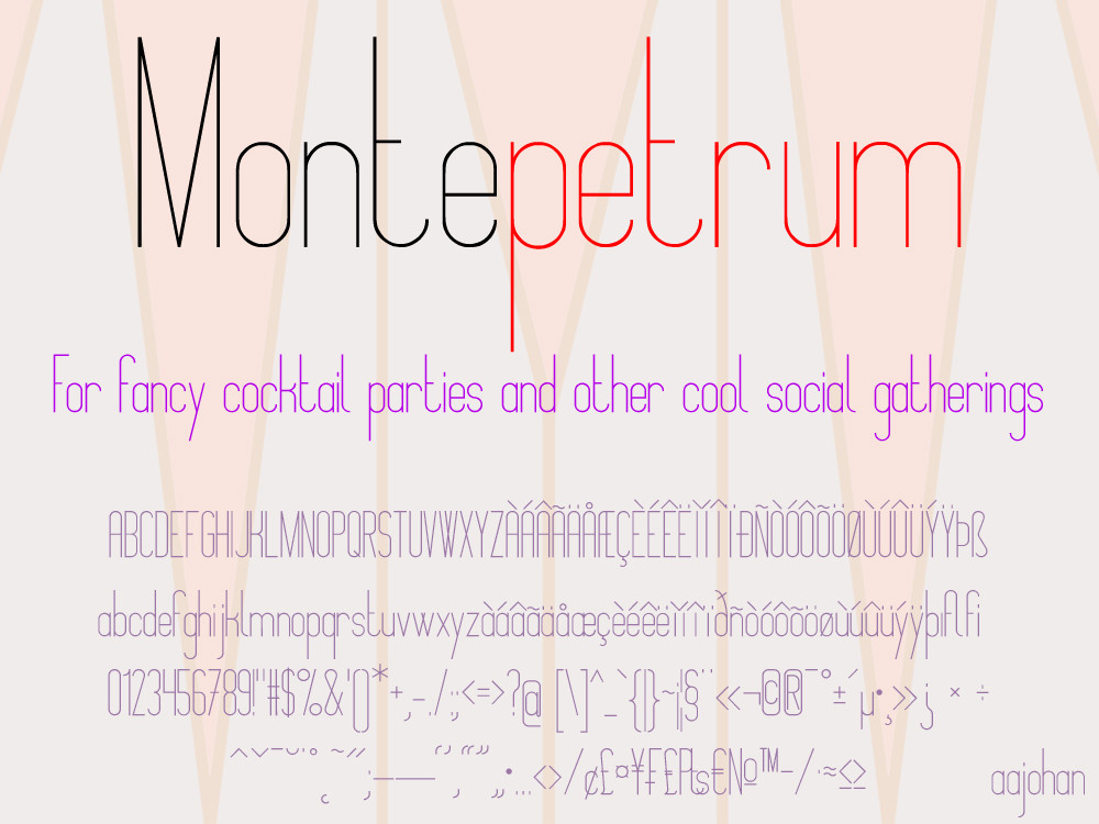
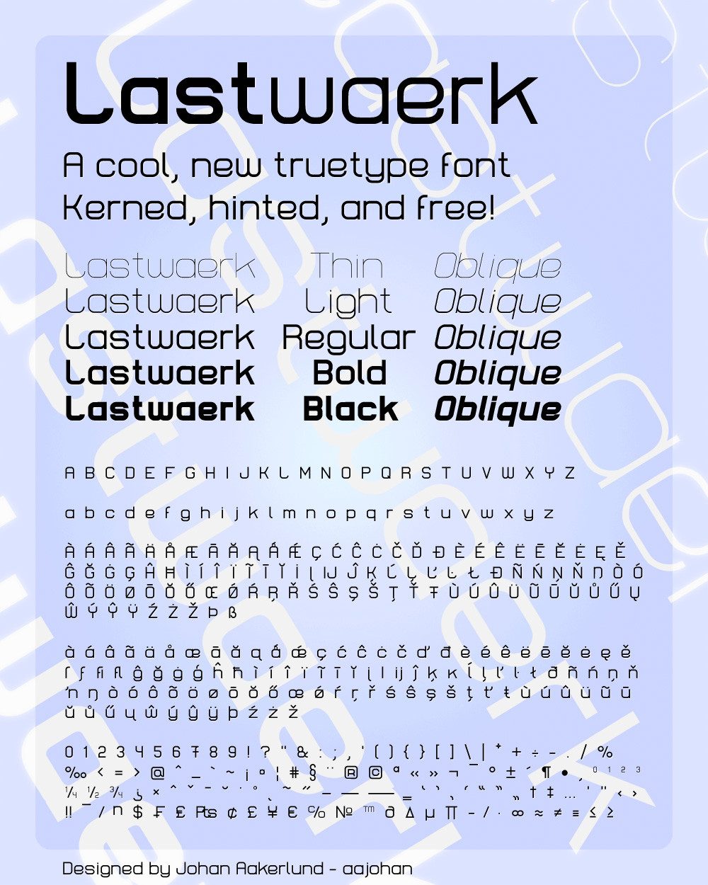
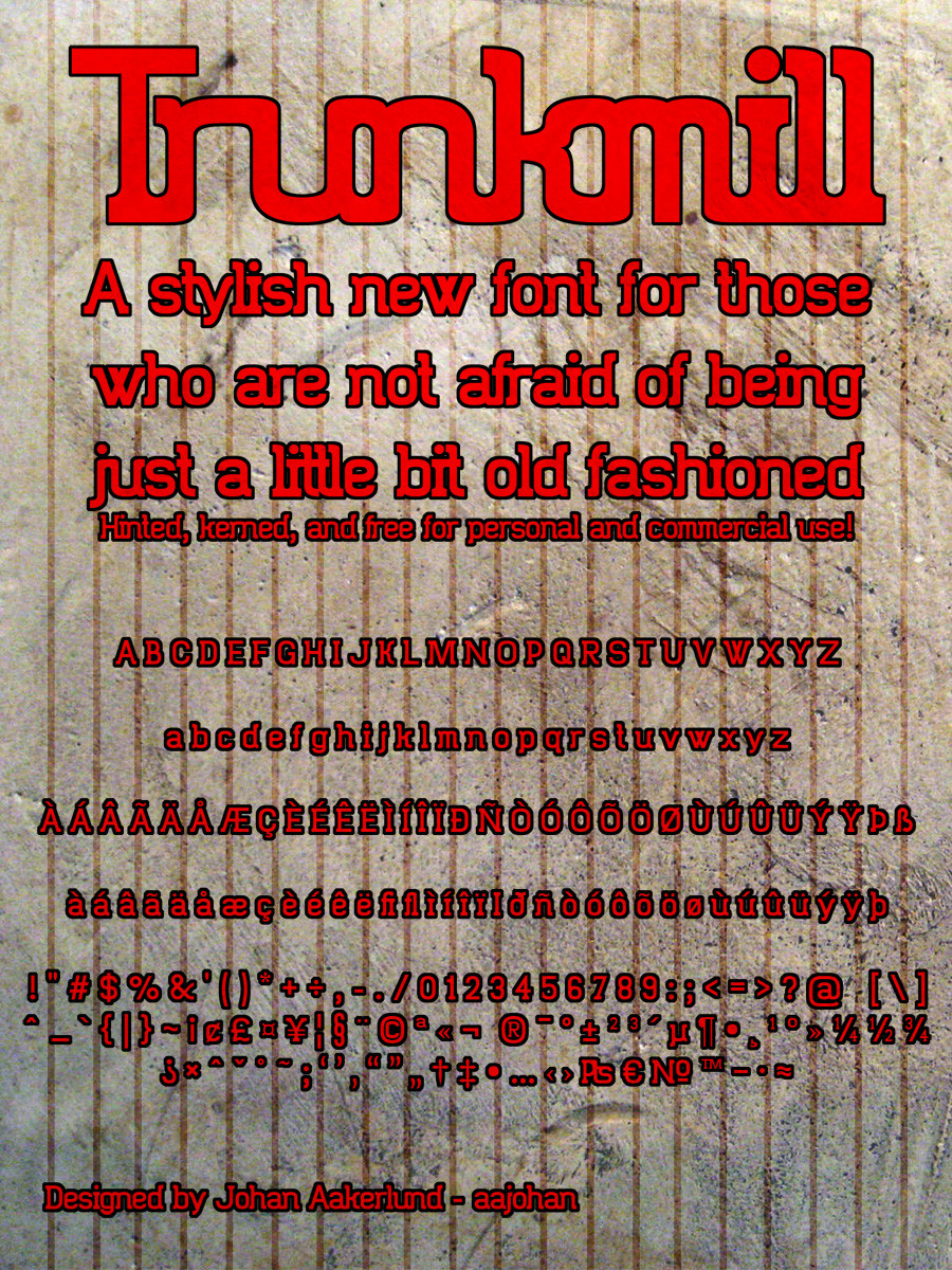
This is the latest version of Comfortaa: v3.001-Check out my three other fonts: Montepetrum: fav.me/d2if3uu Lastwaerk: aajohan.deviantart.com/art/Las… and Trunkmill: aajohan.deviantart.com/art/Tru… -
Comfortaa is a simple, good looking, true type font with large number of different characters and symbols. You can see most of them in the preview.
It is absolutely free, both for personal and commercial use.
It is licensed under the SIL Open Font License, Version 1.1 - For most uses, you don't have to worry about this at all as it is a license with very few restrictions, but you can always read the license file (OFL.txt) included in the download folder if you want.
You don't have to give me credit if you use it in your work, but you are very welcome to do so if you want.
If you download it and like it please fav it (but obviously only if you like it). You are also more than welcome to comment about anything you want (I'm open to critique)
I hope you will enjoy using my font!
I obviously would love to see how my font is being used, so feel free to comment with a link to your work, or send me a message
Edit:
v3: Comfortaa has been improved as part of the Google Font Improvements Project. This includes minor or major changes to all characters and support for vietnamese.
Edit:
Cirylic character set added!
Edit:
Note that the font license has been changed to a less strict one.
Edit:
Version 2.000 Released! All characters (yes all) have been redone / re-thought at a higher quality. Especially people using Comfortaa at large sizes will appreciate this. Spacing and kerning has also been re-thought. Some characters have changed more than others - you may notice changes to especially "s" and "f". The Cyrillic character set has also been greatly improved. Overall the quality of the font has just gone up a notch
 (Smile)")
Related content


Comments: 1177


I'm using the font via Google fonts in a website. Is it possible that Google does not have the latest and are using a previous version? You can see it in the url:
[link]
Thanks
👍: 0 ⏩: 0
Typography is a very stylish, i like, congratulations. BUT has a little problem, the character question "¿" in Spanish is created in reverse. Good job anyway.
👍: 0 ⏩: 1

Are you sure? I corrected that problem several months ago. Maybe you have an older version? or are you just looking at the preview?
👍: 0 ⏩: 1
I'm using the font via Google fonts. Is it possible that google does not have the latest and are using a previous version? You can see it in the url:
[link]
Thanks
👍: 0 ⏩: 1
Yes Google has an older version - I've asked them to update it, but they're really quite slow... I can try reminding them again, but I don't have any control over the font on google web fonts unfortunately.
It's funny, the upside down question mark in the link you sent me displays correctly - maybe it's just because I have the latest version of Comfortaa installed on my computer...
👍: 0 ⏩: 1
Yes, when i installed the lastest version of Comfortaa the question mark displays correctly. Google font is the problem. Thanks anyway for your work and your attention. Have a nice day.
👍: 0 ⏩: 1
Thank you - you too! I'll contact Google and see if I can get them to update the font
👍: 0 ⏩: 0

You sure are welcome, I use it all the time!
👍: 0 ⏩: 1
It's just so perfect. Perfect curves, sizes, etc...
In fact, if you want to see somewhere I used it...
[link]
👍: 0 ⏩: 0

Hello,aajohan..It's a lovely font. I would like to use your fonts on my webpage. How can I get this file so that i get make some design review on my computer. Please advise
👍: 0 ⏩: 1
Hi Christy,
Simply use the "Download file" link to the right of the description
👍: 0 ⏩: 0

I really like how simple and elegant your font is. Thank you!
👍: 0 ⏩: 1

Love this font! Haven't gotten the chance to use it in project yet, but I have a feeling it will become one of my regulars.
👍: 0 ⏩: 1
Thank you so much! I'm really glad you like it
Feel free to send a link if you use it
👍: 0 ⏩: 0

I used it here: [link]
Thank you! ^^
👍: 0 ⏩: 1


this is my favorite font and I love you
👍: 0 ⏩: 1

I've been using Comfortaa in a game prototype, where the board is a Boggle-like grid of large capital letters. It's a sweet, clean design, better than anything else I've found. But there's one thing that catches my eye all the time, which is the transition between the upper and lower portions of the capital S. It looks like there's a very slight discontinuity there, very subtle, really only noticeable when it's isolated and enlarged this way. But with all the other curves so perfectly smooth on the other letters this one point always sticks out when I'm testing the game.
An ipad screenshot loses too much detail in compression to see it, but here's a jsfiddle trying to recreate it: [link] (works on OS X Chrome and Safari, not Firefox). What do you think? Am I imagining it?
👍: 0 ⏩: 2
Yes I see what you mean. I'm very busy right now, but I'll correct it when I get the time
👍: 0 ⏩: 0

you're supertalented, I use comfortaa everywhere!
👍: 0 ⏩: 1
I just had a look at your gallery. Your paintings are absolutely amazing! It really means a lot being called "supertalented" by someone as obviously supertalented as you! I'm really glad you like my font
👍: 0 ⏩: 0


Hi Johan! I don't know if you remember me, I'm from the Fedora project and we use Comfortaa as our titling font for our website and for our designs
I recently went to an AMC movie theater in Boston USA and I am pretty sure the company is using Comfortaa on one of the reels they play before the movies. The next time I go I'll try to take a photo of it for you.
👍: 0 ⏩: 1
Yea I remember you
That's really cool! Thank you! If you'd take a photo i would be awesome (if they allow that in the movie theaters of course).
Thanks again! I love seeing my fonts in use
👍: 0 ⏩: 0


Hello, I used your wonderful font [link]
Thank you very much for your work!
👍: 0 ⏩: 1

Wow! This is exactly what I was looking for! I might use it in my logo.... let's see how it works
👍: 0 ⏩: 1

Great job! I recently found out about this font and really loved it!
👍: 0 ⏩: 1


Bringing nice type to the web the way it should be. thank you.
👍: 0 ⏩: 1

Used your lovely font again, thank you <3 [link]
👍: 0 ⏩: 1
<= Prev | | Next =>