HOME | DD
 aajohan —
Lastwaerk - font
by-nd
aajohan —
Lastwaerk - font
by-nd
Published: 2009-09-21 22:29:12 +0000 UTC; Views: 84133; Favourites: 699; Downloads: 20752
Redirect to original
Description
Here we go")
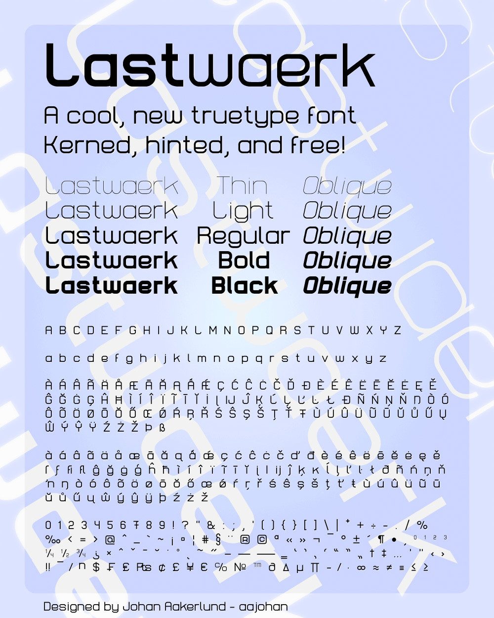
My second font: Lastwaerk. I've been working on this for over 8 months - I almost can't believe the number of hours I've spent on making this font. But I think (hope) it was worth it.
As you can see from the preview, Lastwaerk is a clean, legible sans serif font in 5 weights ranging from thin to black, each with an oblique type - they all take up the exact same amount of space. It has a total of 378 characters and symbols, all included in the preview.
Lastwaerk is completely free! Both for personal/non-commercial use, AND commercial use - and you don't have to give me credit when using it, but you are of course very welcome to do so if you want
 (Smile)")
Feel free to comment about anything you want! (critique too of course)
If you download it and like it, please fav it
(but only if you like it!)And that's it! I really hope you like it
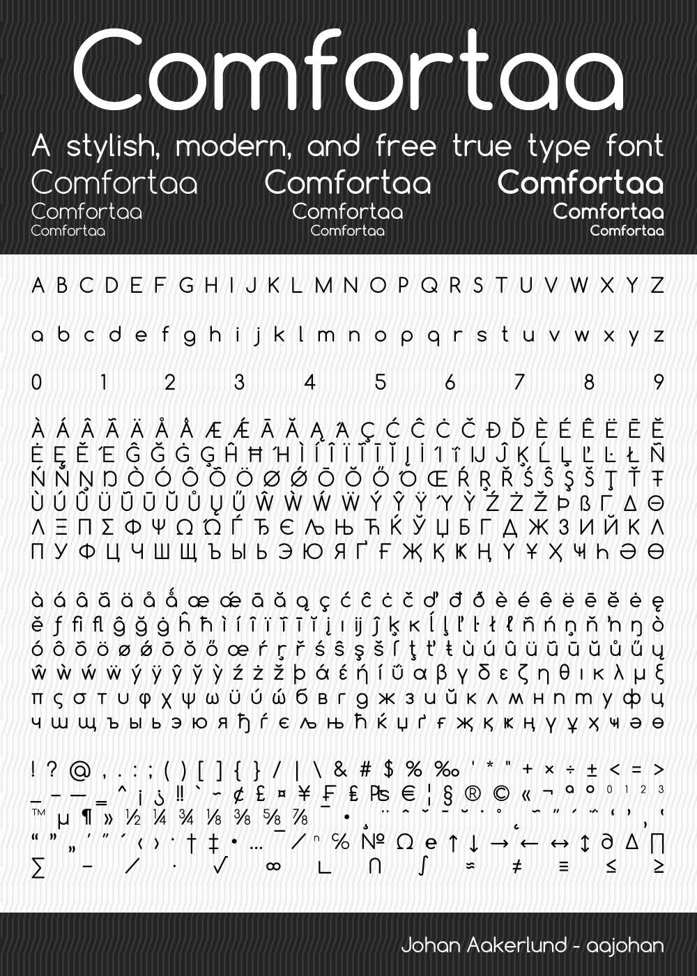
Check out my other font comfortaa: [link]
EDIT: Huge thanks to for featuring Lastwaerk as DD! And thanks for all the favorites and nice comments!
Related content


Comments: 208

VERY sweet font! I my use this one in my band's next logo =]
👍: 0 ⏩: 1

I can see how this will be very useful to artworks in the future.
so clean and sharp.
congrats on the DD!
hopefully more people will get to see your great work!
👍: 0 ⏩: 1

Oh now i love this <3 It is so well balanced :instantly downloads:
👍: 0 ⏩: 1

This is really nice. Though, to be honest, I would be worried about the e's counter space filling, particularly in the black and bold, when used in smaller point sizes. However, I need to praise how complete it is! Usually, these kind of typefaces lack such variation. Good Job.
👍: 0 ⏩: 1

Thanks!
👍: 0 ⏩: 0


omg! I LOVE this font! It looks just beautiful. Well done and grats on the DD!
👍: 0 ⏩: 1

o.O
It is a oh!so-complete font! and beautiful! I can't believe it's free!
A step ahead to a more sharing world


👍: 0 ⏩: 1

Wow, this font is just awesome epic win. Thanks so much for bringing such an amazing sans-serif font to the world for free
👍: 0 ⏩: 1
Thank you so much! 
👍: 0 ⏩: 0

Classy, elegant, simple, and somewhat techno-like (is that even a term?!)
Awesome work here.
👍: 0 ⏩: 1
Thank you!
👍: 0 ⏩: 1

The world needs more free (high quality) fonts. Thank you for taking the time to make this one.
👍: 0 ⏩: 1
Agreed
👍: 0 ⏩: 0

Great job. New typefaces rarely get the attention they deserve, even when licensed so generally. Nice little modern font. Thanks a lot! Will definitely be referring people to this page.
👍: 0 ⏩: 1

Hey there!
Thanks a lot for this great font!
And I am most surprised to see you included so many different characters - most of all Polish nasals (ą, ę and others!). It's so hard to find a good font containing those and yours is just an eyecandy!
Good job once again and keep it up!
👍: 0 ⏩: 1
Thank you so much!
👍: 0 ⏩: 0

Thanks! And you're welcome
👍: 0 ⏩: 0

I wish that some commercial developers put at least half of your effort in creating their fonts. I guess I can see here every single latin alphabet. Just to let you know, as a native user of Polish letters, I APPRECIATE IT ^_^
I have DOZENS of professional typefaces on my hard drive (which were installed with various graphic editors), but only about 10-15% of them have Polish characters, which makes them more teasing then usable.
THANK YOU VERY MUCH for remembering that there's A LOT more than only English characters in use when it comes to writing text!
👍: 0 ⏩: 1
Thank you so much!
I have the same problem with the danish characters æ, ø and å. Though more common than the Polish characters it can still be a pain to find free fonts that include them
👍: 0 ⏩: 0

Thank you so much for that typography...it's like a present for designers
👍: 0 ⏩: 1


Wow! I love that you put in all the accents, I don't belive a font is complete without them but some designers don't seem to aknowledge that english is probably one of the few if not the only that dosen't use them.
the design it self is interesting reminiscent of Eurostyle but much more condensed and verticaly oriented with a slight edgyness to it, that makes it both cool and practicle.
Great work, so generous of you to share.
I will definitly use it.
Thank you.
👍: 0 ⏩: 1
Thank you so much!
I actually was somewhat inspired by Eurostyle with this font - but as you so accurately described, I wanted it to be more edgy and "geometric"
👍: 0 ⏩: 0


Thank you! That was exactly the idea (or some of it at least
👍: 0 ⏩: 1

really like it...
thx for effort put into it
👍: 0 ⏩: 1

This font is fantastic. Props for releasing it under such permissive licensing conditions.
Comfortaa is also great. Both fonts evince serious attention to detail.
👍: 0 ⏩: 1
Thank you so much!
👍: 0 ⏩: 0

Beautiful! Inspired by Eurostile?
👍: 0 ⏩: 1

Free font for commercial use! You are an angel, my man.
👍: 0 ⏩: 1

This is an awesome font.
👍: 0 ⏩: 1
<= Prev | | Next =>