HOME | DD
 aarora — ERASER
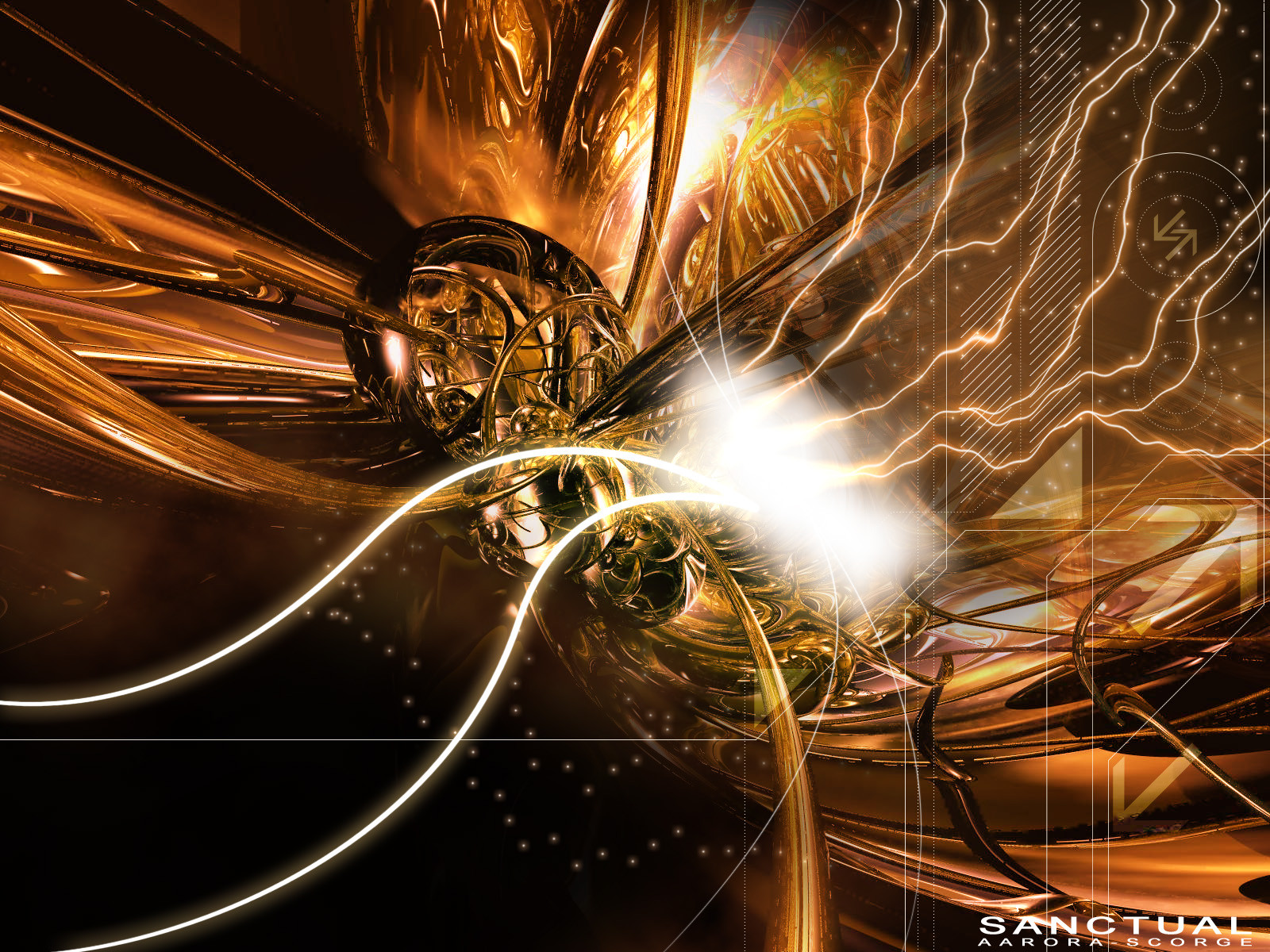

Published: 2004-07-21 18:53:01 +0000 UTC; Views: 694; Favourites: 15; Downloads: 217
Redirect to original
Description
vsTonare has already submitted this but I am resubmitting it for color changes and for print purposes. Enjoy
 (Smile)")
Related content


Comments: 24

love the top part a lot here, the bottom not really, but still looks amazing
👍: 0 ⏩: 0


Jul 21, 2004")
Anyways its not often I get to fav one of my collabs....Love the colors bro.

👍: 0 ⏩: 0

thats realy cool!
i loved the render and brushing, everything rocks.
+fav
👍: 0 ⏩: 0

sweet color and brushing also the render is cool too!
👍: 0 ⏩: 0


I loved the original, and this one kicks just as much ass. Another 
👍: 0 ⏩: 0

even though some of the the top and side (and typo) throw me off a bit..i do like the style youve created here...good job
")
👍: 0 ⏩: 0


yep like thes collers better +fav, great brushes, see a good fattel point in here, loverly render and nice typo to +Fav
👍: 0 ⏩: 0

Nice I see it very often that friends make prints for other thats a nice idea ..
👍: 0 ⏩: 0


could use some work on the colors and the 2d. nice job!
👍: 0 ⏩: 0

Hey thats looks really cool.
Although I can't help but wonder how it'd look in another colour >_>
👍: 0 ⏩: 0

the render, brushing and pixelstretching is l33t! but you could work on the colors and the 2d... it's just like you put some signs there in a lower opacity....
👍: 0 ⏩: 0

Very nice work indeed, I especially like the render and lighting, GJ
👍: 0 ⏩: 0

Hey waou !
very awesome work dude !!
the render is great ! and the brush cool !
nice color tone too
👍: 0 ⏩: 0


nice one man!! that is leet! nice render and brush work dude!!
👍: 0 ⏩: 0

Nice render. I like how you make the 2d barely visible. Very nice
👍: 0 ⏩: 0

Like the render area, but the top right is weird. good work u both.
👍: 0 ⏩: 0