HOME | DD
 AbhaySingh1 — Abhay Singh Card Concept 1
Published: 2009-06-25 13:56:58 +0000 UTC; Views: 5859; Favourites: 33; Downloads: 244
Redirect to original
Description
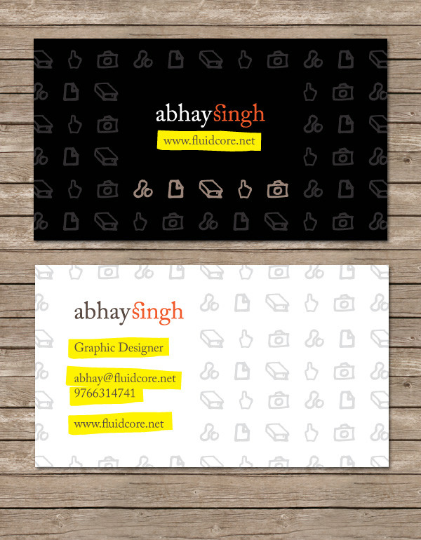
This is a business card design that I'm working on for myself. (Smile)") I really need some constructive criticism and feedback on this, as these cards have to last me quite some time once they're printed.
I really need some constructive criticism and feedback on this, as these cards have to last me quite some time once they're printed. ") I'll be sending these off to my printer in a few days, so am trying to finalize the design asap.
I'll be sending these off to my printer in a few days, so am trying to finalize the design asap.The top part is the back of the card and the bottom is the front.
So... please critique!!
Other than that, all comments and faves appreciated!
EDIT: Increased the space around my name/website on the black side, please comment.
Credit for the background texture goes to [link] by ~ftIsis-Stock
Related content


Comments: 21

Hello .
I am Nicole Pink, am a single female from United State, but currently in Yemen for peace keeping mission, i work for US Army/Nasa, I would love to know you more better and that is only if you do not mind to write me to my email ( sgtnicole8@hotmail.com ) am an easy going lady that will do anything for the person i love, can you tell me something about yourself in your mail to me so that i will do the same, waiting for your mail ?
Nicole .
👍: 0 ⏩: 0

Hello !!
I added your business card for inspiration at www.freshbusinesscards.com
Enjoy
")
👍: 0 ⏩: 0

Cool, its original it would be awesome if the icons were more random.
But i like how you highlighted the main part with a yellow marker
👍: 0 ⏩: 0

what´s the name of the font? could u upload the font?
👍: 0 ⏩: 0

I dont like the small icons you have putted there. ")
👍: 0 ⏩: 1

Ah that's OK, a matter of personal preference I guess
👍: 0 ⏩: 1

Original idea. I like it. Although there was a suggestion about that yellow highlights I think they go perfectly with the hand made theme.
I would use a business card like this
👍: 0 ⏩: 1
Thanks a lot
👍: 0 ⏩: 1
Don't tempt me, cause I feel the need to (not speed) have them! >
👍: 0 ⏩: 1

color concept isn't good but desing and kompo concept is really nice
 (Wink)")
👍: 0 ⏩: 1
maybe pastel colours...it accentuate cartoons images...
👍: 0 ⏩: 1
Hmmm... thanks for the suggestion, I'll try it out and see how it turns out
👍: 0 ⏩: 1

About the Black side:
I like your little sketchy icons, it's pretty graphic to say what you're made of. But the repetition doesn't seem to work while you want 5 of them to stand out. So you seem to be increasing the work for the viewer's eye. What if you tried to just keep the emphasised ones and got rid of the rest, would that make it a little peaceful?
I see a repetition of your brand name on both sides, probably for recall value. I guess can't stand against that but, what i could put forward is that it is your card from both sides and the time it takes to flip it is about 1-1.5 secs, which will keep the viewer recalling your name when he remembers the images immediately. So do you really need it on both sides?
On the white side:
I like the icons now in subtle grey. They surely work here (instead of in the black). Once again, you mention your website becomes too redundant.
I like the color combination. It seems pretty funky for the Abhay stuff i know
👍: 0 ⏩: 1
Thanks for the feedback
And I've replied to this already, so I won't say much here.
👍: 0 ⏩: 0

Visuals looks Good.
But IMO, the yellow, black and white contrast is so strong that its dominating the orange of your logotype. Specially in the black bg one.
👍: 0 ⏩: 1
Ah, thanks for the feedback
👍: 0 ⏩: 0