HOME | DD
 addy-ack — Timeless.. .
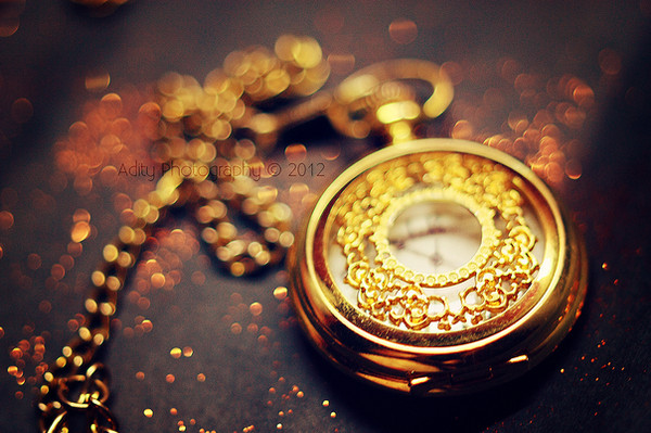

Published: 2011-03-14 11:14:35 +0000 UTC; Views: 14788; Favourites: 1402; Downloads: 0
Redirect to original
Description
© addy-ack
This image may not be used in anyway!
Related content


Comments: 44


Hi,
I like you photo very much. may I use one or some in my monthly published e-magazine.(www.avemeli.com) of course with your name under it.
thank you in advance
avemelidergi
👍: 0 ⏩: 0


your photos are fuckin beautiful! i love them, congrats!  (Smile)")
👍: 0 ⏩: 0

This is such a unique and interesting shot. I love the lighting and the composition.
👍: 0 ⏩: 0

Oooo. I love the way this feels - the depth of field is perfect, makes me want to reach out and touch it. Great colors, too. Well done!
👍: 0 ⏩: 0


I don't know why but in artwork, clocks and pocketwatches always seem to make things more intriguing and effective. Why is that?
👍: 0 ⏩: 0


I like how clear the clock is compared to the blurred background^^
👍: 0 ⏩: 0

How do you edit the background and blur certain parts? It blends in so well. *o*
👍: 0 ⏩: 0

I absolutley love your watch pictures, they are always so beautiful!
👍: 0 ⏩: 0


...wow I think I have the same exact watch 0_0;
Or at least something similar
👍: 0 ⏩: 0


Great shot! The angle of the photo is perfect, and the colors give it a warm feel.
Here's just a small critique: I might have prevented that reflection of the bottom half of the pocket-watch and focused a little more on the pocket-watch's numbers.
~Forbearnan
👍: 0 ⏩: 0


")


