HOME | DD
 admin-sever15 — Plasma
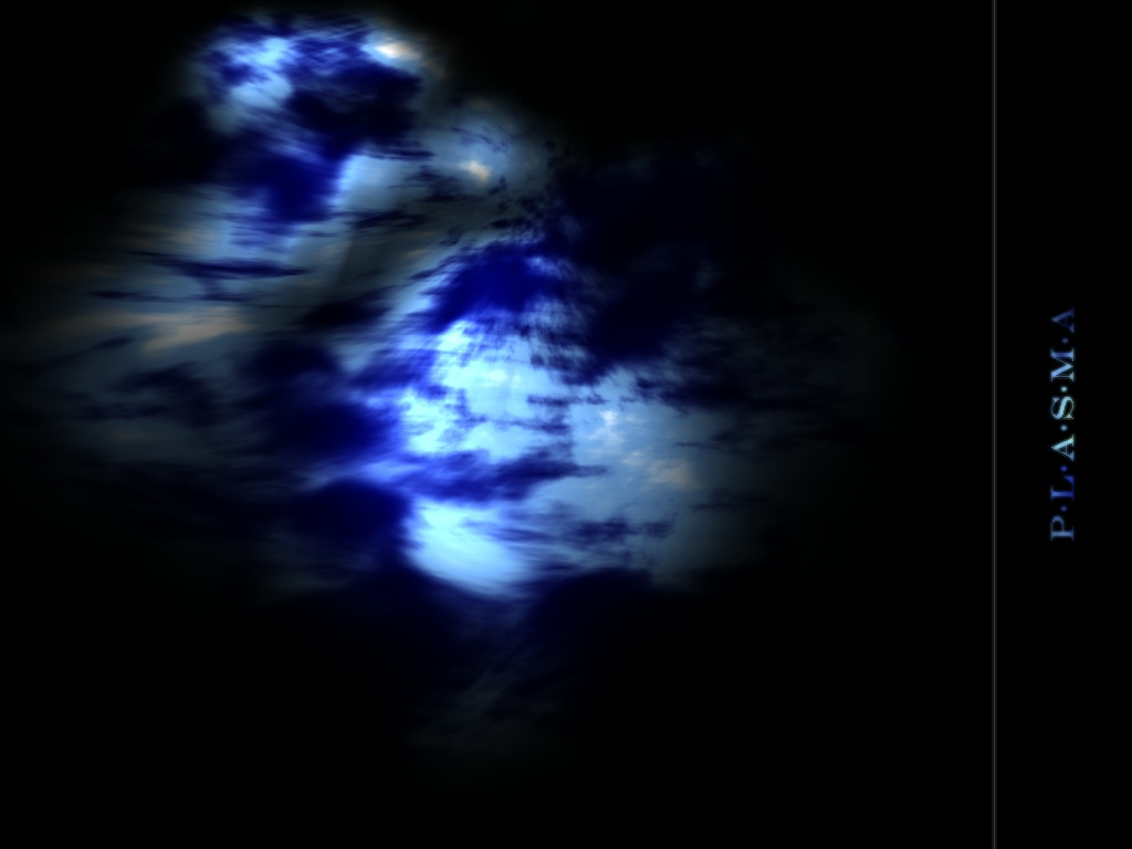
Published: 2002-07-21 06:24:48 +0000 UTC; Views: 446; Favourites: 0; Downloads: 49
Redirect to original
Description
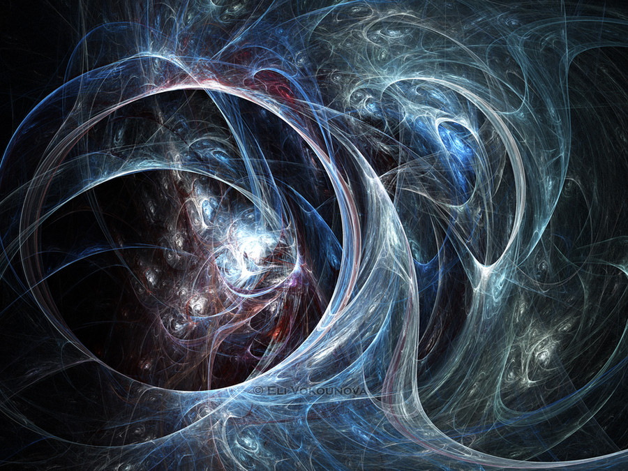
A rather lengthy produced picture.. made in bryce 3d.UPDATE
made the words less blurry
Related content


Comments: 7

Good choice of colors! I would have gone with yellow instede ot white, and a very dark navy insted of the black, But it's good all the same! I like the text on the side like that. I aslo like how the text isn't all one color. Good job!
👍: 0 ⏩: 0


trippy. a lot of negative space! I'm not a big black fan myself, but I still like it
the text is damn blurry! you obviously did it on purpose, but I think you might have overdone it [it's giving me a headache ]
nice render though.
👍: 0 ⏩: 0

Very cool use of Bryce! Interesting use of negative space.
👍: 0 ⏩: 0

Wow! I love that effect. It reminds me moonlight breaking through the clouds on a dark night. How'd you do that? Looks sort of like a Metaball, but I can't really make it out.
The text is a little bit too blurry for my tastes. But, it's still a great piece. I'm gonna pop this on my desktop and head for gallery. Very nice work!
👍: 0 ⏩: 0

That looks realy good apart from the fact that I think it needs more in the backround, to fill up the unused black, it looks kinda like a planet so maby you could ad stars or somthing. Just an Idea.
👍: 0 ⏩: 0

nice abstract work...don't usually this kinda thing come outa bryce...
👍: 0 ⏩: 0