HOME | DD
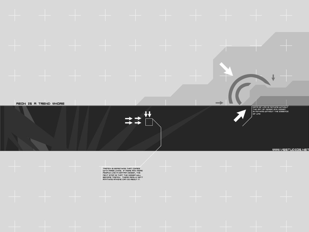
 aeon — Aeon is a trend whore
Published: 2001-11-07 19:41:41 +0000 UTC; Views: 1406; Favourites: 4; Downloads: 457
Redirect to original
Description
Well, I too am a trend whoreEDIT: I reuploaded it so now you can download the image, but I don't have the ZIP anymore
Related content


Comments: 10


/me thinks you need BIG white lettering i allways luve that trendy style and yea the txt need to be crisp
-----
dont think
👍: 0 ⏩: 0

Nice detailing, very nice. nothing wrong with trendy, it gets results. Solid wallpaper.
metadream.com - Sal Loria
deviantMAG.com - Senior Editor|Software Reviews
deviantART.com - Addict
CrazysunArt.narod.ru - Member
👍: 0 ⏩: 0

Needs some serious work, and change the text mode from 'crisp' to 'none', looks better that way.
///
xpedition
http://www.nitrocorp.org http://www.kwanstudios.com
👍: 0 ⏩: 0

well said mantik...
good job on the wp...
the text looks a little out of place though hehe
----
phuror
👍: 0 ⏩: 0

Just create.
.RA
h:tron http://www.hypertron.org
un:realism http://www.unrealism.net
i:industrial http://www.ingen.nu
[a:form]
👍: 0 ⏩: 0
"trend-whore"? It's only a trend in your eyes if you chose to recognize it as one. Many seem to love to call this form this, it's a shame, it's such a beautiful style.
.RA
h:tron http://www.hypertron.org
un:realism http://www.unrealism.net
i:industrial http://www.ingen.nu
[a:form]
👍: 0 ⏩: 0

very nice very trendy
..:: ART|hive http://jamesmusgrave.cjb.net ::.
👍: 0 ⏩: 0

i'm such a sucker for trend whore, it turns me on.
I like this piece alot ( stupid trend whore liking qualities i have ) i think that the strcxutre , trendy elements and use of space are very good. NOthing to be ashamed of.
Hypocrtically, i think you could do more with the white space, i sorta get bored after the trendy stuff
overall very good work!
👍: 0 ⏩: 0

hmm, this reminds me of something...
watcha been up to gabe?
: ::] regener8ed [:: :
if at first you dont succeed, skydiving may not be for you.
👍: 0 ⏩: 0