HOME | DD
 Aerozopher — MTG-Redesign: Phyrexian Hulk
Published: 2011-09-22 23:37:49 +0000 UTC; Views: 9204; Favourites: 109; Downloads: 0
Redirect to original
Description
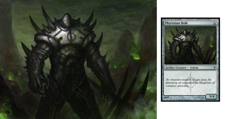
My second alteration for a Magic Card.This time I made a png which is showing the illustration and the card at the same time
")
He's pretty much looking like a golem of old mirrodin.. well..
This illustration is pretty rough actually, also the resolution is small..
--------------------------------------------------------------------------------
Konstantinos Poupakis / Stryke
 AERONYZE.COM [my hp]: [link]
  Like my Art on Facebook: [link]
Related content


Comments: 84

No one can really teach you, they only can help you teaching yourself.
Practice dude, do photo-studies of everything you'd like to paint
 (Smile)")
👍: 0 ⏩: 1

The brushes and the blendings the colors and the savings,
painting is a challenge, one that wears me down,
I seek guidance through the mist, to longer frown.
Stryke me with genius, artist of brilliance,
show me the way, ultimate illuminance.
FINE! I'll do as you say.
👍: 0 ⏩: 1
I'm very far from being a master, but I will work til I am one.
And I understand you, but.. you can do it.
👍: 0 ⏩: 0


May be you'll redesign Protean Hydra?))) [link]
Today's evening Inistrad will be released and all my 2010-set and zendicar and scars of mirrodin(not sure) cards will be off from standard(
👍: 0 ⏩: 1
you crazy? )))
hahahha, I just checked all cards of innistrad. Funny stuff going on.
👍: 0 ⏩: 1
Yup, i am
Hey, why not to?)
Innistrad will be my bane! As i'll lose main point of my deck, Kalastria Highborn. She's really expensive and rare.
And her main ability - when you sacrifice creature in any way - you get 2 life and deal 2 damage to opponent.
👍: 0 ⏩: 1
Nice ability! I like.
Because the original picture is already awesome and it's a fucking hydra with thousand heads hahahhaha )
Don't you have a better suggestion?
👍: 0 ⏩: 1
It's a predator! It can contain more gore! more epicness! MOAR! ")
Lol.
Well, then there are some epic, but old cards. Some of them have weird art. Like Dreadwing or Disfigure
Even Child of night i would have redrawn if i was able. But i am not
Btw, for me most interesting extensions (i mean cards illustrations) were 4th, 10th and zendicar. What are yours? :3
👍: 0 ⏩: 1
wait, you call Dreadwing and Disfigure old? (Disfigure is awesome btw)
I find them okay. Child of night is half abstract and classy, but you are right, she could be a bit more sexy and defined.
I have to admit, that I found gems in nearly every set yet. Of course sets like zendikar are more filled with (technical) awesomeness since they hire the best illustrators out there.
From the new sets shards of alara, scars of mirrodin and zendikar blew me most.
👍: 0 ⏩: 1
And what do you think about new phyrexia? They are great! I like artefact creatures paintings)
Dreadwing is really old, redesigned 2-3 times, it originally was from 6th edition. And it's useless i think.
My favourite card is kinda nothing special, it's giant growth of 6th edition, you can find it's image and other epic cards here [link]
👍: 0 ⏩: 1
I meant the whole new phyrexia, yeah. since I always loved phyrexians and found mirrodin awesome.
that picture with the mouse is your favorite?
👍: 0 ⏩: 1
yup, this one. I suppose you'll understand my opinion about it"ooh, precious shiny round eyes!" and colours, composition and also age of this card kinda drives me crazy
👍: 0 ⏩: 1

i prefer the older children's rhyme flavour text myself
👍: 0 ⏩: 1
👍: 0 ⏩: 1

Ah, i love the rhyme! i literally won't run any Hulk that doesn't have it. how did it go again... ?
"It doesn't think, it doesn't feel.
It doesn't laugh or cry.
All it does, from dusk 'till dawn,
Is make the soldiers die."
👍: 0 ⏩: 1

looking badass
i like the choice of scenery for him
 (Wink)")
👍: 0 ⏩: 1

Holy cow... this is awesomeness... no.. this is phyrexian awesomeness... also my favourite card of all phyrexians.. AWESOMEEEEE
👍: 0 ⏩: 1

Not bad at all!
Oddly, it rather reminds me of Thran Golem, which is appropriate in a twisted sort of way. It also has some similarities with the dreaded Blightsteel Colossus!!!
Although I must say that of all the artwork of the Hulk (official or fan-made), Matthew Wilson's original is still my favorite. Sure, the New Phyrexia artwork is good, but I miss the brown/warm tones of the older artwork. As for Brian Snoddy's version...
...well, I find it to a tad weak visually.
👍: 0 ⏩: 1
yeah, agree.
About the brown tones, one thing I miss is the feel of old artifact cards. Because of the brown card design, you know. They have this "relic" feel.
👍: 0 ⏩: 0


<= Prev |