HOME | DD
 ahmedzahran — Tiba website

Published: 2007-06-25 22:18:25 +0000 UTC; Views: 33700; Favourites: 241; Downloads: 1950
Redirect to original
Description
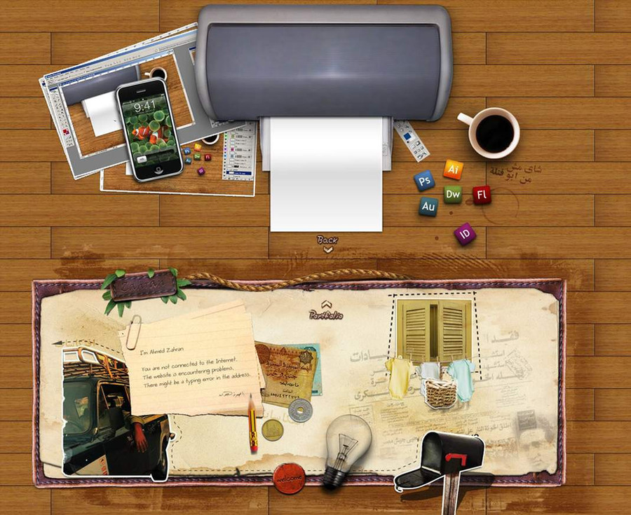
Design for Tiba company . it is an egyptian stock company for agriculture development.Related content


Comments: 110

really... i feel relax when i see this design ...
very nice ya zahran
👍: 0 ⏩: 1

thanks a lot yaser basha .. 
👍: 0 ⏩: 0


ya, I would make the navigation text a like and off white or something because right now its not that legible.
👍: 0 ⏩: 0


")
pixelbudah In reply to ??? [2007-07-07 08:59:09 +0000 UTC]
this lookg very nice I love hte colours and also the heilights you made, but the only thing I would change is the colour fo the menu text it's not too noticeable that's it KEEP UP THE GOOD WORK
👍: 0 ⏩: 1
thanx for the comment .. may i try to change the text color
👍: 0 ⏩: 1


Such an amazing idea that worked out brilliantly! Splash is amazing site looks great!!
keep it up!
👍: 0 ⏩: 1


looool .. 7elwa .. thanks aiman basha
👍: 0 ⏩: 1


Sweet work, love the 3D aspect of the page. How long did this take?


👍: 0 ⏩: 1
thanx for the comment .. it takes about 7 hours
👍: 0 ⏩: 0

 (Smile)")
👍: 0 ⏩: 0

Look awesome. The splash looks really nice, and the actual page looks awesome as well. Great work.
👍: 0 ⏩: 1


Great color palette and the layout is wonderful. I like the little tabbed buttons on the edges, they fit so well. I don't know whether the content boxes look like they are sunk into the green or embossed and sticking out, but I know it looks good.
And your splash IS to die for! Great work. 


👍: 0 ⏩: 1
thanx for your nice comment and support
👍: 0 ⏩: 0

i really love the splash, the main site looks good too but the splash is top notch
 (Wink)")
👍: 0 ⏩: 1
thanx man . i agree with u
👍: 0 ⏩: 0


welldone man, but i think there is a big green area on top, and u need 2 change the fonts, but welldone
👍: 0 ⏩: 1
thanx ya basha .. the top green area is an intro in the first page .. for the fonts . i think it is bad here .. but soon i will write the link of the website to see the fonts in actual size it will be better in html
👍: 0 ⏩: 1
i'm sure it will bw good, God with u
👍: 0 ⏩: 0
pixelzeesh [2007-06-26 07:05:50 +0000 UTC]
design and layout is nice but some of the bad points reflect designers skills...very well....like fonts
👍: 0 ⏩: 1
thanx for ur comment ..the fonts in actual size in html is better than this .
👍: 0 ⏩: 1


| Next =>