HOME | DD
 Akamai — Style
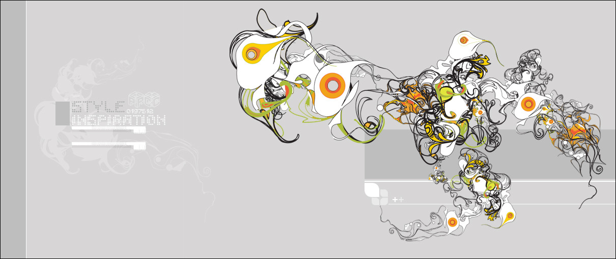
Published: 2005-09-01 23:46:18 +0000 UTC; Views: 6444; Favourites: 107; Downloads: 1532
Redirect to original
Description
EnjoyComments, Fav's, Watches. All greatly appreciated.
Thanks
Related content


Comments: 50


Hi ..
Nice graphics! Looks awsome ..
We're on the hunt for talented graphic artists and illustrators, who has interest in earning money on their graphics, by letting us sell these on our online portal.
We're developing an online webshop, selling state-of-the-art T-shirts with graphics specially made by such as you.
Should you be interested, then please have a closer look at [link] or email me at charlie@teebee.dk
I'll be looking forward from hearing from you and hope that you find our project interesting enough!
Take care
// Charlie Nielsen
👍: 0 ⏩: 0

like the ideas that flow within you -- an imagaination that really pushes the limits -- like the colours and different styles used -- later days
👍: 0 ⏩: 0


definately like nothing i've ever seen, I love the diversity along with the fact that all the little creature things have all the sambe basic characteristics, nice job
👍: 0 ⏩: 0


i can only say that your work is impresive !!! waooooooooooo !!! in my lenguage i say "estas cabrón vato"
👍: 0 ⏩: 0


FARESH
really nice and new. i like it alot.
👍: 0 ⏩: 0

fan-fucking-tastic. finally, some creativity. i could do without the icon next to the plus signs, though.
👍: 0 ⏩: 0

Nice pic there
Gr8 work!
__
See my gall pls and say somethin
")

👍: 0 ⏩: 0


That's .. fcukin' hot. :fav+: I'm gonna check out that rest of your gallery now.
👍: 0 ⏩: 0

this picture is amazing, your vector skills are great
👍: 0 ⏩: 0

great job man, really nice composition and subtle 2d- +fav
👍: 0 ⏩: 0

looks great bro .. but maybe the stroke should be more fine!
 (Smile)")
👍: 0 ⏩: 0

ooo, star likes, though im not exactly sure to explain how i like it or why. either way, gj
👍: 0 ⏩: 0

Here are the "Dot" fonts.
Atomic Clock radio
Alpine 7558M
Dotchaos
👍: 0 ⏩: 0

what is the name of font used for "Style inspiration" ?
👍: 0 ⏩: 0


Great style ,nice shapes and forms . Colors are good too .
👍: 0 ⏩: 0

gawddamn!
crop the text and put it on my wall please.
👍: 0 ⏩: 0


Its a really nicely composed piece, just some of the strokes seem too heavy
👍: 0 ⏩: 0


very interesting but kinda cool at the same time
👍: 0 ⏩: 0

Looks killer. Other than the typo, and sillouhette under it, everything else looks great to me. Good work.
👍: 0 ⏩: 0

WOW.
Hope you appreciate MY +fav. Because youre getting one.
👍: 0 ⏩: 0


one of your better pieces IMO,but you can add so much more and this be a real eye-popping piece.
👍: 0 ⏩: 0


the vector is AWESOME
but the typo is really boring.. i dont like it
")
👍: 0 ⏩: 0


Looks very nice, cool colours. But abit boring for me
👍: 0 ⏩: 0