HOME | DD
 alex4ever — 2 SHIZOID code red
Published: 2002-02-03 23:31:23 +0000 UTC; Views: 1784; Favourites: 9; Downloads: 234
Redirect to original
Description
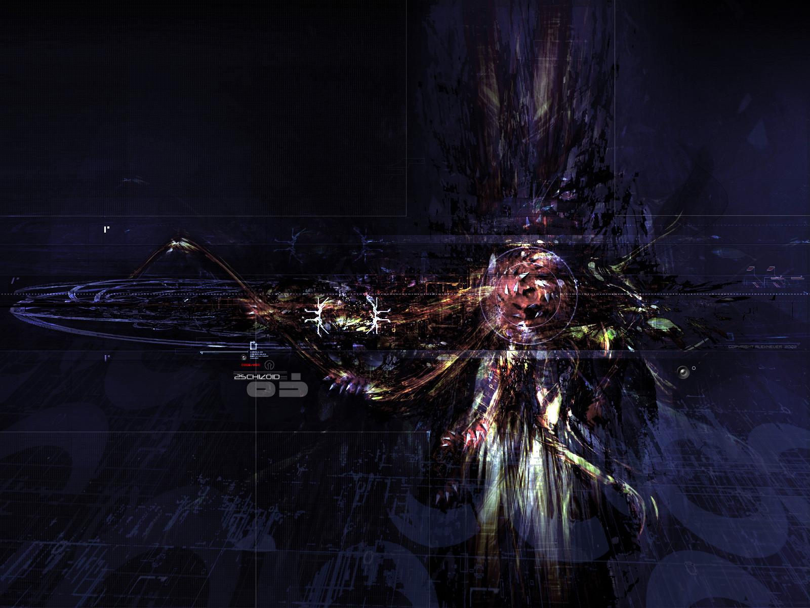
trying for a 'grungey/trendy' look for this one.Related content


Comments: 45

Definitely a bit ahead of your time on this one, too bad I missed it back then ")
👍: 0 ⏩: 0

well dude i love almost all of your wall papers even this differnt sytle but make them all this size your letting me down i almost cried becuse there so cool but i cant use any of them im on 1600x1200
👍: 0 ⏩: 0

yup you reached your goal.. this is trendy AND grungy.. nice work.
-----
BIN LADEN SUCKS [link]
👍: 0 ⏩: 0

Definitely a departure from your usual stuff ... i'm really digging the colours, but the technique really impresses me
👍: 0 ⏩: 0

mhhhhh i dont know what to say i was linked by someone to visit this this ... deviation
👍: 0 ⏩: 0

The colors kind of turn me off, but its still AMAZING.
-----
-amphex (Dan)
👍: 0 ⏩: 0


Hmm.... I think I've seen to many pictures of that kind. It's great, but I get somewhat bored. ....
:/
👍: 0 ⏩: 0

Neat stuff man, I'm enjoying it's darkness.
-----
-Smaken är som baken, den är delad-
👍: 0 ⏩: 0

Intresting. Could have been better followed through though.
-----
[.illist.org.____.Perfekt.k5.]
[.elle.iji.slave.___.elle@illist.org.]
👍: 0 ⏩: 0


*unf* *unf* *unf*
Althou i think theres a few to many colors.. but thts jsut me
+Sometimes Its Story Time+
👍: 0 ⏩: 0


Great new styles you are trying, I like them.
Infamous
Shadowness.Staff
:: http://www.shadowness.com ::
👍: 0 ⏩: 0

pure own, totally.
---------------------------
Muzzy.
👍: 0 ⏩: 0

wicked cool ....i love the colors mate .... really nice to see trying some new cool ideas
-olo-
WARNING: do not click here --> http://www.computerologist.org
👍: 0 ⏩: 0

Nice... You did a great job on this. It certainly is a cool twist from your usual style.
👍: 0 ⏩: 0

wooooooooah ...
u really did manage to give it a grungy-trendy look ..
impressive work alex ..
love it
👍: 0 ⏩: 0

Strange.. or is the word im looking for sweet? .. heheh .. THis is good!!
Sorry.. i still havent figured out how to comment in a more constructive way!! :/
[Who am I to comment you]
http://aerosole.plastiqueweb.com/
👍: 0 ⏩: 0


Incredble work here
i been staring and staring
Excellent
Visit https://radio9x.deviantart.com/gallery
👍: 0 ⏩: 0


Whoa, crazy detail, amazing work.
How do you do it?
¤-[Kwan Studios Finland]- http://www.kwanstudios.com
👍: 0 ⏩: 0

WOW!... and outch! cause this is so good it almost hurts! it changed alot since i've seen it last. i adore that color change... now it's blue everywhere!
you've really pulled this style combinaton amazingly... in fact this is the only real grungy/trendy mix i've seen around that actualy works! it's like a "filthy dirty 3D"
and 2d? well, you've made your point: you definitely like those arrows huh?
2d is great as always!
(wow! look, not even one bad thing to say! something may be wrong with me... )
°°°Two people are needed to make a good piece of art: the artist and someone else to hit him on the head with a hammer when the piece is finished.°°°
👍: 0 ⏩: 0


Looking sweet alex. Just the color variation that kida distracted me a bit.
👍: 0 ⏩: 0

Wow. Different and cool.
Avalon Sector v5:: http://www.avalonsector.com/ Finally here!!!
👍: 0 ⏩: 0

Very nice work. It's reall something different then most of the stuff you see on here. I really like the grungy textures and the 2d elements really add a nice touch. Good work.
:: exy BrazenSix(Mathias) :: http://www.dfektion.org ::
:: The snowman outside my igloo tells me to burn things ::
👍: 0 ⏩: 0

looking good alex totaly different then normal what you make it in
👍: 0 ⏩: 0

It's very dark and I like it. The colors have a cool grungey effect. The text just looks awesome too.
https://dreamz13.deviantart.com
👍: 0 ⏩: 0

damn cool alex.. and the color choice is nice as well. keep it up
formally known as n0zix
dfektion: http://www.dfektion.org : inject a dose
twisted_drain: http://www.twisteddrain.com : fountain of decay
👍: 0 ⏩: 0

i love the very dark and grungey look..great 2d and use of colors..is there even any 3d in there? the background seems to hide a bti which is really neat and everything oddly blends so well and it looks great and definently original..excellent work
+dfektion
👍: 0 ⏩: 0

wow, great work with the colour and complex composition.
It looks awesome, but just so you know I used save for web in PS and got this to 358kb and it looks almost identical to your version. You would REALLY need to be looking hard to see the difference in quality.
Great work.
_________________
see me in a polar bear suit ?
http://www.sphosting.com/orangegfx/polar bear/pics.html
👍: 0 ⏩: 0

wow thats totally mad! Great work there Alex!
Simon
http://www.roadkillart.com
👍: 0 ⏩: 0

I was expecting something red
lol, but I like it, it's a little risky for grunge (in my eyes) but due to the fact that I love grunge, it suits me just fine.
__
http://femstyle.net/saige
👍: 0 ⏩: 0

Forgot to vote
+++++++++++++++++++++++
// profanity.dk www.profanity.dk
// Kwan Studios Denmark www.kwanstudios.com
👍: 0 ⏩: 0

very nice alex, did a great job combinding them, I love the colors
_________________________________
For every apprentice there is a master
Adopt a Deviant https://forum.deviantart.com/150391
-------------------------------------
!
-
👍: 0 ⏩: 0
Very nice piece - I really like the mix of styles.
Good work on the colors ... very interesting, but doesn't fit together so well (imho).
Very nice piece tho - hope to see more from you in the future.
+++++++++++++++++++++++
// profanity.dk www.profanity.dk
// Kwan Studios Denmark www.kwanstudios.com
👍: 0 ⏩: 0

very cool. You did what you set out to grunge/trend, very nice
-wseid
-ponder the panoramic https://wseid.deviantart.com
👍: 0 ⏩: 0

omg that's incredible!! i lub it =]
://cha.os
://perceiving.is.believing
👍: 0 ⏩: 0
