HOME | DD
 AlloyMorph — Hyper-Stylised Sapling Shield

Published: 2013-06-14 14:51:22 +0000 UTC; Views: 371; Favourites: 1; Downloads: 0
Redirect to original
Description
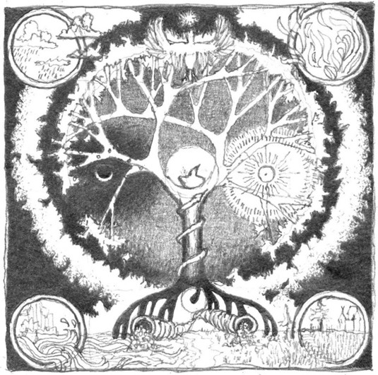
Time taken: 3 and a half hours. Possibly more seeing as I didn't finish it in one sitting.Backstory: So on Wednesday Martyn Littlewood uploaded the Season 2 debut episode of Kingdom of the Saplings; one of my favorite Minecraft LPs since I got the game myself. I'd had a Business Studies A-level re-sit earlier that afternoon, so when I got home I wanted nothing to do with words, writing or analytic techniques and just sat down to watch the contents of my YouTube subscription box without a care in the world.
Nothing unusual happened, until Martyn made a casual request for some new fan-art to mark the beginning of the series. I half-expected that; fan-art features were a recurring part of the previous KotS. What I didn't expect was for me to reflexively grab a pencil and start sketching on the nearest blank sheet I could find in response. You might think I'm being extremely over-dramatic, but I've heard multiple accounts of how when ideas come to people, the latter becomes possessed by the former. That's what this felt like-I didn't think, I just drew. And I was shocked by the result because I've never been able to consciously do anything freehand on this sort of scale or detail. I guess I found "the zone". Or maybe using the left side of my brain so much for the last several hours stimulated my right hemisphere into overdrive. Either/or.
Looking at it now I can see a couple of different influences, besides the Sapling symbol that is Martyn's signature. The wings partially resemble the Hylian glyph from The Legend of Zelda; even the star at the top makes a mark similar to the Tri-Force. I guess the main reason for them being there was to fill the empty space that opened up between the lower tree canopy and the horizon in the background. Not sure about how the individual feathers look; being that pointy would suggest that they were either dripping wet or honed to a razor.
I thought of leaving the Sapling logo at the base of the tree roots as a simple line to keep it clear, but that didn't seem to fit with the rest of the aesthetic. So the next day when I had finished everything else I asked myself: What other symbols spiral around and look generally BA? First answer: Zerg. Though putting xenomorphs into this picture was out of the question, I still mimicked the spines you'd expect to find on a Hydralisk to add some more depth to the swirl. Even if said spines ended up looking less "sharp" and more "mint-flavored".
I don't think I have anything else to say on this particular piece. Though I guess this is my first upload, so I should say something ceremonious. But I didn't bring a speech or anything...
Ah well. Enjoy it if you found your way here. Until next time.