HOME | DD
 Allpha — Freedom
by-nc
Allpha — Freedom
by-nc

Published: 2007-06-04 13:40:15 +0000 UTC; Views: 932; Favourites: 9; Downloads: 102
Redirect to original
Description
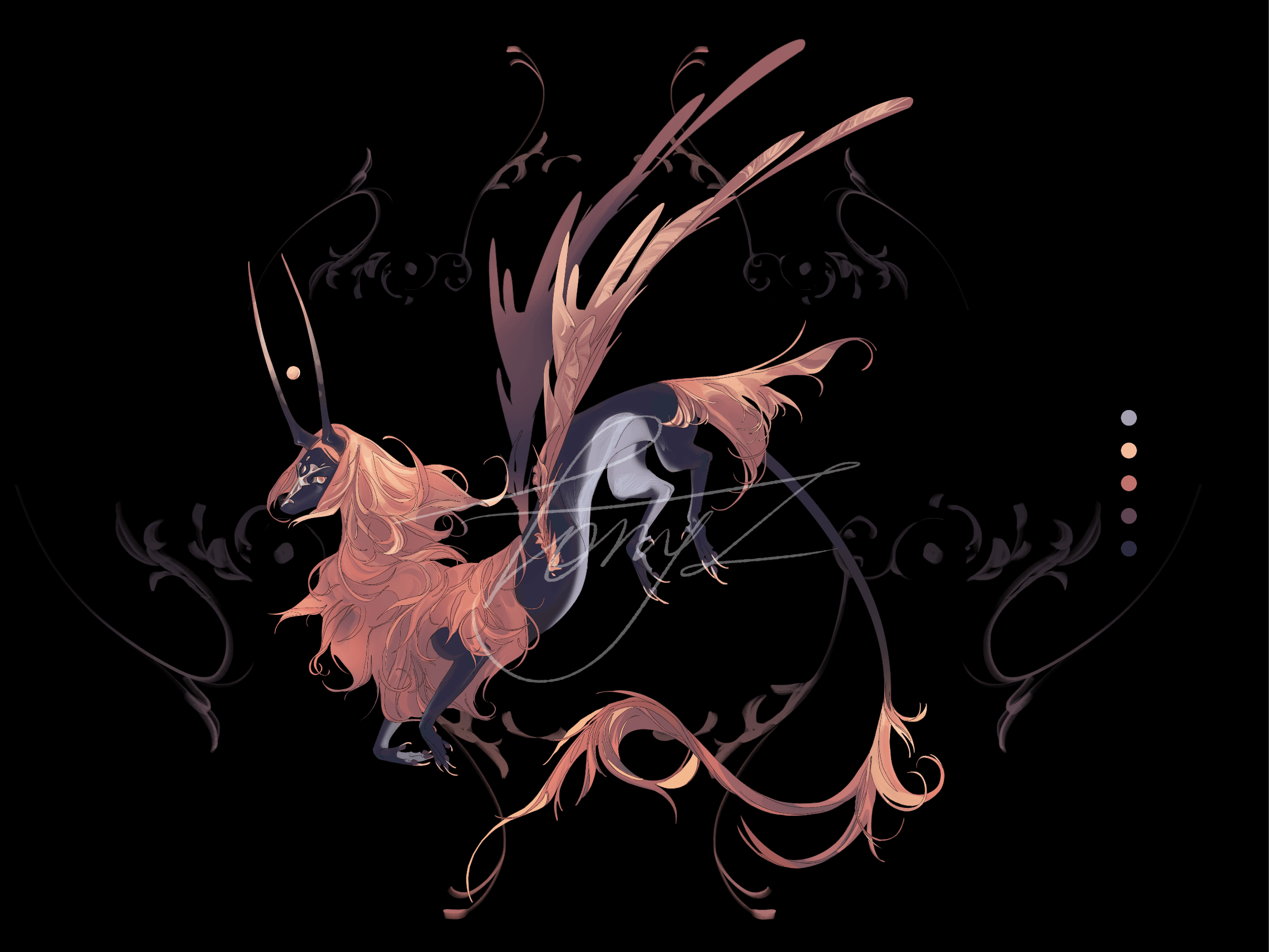
Made this in about 30 minutes, took me quite some time to get the brush that i wanted, but it turned out nicely.Please comment and add to favorites!
")
Related content


Comments: 2

Yeah...Don't like all of the silhouettes dancing around.
The red you used for the spade looks off. Everything else is a vibrant color and it just looks dull. It makes me think of yogurt, even though yogurt isn't ever really a dull-red color. I hope you understand what I'm trying to say?
I don't like the "Freedom" either but I'm not sure if it's because of the font or because of the effects that you used. The stroke (I assume that's a stroke?) looks grainy.
Part of the problem I have with the text is that it's in all caps. Olde English fonts usually don't look very good in all caps.
Also: The outline on the Spade, I'd make it solid instead of semitransparent.
And the little spot of white from the fist, on the left side of the Spade, I would get rid of.
Otherwise, it's looking good. I'd be curious to see how it looked without all of the white stuff but I kind of like it all.
👍: 0 ⏩: 0

looks nice even if i'd prefer a version without the reddom spade and the guys dancing around
👍: 0 ⏩: 0