HOME | DD
 alothnal — phantom limb
by-nc-nd
alothnal — phantom limb
by-nc-nd
Published: 2007-01-15 08:09:03 +0000 UTC; Views: 953; Favourites: 56; Downloads: 0
Redirect to original
Description
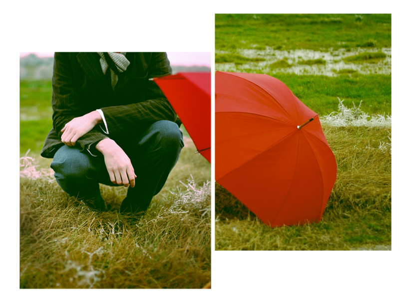
i dont know, but the umbrella on the right is a little lighter/less saturated than the left, but on aperture and photoshop it looks like the same shade. hm, it all really depends on how it prints i guess.another from the same shoot.
title from the shins, again,
 (Smile)")
time for sleep.
Related content


Comments: 7


Dig. This is sweet. Great composition, and great title.
👍: 0 ⏩: 0

These work beautifully together.
Lovely photos and a great concept.
👍: 0 ⏩: 0

I think it's more the color and saturation. The right side has a tad more orange.
Anyway, I really like the cropping/framing here. The colors are right on too. Nice work.
👍: 0 ⏩: 0


it really is a great idea.. I just must go out and buy myself a red umbrella now.. you simply are genius!
👍: 0 ⏩: 0

")