HOME | DD
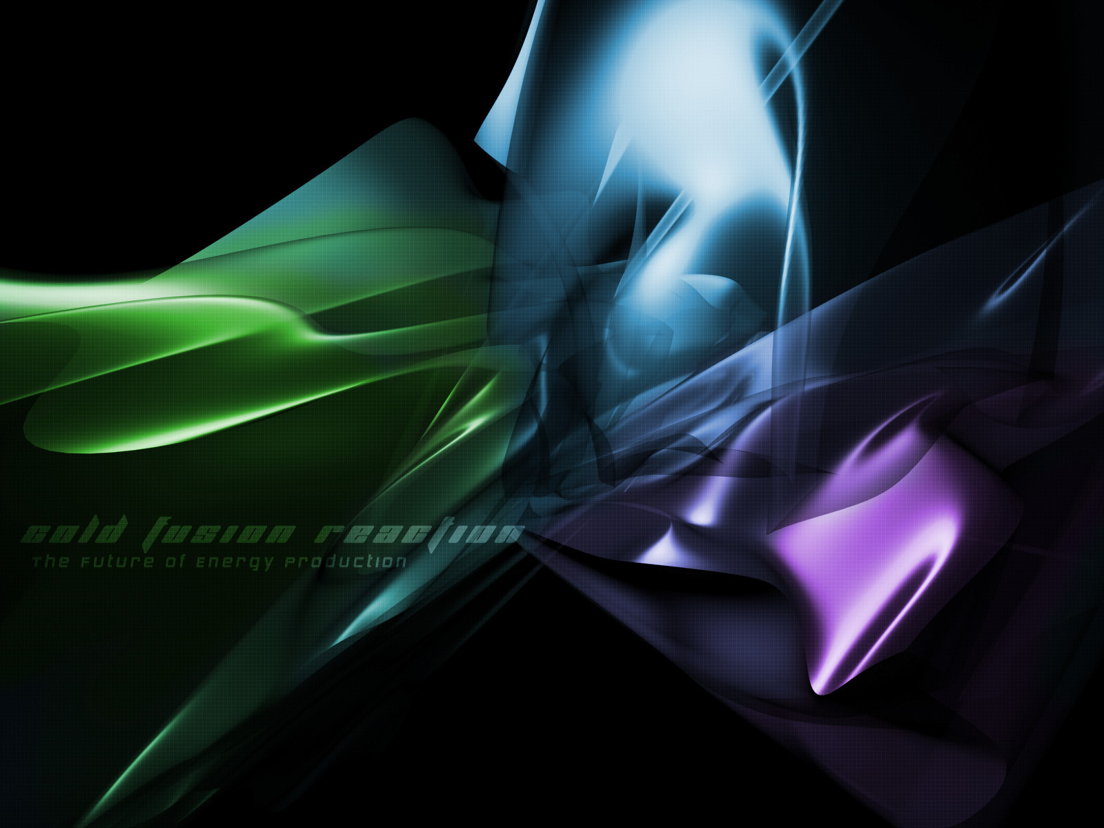
 alptraum — Cold Fusion Reaction v1
Published: 2002-02-27 02:44:55 +0000 UTC; Views: 2338; Favourites: 17; Downloads: 244
Redirect to original
Description
,cold.fusion.reaction v.1_,colorful.flowing.clean_
,a.must.have_
++enjoy++
,please note, it is v.1, so any comments can help on a v.2. thank you_
Related content


Comments: 31


Beautiful...
Warm and cold... with a hint of organic tech. Nice.
👍: 0 ⏩: 0


great work once again! i agree with the others: simply love the colors!
eagerly waits for v.2!
👍: 0 ⏩: 0

wow..... i like this one ... great color ..... very nice style.... great transparent effect... keep you the good work
-----
-klex
👍: 0 ⏩: 0

Interesting, the colours go really well together. Although I agree on making the text stand out more. Nevertheless great job
-----
hey kids rock on
👍: 0 ⏩: 0

This is really nice work...but I agree with wulfhound...tell us something more about how this pic was built....
-----
Nope
👍: 0 ⏩: 0

i really think this is a great one...i love the colors....one thing you might want to look at if and when you decide to try things with it..is to erase the grid on the part of the objects that become more evident..in the places that don't look transparent....i'm not sure howit would look..but it might be cool i think this is great tho as is
-----
-olo-
WARNING: do not click here --> http://www.computerologist.org
👍: 0 ⏩: 0

I like all the bright colors and shapes, but the grid just doesn't seem to belong with the rest of it. All in all, a very nice piece. Can't wait to see version two!
Raeder
👍: 0 ⏩: 0

All in all a very good job.
I think the only thing to adjust are the edges of the renderings. They are too sharp. Sm00th them.
Favorite !
👍: 0 ⏩: 0

make it more clean and give it a new style of design that design is dieing out the more and more people use it..fix the text too make it stand out a bit more ..good work though
-----
Wo0T!
👍: 0 ⏩: 0

oooooo now this is nice.
awesome colours, great layout.
very cool.
i think the grid looks great.
i dont think it needs a v2
great as it is =c)
👍: 0 ⏩: 0


wow this is great ... so smooth !!!
very clean picture ... colors ok , contrast ok ...
a ncie wallpaper !!!
-----
check out my stuff
comments are welcome
👍: 0 ⏩: 0

Stunning colored piece i should say. Its very well idealized in this matter. Its always good to see a perfectly harmonious color choice. Good work.
👍: 0 ⏩: 0

yeah baby this is so smoooooooth and the colors dont clash. wow good job i hope you finish this soon
-----
FLUX 2
http://flux.usednukes.com
nakatira sa
http://serp.port5.com
👍: 0 ⏩: 0

so sick!!! gotta learn 3d sm man, hehe.... good work good wok
-----
: :::www. .net::: : www.subroot.net
👍: 0 ⏩: 0

amazing. i love the colors and the smoothness. great work.
👍: 0 ⏩: 0

I Like it. The metallic colors and the overall smoothness of it is great. It's a pleasure to look at.
👍: 0 ⏩: 0

Very cool. The colors flow together very nicely. I must confess a prejudice about writing on wallpapers. There have been several that I have seen that are fantastic.....but writing on the graphic then detracts from the statement made so eloquently by the artwork itself. unless the writing itself is the artwork. There is a mood to the work you have done. The grid over the artwork is great. The regularity of the grid is broken completely by the freeform constuct. I think a note to accompany the work is great, but the work itself, in my humble opinion; stands very well by itself. Very well indeed. Bravo.
It would be really great if contributors would, along with comments about the motivation for their work; include a line or two about the software and any "moves" used to make the graphics. We could all learn a lot that way.
👍: 0 ⏩: 0

hmmmm I like it how it is. I love the uncluttered look of it. The colors rock and great job on the effects !
👍: 0 ⏩: 0

Excellent colors and forms. They all are very soft and pleasing to the eyes. A killer desktop, IMO.
Very nice work.
/me goes through your gallery
-----
[ all realism without imagination is mere reductionism ]
[ s . 2 . r ]
👍: 0 ⏩: 0

wow great colours and render
beatyful
-----
smoking
👍: 0 ⏩: 0

you have a lot of good things working here... the colors are great, the 3d stuff is superb, the typography fits well and there's plenty of room for icons. The only downside I see is the grid seems a bit forced. It covers -everything-, which is a bit too much, in my opinion
-----
-mage
👍: 0 ⏩: 0

yeah, tdawg has a good idea there, and maybe you could make the objects a little more transparent in the render, that way, the shapes look a little more flowing and tansluscent but otherwise yeah, great render you've got there
keep up the awesome work
-----
👍: 0 ⏩: 0

love the colors, the movement and the grid, all very cool
-----
-- We all live in a yellow submarine --
👍: 0 ⏩: 0

very bright colors... i love the movement...i think maybe some more angle shapes would add some nice depth
-----
::the new state of design::
are you ready? https://tdawg.deviantart.com
👍: 0 ⏩: 0

Like jade said the colors truely rock, very nice job on this!
-----
++// Gfx from the best to the rest //++
++// Do me a favor, comment on some of my latest art https://mrjezus.deviantart.com //++
👍: 0 ⏩: 0

Like the colors. Nice one.
-----
The way to love is to realize that it may be lost. -- Gilbert K. Chesterton
👍: 0 ⏩: 0

Awesome abstract render, and the grid is cool.
-----
-amphex (Dan)
👍: 0 ⏩: 0

kcik ass shit man
-----
-------------------------------------
up..
👍: 0 ⏩: 0