HOME | DD
 alvinlee — BIRDIE - Chillin' Part Two
Published: 2008-07-13 16:48:44 +0000 UTC; Views: 60878; Favourites: 1246; Downloads: 0
Redirect to original
Description
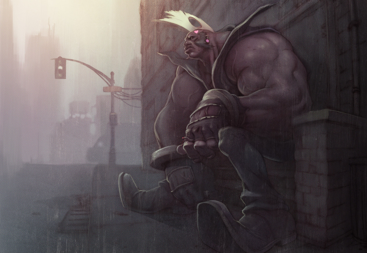
Here's a sample of that same Birdie image except with a completely different direction in terms of colors by doe [link] , It's so dramatically different and cool i thought you all would enjoy seeing this!Which one is better, it's all down to personal preference, but this one is definitely moodier.
Related content


Comments: 84


 (Smile)")


Ramil Sunga and you....perfect combination bro!.....Excellent Done!!
👍: 0 ⏩: 0

dunno which i like better myself, but moodier is definitely a great description for it.
👍: 0 ⏩: 0

I have no preference on which is better! each is completely soulful in its own right, and equally as stunning! I love how this one has a smoky/angsty feel to it, you're right it is more 'moody'. In all, a gorgeous piece of artwork yet again. ^^
👍: 0 ⏩: 0


Nice colors...really like the tone set in this one with the colors...the 1st one was nice as well but, this one is much better in my opinion
 (Wink)")
👍: 0 ⏩: 0

dude! its ramil sunga....that guy is badass....remember seeing his 3d work from a previous year in college, it was sick
👍: 0 ⏩: 1

YEAH! It's Ramil alright and i agree, the guy IS badass! He's such an inspiration to my work and he constantly pushes me to become a better artist. It's like he's my artistic soulmate!
👍: 0 ⏩: 0


all i know is this kinda takes away ur awesome lines... i can't even tell u drew it!
👍: 0 ⏩: 0


Heyyy! I like this one better ")
👍: 0 ⏩: 0


for me this is a better version though it doesn't make the other one anything less than worthy..i both faved them actually....
👍: 0 ⏩: 0

wow the colors perfectly fit with the mood of the piece, sweet work!
👍: 0 ⏩: 0

This one is great as well, but if i had to chose i would have to go with the first one. It showcases your linework more clearly while still conveying a cool unique color style!
👍: 0 ⏩: 0

It's hard to say. THis one is defiantly moodier, but the first was more unique. Those blurry buildings in the background look FREEEGIN SWEEEEET!
I can't choose.
👍: 0 ⏩: 0

This is bad ass man. Really cool. Love the additions you made.
👍: 0 ⏩: 0


wikid! its like colored in traditional way! really cool mate
👍: 0 ⏩: 0


That one is stunning in a James Jean way. I loved the previous, but this is all kinds of awesome. :]
👍: 0 ⏩: 1
I thought so too, we both admire James Jean's style very much and i think it shows in this piece. Doe is awesome!
👍: 0 ⏩: 1
Who honestly doesn't admire James Jean's work haha The man is inspiration x 1000, both in art and work ethic.
I hope to see more collabs from yourself and this Doe person, because I am loving this.
Who is Doe by the way? I went to the site but there was an unfortunate lack of info.
👍: 0 ⏩: 0
NuclearConvoy [2008-07-13 17:17:13 +0000 UTC]
I like this one better, but for no reason I can qualify in critical terms.
👍: 0 ⏩: 0


that colouring is amazing. And the texture on the picture makes it looks cooler somehow
👍: 0 ⏩: 0

<= Prev |