HOME | DD
 Andasolo — Qooga Gaming - Sold

Published: 2011-09-18 19:59:40 +0000 UTC; Views: 61747; Favourites: 468; Downloads: 1344
Redirect to original
Description
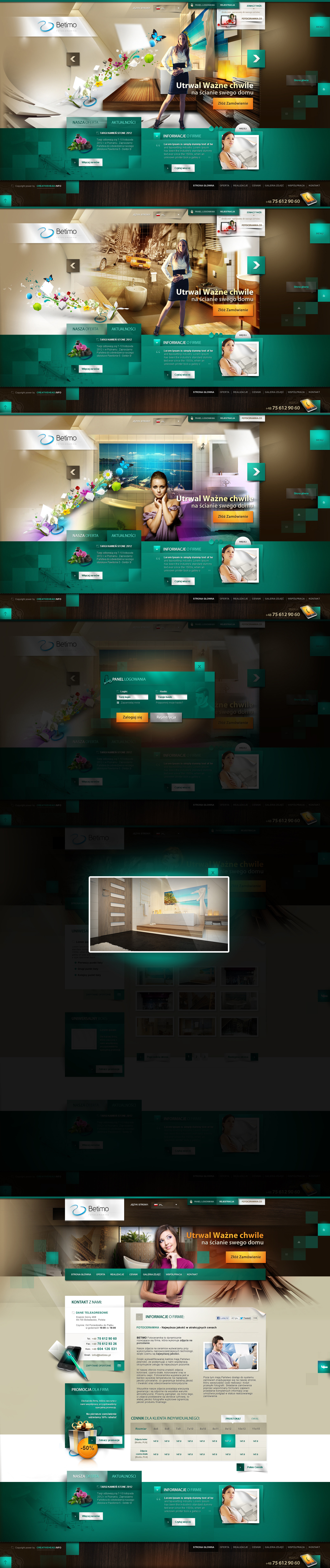
Qooga Gaming - 18.09.2011Template Status: Sold
Follow me on
 facebook Twitter
Related content


Comments: 150


hab gerade mit na neuen Internetseite angefangen und habe schon kb mehr!
Einfach absolut geil, das Wasser hast du selber gemacht? o,O
FAV!!
👍: 0 ⏩: 1

Blödsinn ")
👍: 0 ⏩: 0


Great work, perfect colors, only background on end of layout could be better, there is too much of those renders, but i love it, whatever!
👍: 0 ⏩: 1

I don't like that background, but design is pretty normal!
👍: 0 ⏩: 1

omg, one of the best for sure... !!!!!!
most loved is the background.. how did u do this water and the fire... omg
A M A Z I N G...
👍: 0 ⏩: 1
Implemented some stocks  (Wink)")
👍: 0 ⏩: 0

hammer design...allerdings stört mich nur eine kleinigkeit
und zwar das teil da links neben ergebnistabelle diese tech dingens da im backround (hoffe du weisst was ich meine (Smile)")
konzept..aber sonst hammer teil
👍: 0 ⏩: 1
Was genau meintest du? Danke dir
👍: 0 ⏩: 1
meine diese tech dingens links in höhe von neuigkeiten übersicht wo auch Qooga in rot steht
das find ich passt nicht rein
👍: 0 ⏩: 0


Wenn du jetzt noch mit 960grid arbeitest biste perfekt
👍: 0 ⏩: 0

Du haust ja schöne neue Designs raus, nice nice, gefällt mir. Ein wenig zu viel "Bonbon" vlt aber trotzdem ganz schön schön :3
👍: 0 ⏩: 1
Danke, ja definitiv Geschmackssache
👍: 0 ⏩: 0

Looks great! Very very nice. Much respect. hehe
👍: 0 ⏩: 1


")

Mach den ganzen Wasserquatsch raus, den Header etwas schmaler und die Fonts auf Webformat dann is es Weltklasse!
👍: 0 ⏩: 1
Das Wasser werd ich wohl erstmal drinbehalten, das sorgt für Kontraste die beabsichtigt sind. Was genau meinste mit Fonts im Webformat? Sind doch nur Blindtexte. Danke soweit!
👍: 0 ⏩: 1
Ok das mit dem Wasser ist natürlich dir überlassen. Mit den Fonts im Content find ich es immer anschaulicher wenn sie rüberkommen wie nach dem Code. Also unscharf und eine Webkompatible Font. Dann kann man sich das ganze besser vorstellen. Hier auf deviantART ist das natürlich relativ da hast du recht
👍: 0 ⏩: 0


You come from Planet Mars.
This is amazing.
👍: 0 ⏩: 1
Haha so i'm a extraterrestrial?
👍: 0 ⏩: 1
| Next =>