HOME | DD
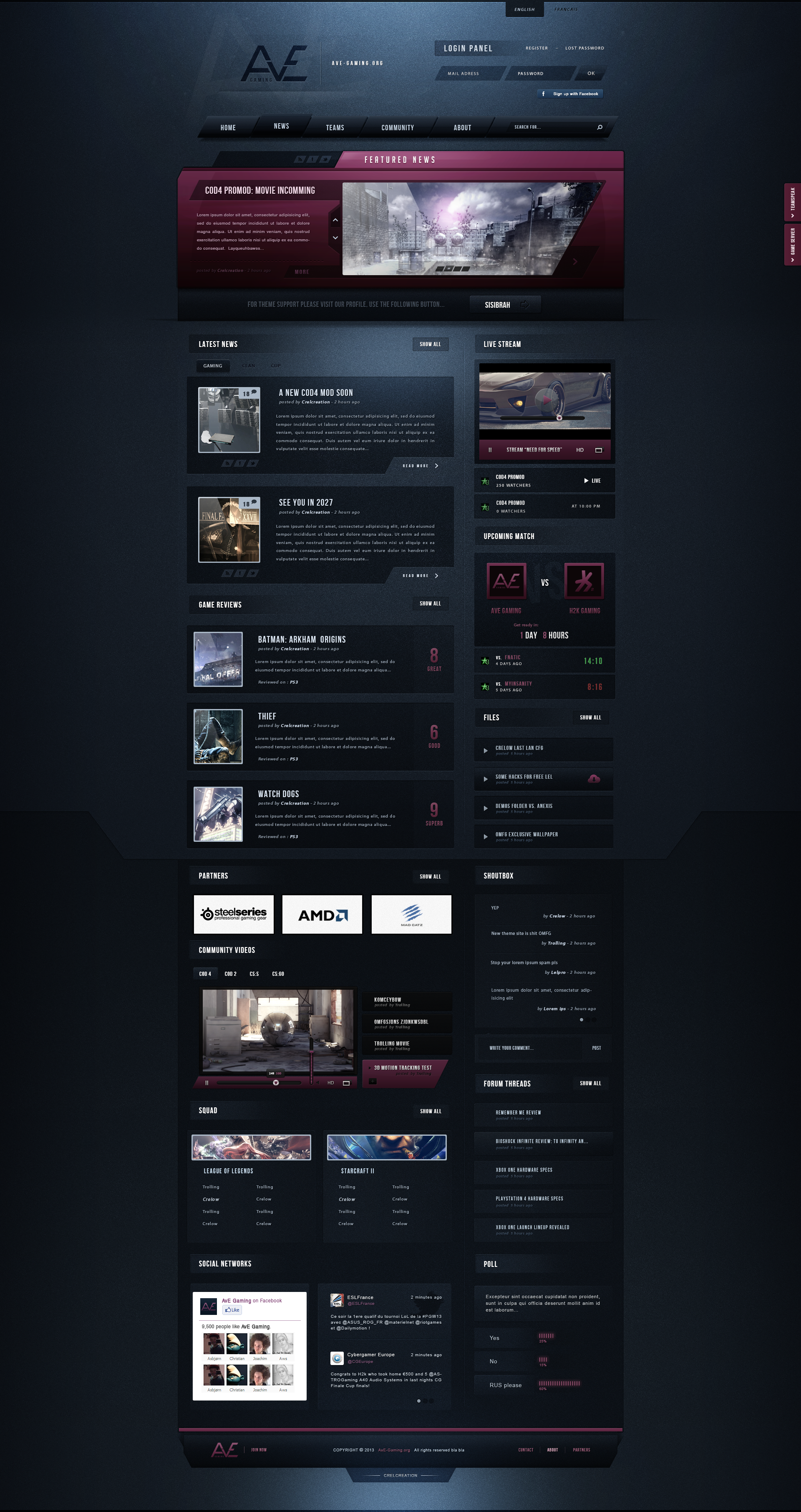
 Andasolo — SEYKO Gaming - Sold

Published: 2011-02-19 15:34:10 +0000 UTC; Views: 83773; Favourites: 748; Downloads: 2047
Redirect to original
Description
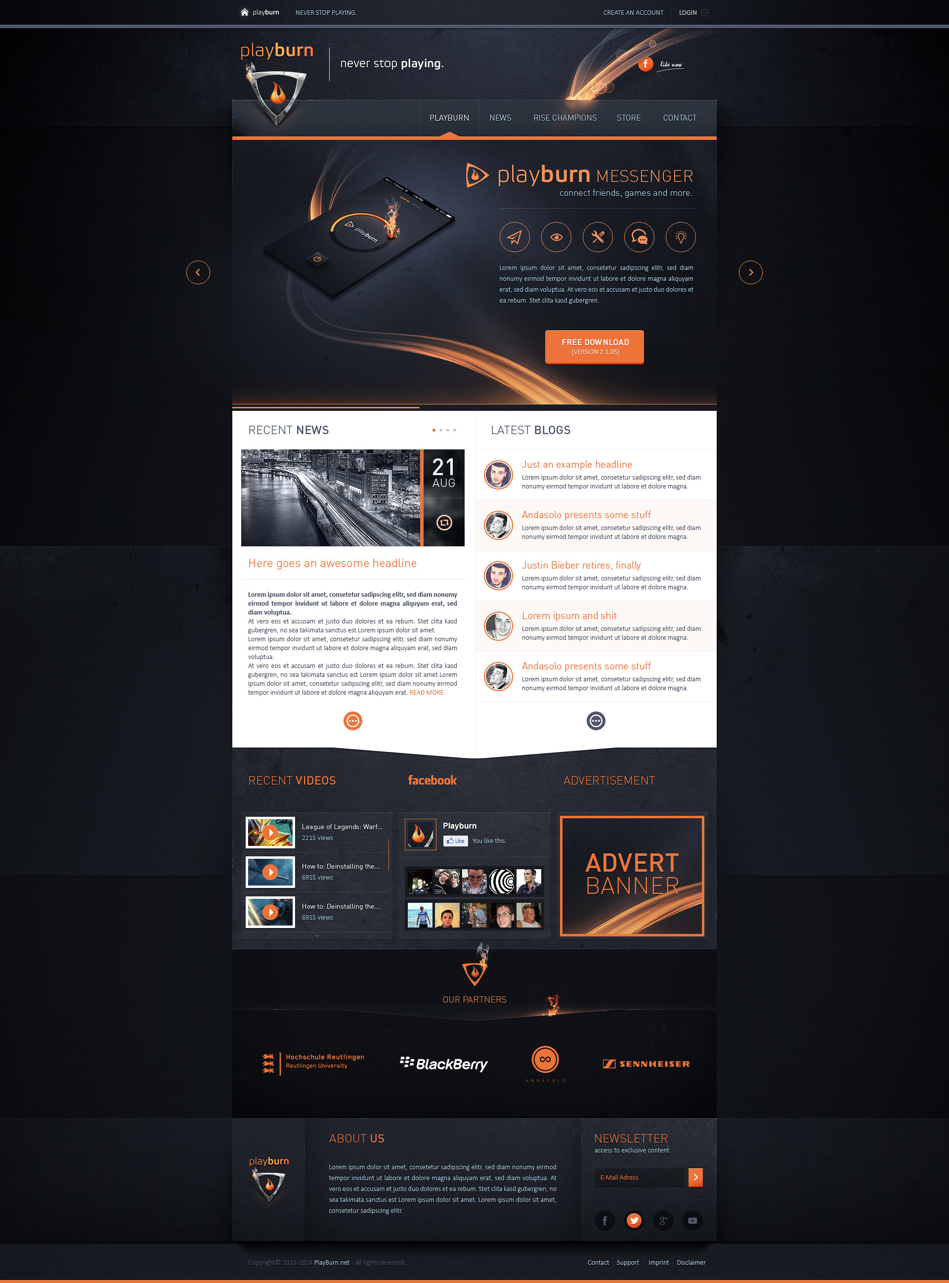
SEYKO Gaming - 19.02.2010Template Status: Sold
Follow me on
 facebook Twitter
Related content


Comments: 280

Navi wurde öfters bemängelt, aber was genau meinst du mit den Stellen überm Content?
👍: 0 ⏩: 1

Der Login stört mich ein wenig. Ist so eckig im Gegensatz zu den runden Elementen.
- meld dich mal per icq oder fb bei mir bitte
👍: 0 ⏩: 0

You'll never cease to amaze me, great work again... ^^
👍: 0 ⏩: 1

Incredable, The site really speaks for itself. Very high tech looking. I have to be honest here, you're a huge inspiration for me and make some of the best web site templates I've ever seen!
👍: 0 ⏩: 1
Thanks Dee, that's a real compliment and I'm glad u like my work
👍: 0 ⏩: 1

nice  (Smile)")
")
👍: 0 ⏩: 1

Das ist gut! Vielleicht irritiert die Textur bei manchem Inhalt ( Board activities z.B.), aber alles in allem ein verdammt gut verarbeitetes Design. Glück dem Clan der das kauft
Stammt das Logo von dir?
👍: 0 ⏩: 1
Danke vielmals, das mit der Textur stimmt wohl :/ Das logo stammt von mir
👍: 0 ⏩: 1
Also kritisch ist das nicht, es liegt nur daran, dass die Textur des Hintergrunds nahtlos in den Vordergrund läuft, direkt unter den Text. Vielleicht hilft es einfach, die entsprechenden Bereiche minimal (10-20 % Deckkraft ) abzudunkeln um den Unterschied zwischen Hinter und Vordergrund zu markern.
Das Logo passt gut (Header und Footer), umso mehr Achtung für die Arbeit, die hat sich sicher gelohnt
👍: 0 ⏩: 0

Du bist KRANK !!!!
Hör bitte auf zu designen ich weine gerade vor Neid
👍: 0 ⏩: 1
Ich werds versuchen danke
👍: 0 ⏩: 0

Love the header, and I also really like what you did with the textures mate
... just think the navigation is very boring by comparison to the layout
")
👍: 0 ⏩: 1
Thanks mate, yeah the navigation earns a lot of criticism haha
👍: 0 ⏩: 1
if one bit goes detail all should  (Wink)")
👍: 0 ⏩: 0

Find ich sehr nett aber für mich zu dunkel aber das ist ja Geschmacksache. Der Mouseover bei der Navi mag mir irgendwie nicht gefallen
Keep it up
👍: 0 ⏩: 1
Gut Diese Hell-Dunkel Geschichte ist sehr Geschmacksabhängig, klar. Der Mouseover kam leide röfters nich so gut an. PS brauch dich mal nacher fürn evtl. coding auftrag und preise
👍: 0 ⏩: 1
Jo meld dich einfach via Facebook oder ICQ
👍: 0 ⏩: 0


Sensationell,wo nimmst Du nur die Ideen her
Habs gleichmal bei uns eingeschickt ne

👍: 0 ⏩: 1
Danke PaIn, naja man experimentiert ein wneig rum ")
👍: 0 ⏩: 1


Thanks mate
👍: 0 ⏩: 0

<= Prev |