HOME | DD
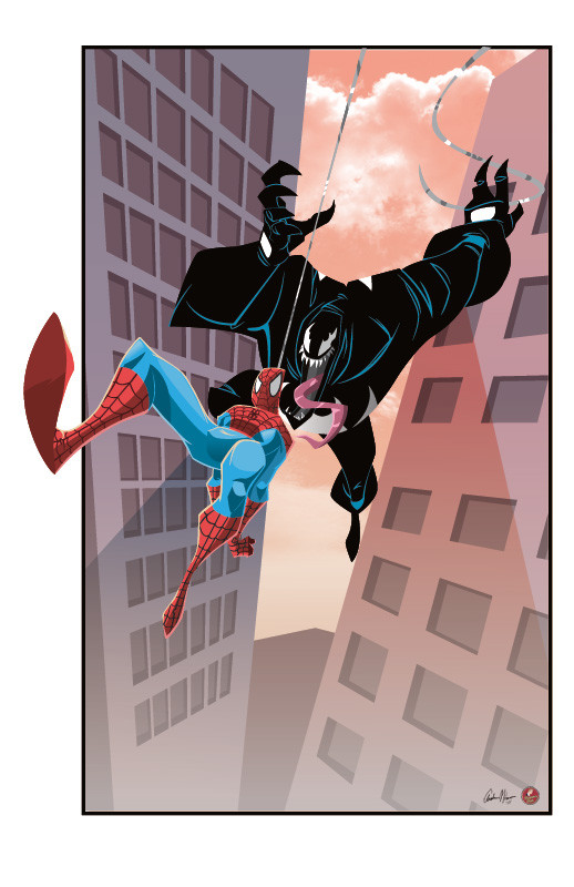
 AndrewJHarmon — Venom Attacks
Published: 2009-12-29 07:10:02 +0000 UTC; Views: 4849; Favourites: 165; Downloads: 0
Redirect to original
Description
Available as an 11x17 print! ---> [link]I liked someone's opinion, Frank Cho I believe, who commented how he wished people would keep Venom solid black rather than so defined. Well I was going to follow suit because I like the idea but while I decided to add in some lines, I won't be adding light sources or the like. I think I dig the idea of a solid (or near solid) black Venom
 (Smile)")
Original: [link]
Lines:
Colors: Me
Related content


Comments: 47


Maybe if spidey ignores venom he'll feel awkward and go away. hopefully....
👍: 0 ⏩: 2

Where'd Spider-Wuss go? SPIIIIIIIDER-WUUUSS!!? COME OUT AND PLAAAA-AAAAY!!!
👍: 0 ⏩: 0

Sounds like a plan
👍: 0 ⏩: 0

Very nicely done! On your six, Spidey! Look out!
Solid black Venom does look pretty good. I like the bluish lines that help outline his physique. Lovely coloring for the rest of the picture too. ^_^
👍: 0 ⏩: 1
Thank you. I had to add the blue lines simply because Dan put a lot of character into Venom with them and I didn't want the viewer to be cheated out of some Dapper Dan goodness.
👍: 0 ⏩: 0


Excellently done, and I agree with the all black venom. Since it's a "space goo" costume, I guess it doesn't have to be reflective at all, and can just absorb light.
👍: 0 ⏩: 0

this looks great bro. printwise heavy on the recommendations of vamping background a bit purple toned. Caters to a wide audience and easy flick. Then you can say convention exclusive lol.
👍: 0 ⏩: 1
If your slinging some slang my way I think you're losing me in the vernacular LOL
👍: 0 ⏩: 1
no worries mate. Purple sells with opposite sex and younger people. So if ya change the colors of the buildings to purple hues the composition would look amazing as a print and would sell rather well. And as an added bonus...if people asked you 'can i find this online?' you can say no.
👍: 0 ⏩: 0

This will be a seller!.
Now wheres Cap!
Seriously, nice work.
Tod
PS. I have a total of 42 picks for my book.
👍: 0 ⏩: 1
LOL Thanks, man! Sweet on the picks!
👍: 0 ⏩: 1
I figure on 11 pages, 1 as the cover and 10 for interiors.
I'll have a front cover image, back, the inside front and back will be acknowledgements and credits, with the inside pages allowing me 40 images.
It's just putting it together is the key.
Tod
👍: 0 ⏩: 0

Thanks, Dan! Took a little liberty with the background. Hope you don't mind!
👍: 0 ⏩: 0


Love this! The style, shapes, simplicity, dynamics! It has it all! Nice job!
👍: 0 ⏩: 1
Thank you very much! Dan does a very nice job of breaking it down. Certainly make coloring it even easier
👍: 0 ⏩: 1
Glad to hear that. You guys work well together. So when you color do you use Illustrator to vector over the art or do you color in Photoshop? I noticed that both you and Dan have a near perfect final render, so it kind of feels like vector... Do you mind sharing your process? Thanks in advance!
👍: 0 ⏩: 1
Don't mind sharing at all. Usually, I do all of my work in Illustrator except for effects, glows and backgrounds. Now if I get a really great, crisp piece of line art, then it's a tough call. Sometimes I'll redo the entire line work in Illustrator to make it vector so I can scale it any size I want. Or I'll simply color it in Photoshop so I can color portions of the line art should it be needed. Obviously the image would have to be 300 dpi if at all possible LOL. Or the other option, with the original artist's permission,I simply lose the line art all together and just keep separation through color.
Hope that helps!
👍: 0 ⏩: 1
Nice! Thanks for the insight. I'm trying to achieve an animated feel in my work and I've tried to use vector illustration to achieve it, but I've never been as successful with it as Photoshop. It's nice to hear it's still an option, you do it well. Thanks again!
👍: 0 ⏩: 1
Thank you very much! Keep at it!
👍: 0 ⏩: 0
Well for this piece it was just a sketch by Dan. Not a typical crisp line drawing. I basically try to interpret the sketch lines as best I can, trying to stay true to the artist's original design. Since I rarely do digital ink/black line work in Illustrator anymore, it's a challenge to create separation by color. I'm not sure if that answers your question. If not, let me know
👍: 0 ⏩: 1

kinda looks great though
👍: 0 ⏩: 1

If this is any indicationi of how my Cap piece will turn out....we'll make millions!!!
Tod
👍: 0 ⏩: 1

")

great pic. ...hate to be "that guy", but wasn't Venom invisible to Spidey's spider sense? not to take away from the composition's awesome factor in any way. Just a thought.
cheers.
👍: 0 ⏩: 1
You are correct indeed. Although I didn't draw it, I'm sure Dan wouldn't mind me giving a little artistic interpretation.
If you notice Spidey's body language, it's not exactly poised to engage Venom. That being said, I think Venom is on course to give our friendly neighborhood web-slinger a surprise attack.
Also, you'll notice the lack of any spider-sense ability being displayed. Thus supporting my first interpretation.
Again, this is Dan's drawing and title. I think he was having an ironic/sarcastic play on ol' web head's spider-sense.
But that's how I took it
👍: 0 ⏩: 1


that is one ridiculously large "package" maybe you should make it bigger so noone notices.
👍: 0 ⏩: 1
LOL I can't wait to rib Dan about this one
 (Wink)")
👍: 0 ⏩: 1
I can't wait to see you finish laying down colors. what you have already is really nice.
👍: 0 ⏩: 1
Thank you. I'm actually very excited about this piece.
👍: 0 ⏩: 1
I hate to sound stupid, but you're using PS right? cause it almost looks like you could be using illustrator for that "perfectly mathematically" based rendering. it's fantastic.
👍: 0 ⏩: 1
So far this has all been done in Illustrator
👍: 0 ⏩: 1