HOME | DD
 angryblue — Divine

Published: 2002-02-06 10:03:22 +0000 UTC; Views: 511; Favourites: 2; Downloads: 14
Redirect to original
Description
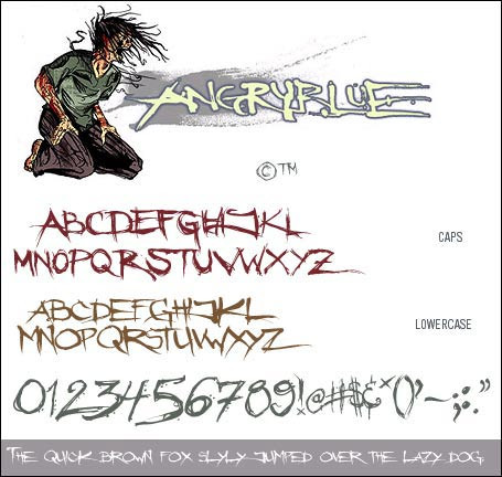
Round4 of a battle with Arnoform.this battle can be seen over at graphic-forums.com
Music:
Porstishead NYC Live and tfinding out what the Iommi cd sounds like.
i've not tried using such minimal colors before. i like what came out of it.
Related content


Comments: 6

To bright justin, turn down your lights! Other than that it's cool.
👍: 0 ⏩: 0

yeah, looks good, use of color is good too, except for the orange text, it take focus away from some of the more interesting areas of the image.
👍: 0 ⏩: 0

yummy blending and bright reds. text could use some work but otherwise great piece. keep up the good work.
👍: 0 ⏩: 0

Thats a pretty cool grungy style on there. The red is a really good color choice too Decent Typography, but could use some work, not sure how, but maybe something a lil more into the same style, unless you were going for that effect of things not matching. Like ironic you know?
-----
Designed Strife - http://strife.kalenic.net
👍: 0 ⏩: 0

This is an awsome image for 2 reasons...
1- Its got great detail and awsome balance...
2- 400th comment for me...
-----
Fat asstronauts for ever...
https://www.deviantart.com/
me= https://fat-asstronaut.deviantart.com/
Irie Vibes to all...
http://bobmarley.com/indexflash.cgi
👍: 0 ⏩: 0

I really like it..it looks awesome..love the colors..I've always loved red black and white together..and blue black and white..very cool and grungyish..
👍: 0 ⏩: 0