HOME | DD
 Anritco —
Tod - Two Surprises
Anritco —
Tod - Two Surprises

Published: 2012-06-11 02:35:24 +0000 UTC; Views: 26909; Favourites: 2425; Downloads: 416
Redirect to original
Description
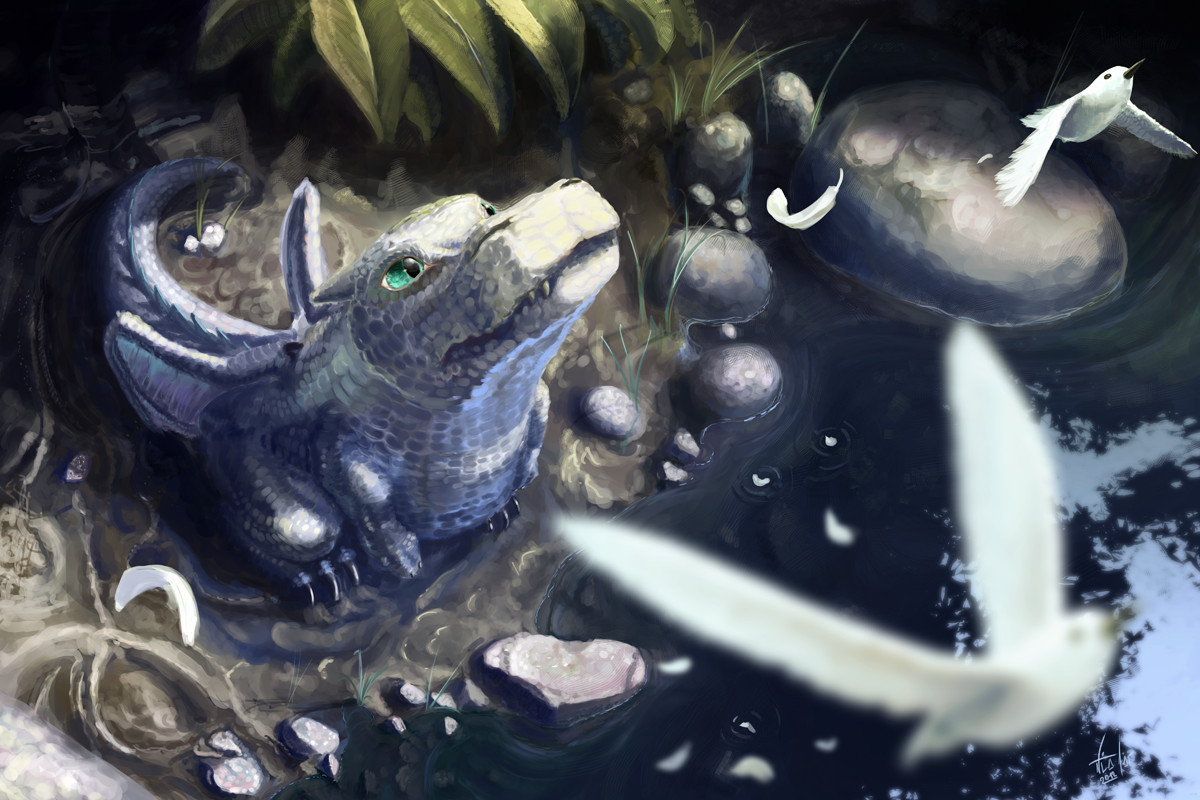
It's been a long time since I uploaded the last ToD Illustration, well, I bring you the fifth chapter, 'Two Surprises'...There was the dragon, growing up, walking trough the forrest looking for something to eat. Suddently he saw a creature floating, a strange creature: it didn't have hair at all in its body. Not even feathers as those another flying animals. The entity with purple wings didn't cast any sound, but in the mind of the dragon, images were projected: a brown-majestic bird taking care with the eggs at its nest. That bird looking for food between some dark-green vegetation. And a hunter wolf giving a bite.
The final imagen was a poor and sad baby-bird, breaking the shell, alone, at its nest.
-"I will take care of it"
 ToD series next ilustration
  ToD series prev. ilustration
EDIT (2012-07-25): OMG thanks so much for the DD!!
Related content


Comments: 151


Sooooooo lovely


👍: 0 ⏩: 1

I think not, but it is always good to be remembered jiji
👍: 0 ⏩: 1

")


he has to chose between the owl and the naked lady with wings
👍: 0 ⏩: 1
I'd choose for the naked lady
👍: 0 ⏩: 1


This is really good! Your skill with lighting and colors is immaculate. Not to mention, the detail, ohmigosh, the detail. I'm not a pro or anything, so what I say from this point on can be disregarded if you like, but, from looking at this piece, I'd say you need to work on composition and guiding lines. There isn't much of a clear focus, and the elements compete with each other to draw your eye rather than work with each other. Utilizing a little more perspective could work, but, looking at your other works, one thing you could really benefit from using more often would be the rule of thirds when it comes to composition.
Also, I love your style! Your texture and colors make everything look so natural. What software do you use?
👍: 0 ⏩: 2
This is, sincerely, the most complete critique I have ever received (at least via DA jeje...)Thanks a lot for this, this two things (the weighing of elements for taking attention the the eye, and the composition) are the hardest things which I m fighting with... you just take right!
And you will be surpriced about how much will I take your opinion about perspective for the next one
Thanks a lot! and well; I m using photoshop, but now I m attempting (with a lots of good results) to use a program that simulates the oils and acrilic's pigment mixtures (did I say it right?) called SAI... it s a program I did get from a partneer from my work... I extremely recomend that program to make the basic colours and define the first shadows volumes and lights... but not textures.
 (Wink)")
👍: 0 ⏩: 1
Thanks! Glad you appreciated it. :3 I was worried you wouldn't. I'm going to go ahead and watch you now~
Also, I feel I should have put more emphasis on guiding lines. Having a path for your mind to follow through the piece rather than having to dart between a handful of different, separate focuses really helps make it more appealing.
👍: 0 ⏩: 1
woha! thats a lot of words I don t know!... I think I have understood the message; btw... I think the point of what you are telling me is to stronger stronger the atention to the elements that are most important? I mean, the elements which I want to highlight
👍: 0 ⏩: 1
Uhh... Yeah! And not through just color or prominence (you do a great job at that already). Through composition, too! Rule of thirds and guiding lines and stuff. Right now in this piece there are 3-4 points of focus. The fern, the faerie, the owl, and the flower. The way the image is composed, all of the points are sorted at equal depth, lighting, and focus, with not much but empty space between them and, due to that and their lack of shared angles or contours, no guiding lines linking them. As a result, the viewer's mind can't quite decide what route to take through the image. What to focus on first, next, etc.
Do you know what three or two ring circuses are? They're circuses with two or three main rings at a time, each with its own show. They're common, but being phased out due to the chore that comes with multitasking as you try to keep track of each ring. It wasn't very popular.
Something similar happens here.
It helps to use perspective, light, focus, depth, and guiding lines to build a clear focus or link focuses together in the desired path. The best path is one that loops, so your mind can keep scanning the image with ease.
Also, the rule of thirds is helpful for mapping and placing elements.
I'm not an expert, and I'm mostly regurgitating stuff I've heard from my teachers and online videos, so there's a chance I may be totally wrong about everything ever.
P.S: There's actually lovely focus and flow between the dragon's head, the faerie, and the fern leaf. It's just the presence of most of the stuff on the right and bottom of the picture throws it off. Remember not to throw in things that are unnecessary or distract from or compete the point of the image. Rather, focus details that compliment it.
If you need visuals for what I mean, maybe I could sketch some up. :l Once again, I'm no teacher, so I understand anything I say could probably make no sense to anybody else but me.
👍: 0 ⏩: 1
You are extremetly right... everything what you said is what I m learning at this point of my career... composition, importance, and the travel that the eye makes trough canvas... I would love if you can draw me a sketch showing all this experiencie and knowedge... you see.. Here in Argentina there is no people who know about all this themes, and people who knows, knows so far that are invited to move Europe or Northamerica... Here are universities of art and schools, but they are full of ignorants and people that only care about money, even that, real masters dont get money enough to feel tempted to share they knowedge... my country sucks, and it is because nobody cares about the future of people...
I would love to get off here... to france, germany or a place which I could learn and apply what I just learned... so I hope this fate be close. (sorry for vent my self with you u.u)
👍: 0 ⏩: 1
Trust me, it's not much better here. Art schools in general are a sham. They're incredibly expensive, and nothing you can learn there you can't learn yourself through practice and free online tips and tutorials. People who are actually passionate about what they do will be happy to dispense all the tips and tricks you need for free, knowing that they're teaching a rookie. It won't be in a guided, strictly regulated, thorough course, but with enough self-motivation, you can piece together what you've learned in to something glorious.
I have no mastery, or knowledge, or experience, just a lot of time listening to internet people talk lined under my belt. I'm just a sixteen year old highschool boy who's enthusiastic about learning.
I'd recommend visiting [link]
It's got some great, friendly professionals willing to drop tips on a moment's notice, and environments where you can watch yourself learn along other people. It's really great.
And for, say, guiding lines and composition, I have a perfect idea for something I could sketch up to show you what I mean. I have no time to do it right now, though, so I'll sketch it up tomorrow. Maybe. I might not have time then, either. I'm awfully busy these next few nights.
👍: 0 ⏩: 1
I think you are just going to be great in this matter... do you have msn or facebook so we can have a fluider conversation? send me a pm if so... I think we can learn from each other
👍: 0 ⏩: 1
Great! I'm still super busy, but hopefully I'll get something to you by the end of the week. And nope, DArt comment stacks will have to do for now.
👍: 0 ⏩: 1
Oh, and also, the bugs around the fern are a touch that's beyond fantastic. Already love your work, dude.
👍: 0 ⏩: 0


I love love love this!! This is so good! I can only hope to become as good as you, I'm improving but still a long way off!!
Just wondering, do you do any kind of digital art lessons or anything?
👍: 0 ⏩: 1
thanks a lot! and well... I did never do any lesson, even in reality... I would really like to! but I think not much people would see them xD
👍: 0 ⏩: 0

Oh wow! This picture is amazing!
You did real great, good job! ^-^
👍: 0 ⏩: 1

Hermoso, y la historia, aunque adorable es algo triste. Muy buen trabajo. Me gusta mucho el dragoncito
👍: 0 ⏩: 1
muchas gracias!... es triste, si... pero aun no es nada triste...
👍: 0 ⏩: 0

")
thx man! I like pretty much your gallery

👍: 0 ⏩: 0


thanks a lot!!
by the way, I love your land
👍: 0 ⏩: 1
yes indeed... I love coldness and I really love the culture and the food you have =3
👍: 0 ⏩: 0

Hermoso trabajo, los detalles son increíbles y me gusta las texturas y colores que usas.
Adhiero con ~exoticmix , el filtro no es necesario. Además, creo que tampoco es necesario subir el dibujo en su resolución máxima, a menos claro que tu objetivo sea que la gente pueda usarlo de fondo de pantalla. Mi recomendación sería dejarlo en un tamaño medio, pero claro, todo depende de ti
👍: 0 ⏩: 1
muchas gracias! todos estas recomendaciones me sirven mucho para presentar mejor mis ilustraciones, agradezco muchisimo que se animen a contarmelas ya que realmente son muy importantes para mi =]
por cierto! me gusta mucho tu galeria ^^
👍: 0 ⏩: 1
Me alegro que sean de utilidad.
Gracias por tu comentario
👍: 0 ⏩: 0

my advice: take off the censorship the nudity is non sexual and only the tiniest part of the painting. I dont think anyone's gonna be scared by this at all, quite the opposite. I think more people will get to see your nice piece here if you take that off.
👍: 0 ⏩: 1
thanks for the advice... I took it off now =]
👍: 0 ⏩: 1
cool  (Smile)")
👍: 0 ⏩: 0

")
")
<= Prev |