HOME | DD
 ansarwasif — typographic experimentation

Published: 2005-02-23 00:15:43 +0000 UTC; Views: 837; Favourites: 19; Downloads: 109
Redirect to original
Description
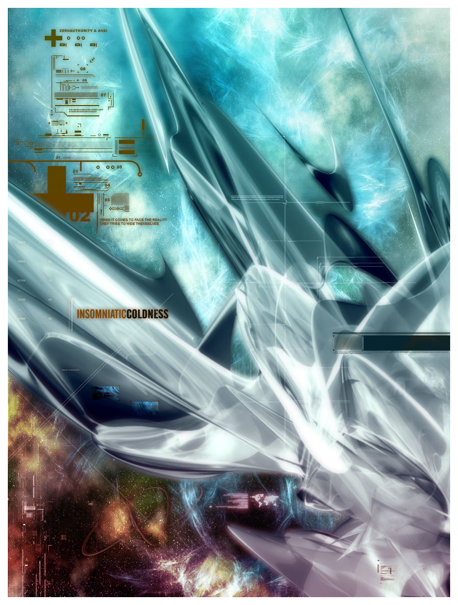
some old shit re-enhanced.Related content


Comments: 16

A very beautifully executed experiment I must say. Very abstract-modern.
👍: 0 ⏩: 0


its a lovely piece ans....awsome as always 
")
 (Wink)")
👍: 0 ⏩: 0


hehe re-enhanced. : )
textures, colors are so well and balanced. it tells me the color scheme of blood and veins but in cool manner. white and red always look good together. thats a great job.
👍: 0 ⏩: 0

 (Smile)")


MASHALLAHH!!!! this is åmåzinG Ånnoooo

ExPeriment worked wonders!!
Hey, u olways use TERRIFIC fonts!! can u give me some cool fonts that i can use for my name of ALLAH project?¿ hope u wont mind sending... (kaisay nahi bhaijta !)
👍: 0 ⏩: 0

")

The white thing at the bottom bothers me. Otherwise, Kickass
👍: 0 ⏩: 0

I like you're typographic skills. I guess it turned out to be a fairly well experiment! I would however take away the yellow random lines that are many in number, but that's my opinion
👍: 0 ⏩: 0