HOME | DD
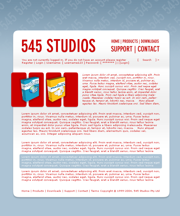
 antisleeper — 545 Website Mock 1
Published: 2003-12-22 19:42:39 +0000 UTC; Views: 608; Favourites: 0; Downloads: 207
Redirect to original
Description
For the 545 contestRelated content


Comments: 4

 (Wink)")

clean design..
the name of the company is 545 studios - would help if the first thing you see is the correct name
the red type is really hard to read for that much text. the white on blue is fine.
i guess support and contact are more important than home, products and downloads?
definitely too much text to read for a main page - for an inside page it's fine
- my 2 cents
👍: 0 ⏩: 0

From the thumbnail in my messages window i didnt think this one was very cool but i think i vote for it now that i see the full view. Great job.
👍: 0 ⏩: 0


