HOME | DD
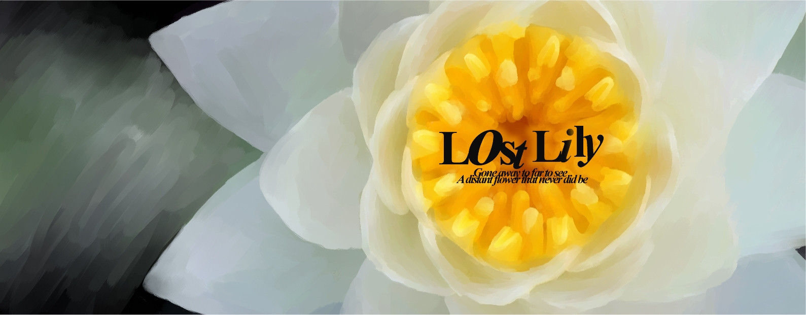
 antisleeper — Dreaming of the lostlily
Published: 2002-02-03 19:18:59 +0000 UTC; Views: 272; Favourites: 0; Downloads: 11
Redirect to original
Description
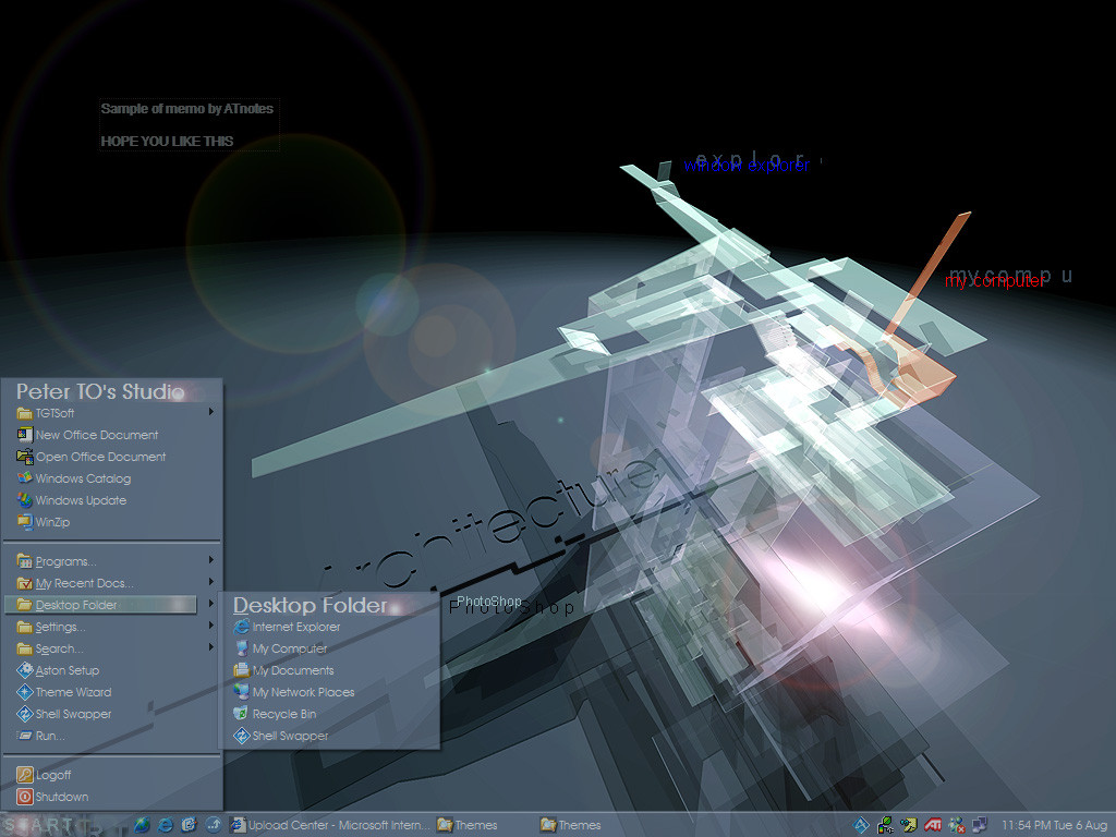
at last i have worked out how to add the texted i wanted on this piece. i did it using a technique that zkreso uses. i hope don't mind me using it as well since it rocks so much. anyways what ya think. hope my devwatching crew don't mind seeing another redition of this imageRelated content


Comments: 15


AWESOME stuff.
looooookin great antisleeper ..
great work
👍: 0 ⏩: 0

i like the aliasing on text
-----
:// fear what you dont understand >
~higgs aka jon
👍: 0 ⏩: 0

I turned out great.
-----
the
will bite your toe whahahahahah
👍: 0 ⏩: 0

no redition no.......
its a class of its own.... like it much.
-tHra N-
👍: 0 ⏩: 0

lovely!
:frown: rock on
Band of the month:Dream Theater http://www.dream-theater.com/
👍: 0 ⏩: 0

More.. flowers
¤-[Kwan Studios Finland]- http://www.kwanstudios.com
👍: 0 ⏩: 0

Hmm... you can't use bold on times new roman, it totally changes it... unless you're using it in a size less than 16, then it'll suck if it's not in bold
so that is italic for sizes 16+
italic and bold for sizes 16-
but then again you might try to deviate a little from me so bold maybe suits you
-----------------------
Zlatko Kreso
Breed Skin Division Head - http://www.breedart.org
Project Pallus founder - https://projectpallus.deviantart.com
DeviantArt member - https://zkreso.deviantart.com
Plastik v4 webmaster - http://plastik.pillboxed.com
And occasional skinner
👍: 0 ⏩: 0

i dun mind seeing another one, its cool this IS the best one
robb
👍: 0 ⏩: 0

Wow, this is quite awesome. I think the text really makes this one, it really sets a nice vibe. Great work!
👍: 0 ⏩: 0

Wooh.. the yummy lily is back
I like the way you did the text, and how it contrasts the flower. There's a bit of order & chaos thing happening here.. with the text going every which way, and the symmetrical lily just sitting very still in the background. Nicely done
~fuzzydemon
The pen is mightier than the sword, unless the person youre fighting actually has a sword.
👍: 0 ⏩: 0

I like this final (?) version a lot. I really love the wide format. The typography fits in well.
parasight:// Fuck winter.
👍: 0 ⏩: 0

Amazing!!! when i saw the thumb i tought it was a photo!!
nice work!!!
👍: 0 ⏩: 0

cool !!! remember those lilly's u did before
http://frozensmoke.com -
http://acidic.tk -
👍: 0 ⏩: 0

very nice work! i love it...only its HUGE!
-- Dredwerk
I love you all, appart from the ones I dont
👍: 0 ⏩: 0