HOME | DD
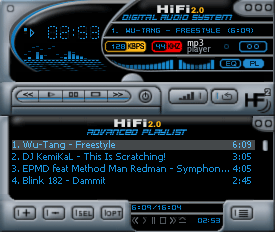
 antm — HiFi 2
Published: 2001-01-15 04:45:47 +0000 UTC; Views: 1171; Favourites: 5; Downloads: 1117
Redirect to original
Description
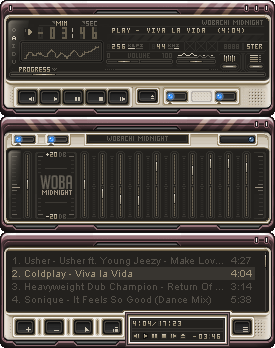
My third winamp skin. enjoy.Related content


Comments: 13


This is also a great looking skin i dig it, but im using your 3rd release of HiFi, cause its just an awesome looking skin, great job on the two releases of HiFi.
Nicolas (Cype)
nicolas@dmusic.com
👍: 0 ⏩: 0

Wow, an awesome skin. I was looking for an entertainment system look, and this is it! What an original idea for Winamp. Simply awesome. For once useability is not neglected for eye candy.
👍: 0 ⏩: 0

Great skin, the seperation of the visualizer and the rest of the screen is inventive, I don't think I've seen anything like it before. The color scheme is great, especially the red and yellow around the KPS and KHS readouts.
👍: 0 ⏩: 0

this is very nice.. i love these types of skins.. i used dreamweaver for a while, which is similar to this.. keep makin skins, bro!
-- matteo --
https://www.deviantart.com
http://www.wastedyouth.org
👍: 0 ⏩: 0

Oh my god...I love it.
The colours around the kbps and khz metres are a particularly nice touch as isonica pointed out.
A functional piece with impeccable form. Incredible!
👍: 0 ⏩: 0


Sleek and smooth metal parts... Very nice curves the whole design just feels good. The only things that bring it down is the messy "kpbs" and "mhz" texts. I also have something against the time numbers font. It fits the theme of the skin but not me I will use this a long time though.
👍: 0 ⏩: 0

whoa .. that is a really slick design. never seen a winamp skin like this before. wonderful originality, colors and overall look. great work!
--[ jark ]--
👍: 0 ⏩: 0

this has to be one of the best skins i have seen in a while. i was looking for something hi-tech looking yet still somple enough to navigate in. very nice work!
👍: 0 ⏩: 0


I love the colors, especially the Yellow and Red around KBPS and KHZ.
The play controls could be more defined though.. maybe bolder looking icons?
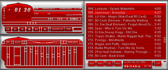
Cant wait for HiFi 3
isonica.com
👍: 0 ⏩: 0