HOME | DD
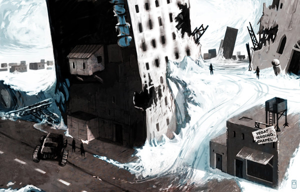
 arcipello — Highways - Bionic Commando

Published: 2009-05-15 17:36:15 +0000 UTC; Views: 81310; Favourites: 1952; Downloads: 2326
Redirect to original
Description
Yet another piece of concept art for Capcom's remake of Bionic commando. This image is in a very different style to the others, i wanted nice clear line art and minimal colouration.Photoshop
3 hours
Related content


Comments: 94
it's like... like... Speed (movie) remake in future xD
👍: 0 ⏩: 0


REALLY ADMIRE THIS  (Smile)")
")
👍: 0 ⏩: 0


love these ''nice clear lines'' as you said.
perfect. Like the blue toning.
fav
👍: 0 ⏩: 0

I think the minimal colouring lets you focus on form and shadow.
👍: 0 ⏩: 0


 (Wink)")

Why does the little man's shadow go the opposite way of the bridge's shadow. Remember your light source!
👍: 0 ⏩: 0


i really like the use of color here, just gives a good impression of the mood
👍: 0 ⏩: 0

3 hours, insane! Even if I had the skills to draw this, it would take years
")
👍: 0 ⏩: 0


Great work. Seen a lot of Bionic commando art showing up recently, I wounder what triggered it.
👍: 0 ⏩: 0

Interesting color choices - it conveys a bleak but not depressing mood.
👍: 0 ⏩: 0


reminds me of C&C TS and Mirai Shonen Conan
👍: 0 ⏩: 0

Funny how the figure's shadow is falling right while everything else's shadow is falling left. *L*
Anyway, this is great! I can stare at it for ages. You achieved great depth with the minimal colours too. +Fav!
👍: 0 ⏩: 0


This would be a perfect illustration for Isaac Asimov's "Nightfall" book.
👍: 0 ⏩: 0


I believe your tried effect worked out very well!
👍: 0 ⏩: 0


PixelEuphoria [2009-05-20 01:14:22 +0000 UTC]
It's like a blueprint of a cleanly and carefully planned messy apocalyptic scene - um,... yea. It's awsome!
👍: 0 ⏩: 0

I? love the monochrome blue to death, really suits the subject, and is great for atmospheric perspective.
Blue is great in every shade!
👍: 0 ⏩: 0


nice! halfway between a painting and an architectural draft.
👍: 0 ⏩: 0

Terrific work, I love the color pallette, the scale, and the simplicity!
👍: 0 ⏩: 0

Wow, this is amazing, i just have to wonder what actually created the destruction, thats just...Wow.
Will the game be for Xbox 360? :3
👍: 0 ⏩: 0


That's really cool. The minimal colors make the piece.
+fav
👍: 0 ⏩: 0

i like that tree on the edge of the cliff...
👍: 0 ⏩: 0

doubtless as was your intention the depth of field and feeling is very well obtained with the limited pallete
👍: 0 ⏩: 0


| Next =>