HOME | DD
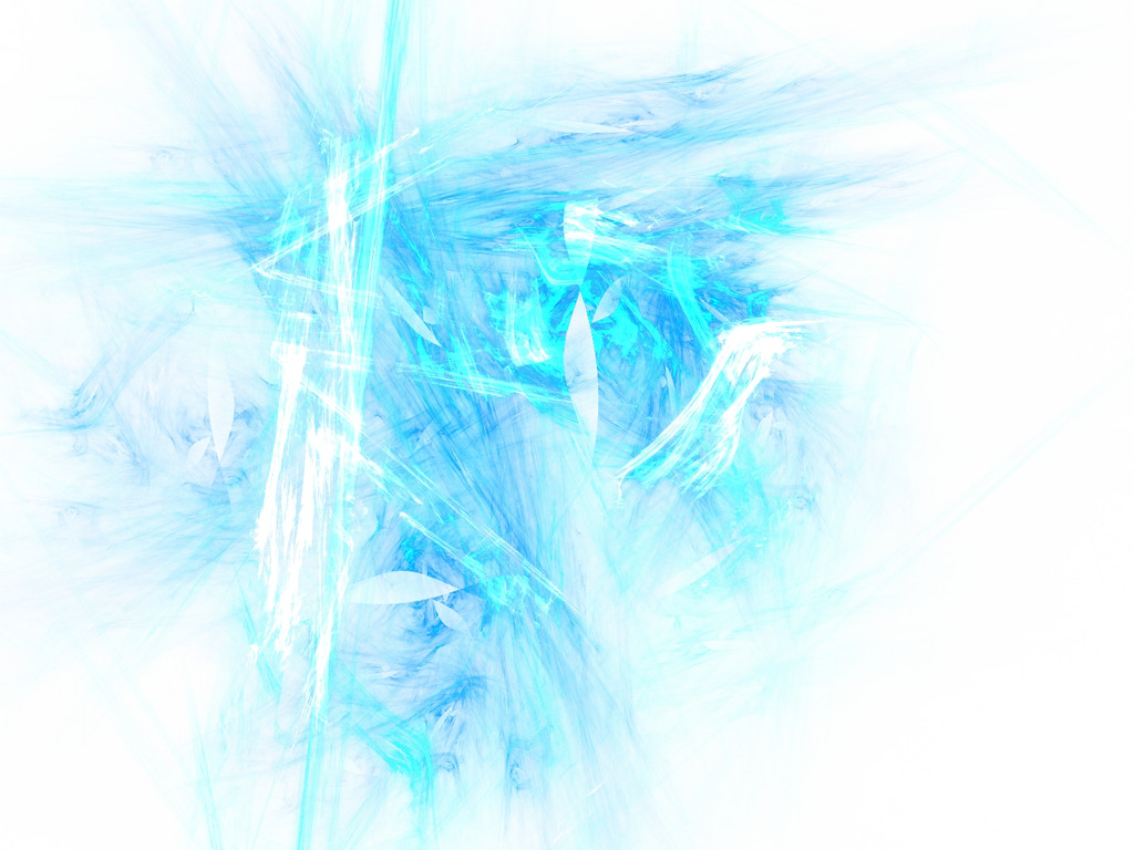
 arleetec — Emotionless Winter Remix

Published: 2002-03-04 00:43:31 +0000 UTC; Views: 1249; Favourites: 18; Downloads: 85
Redirect to original
Description
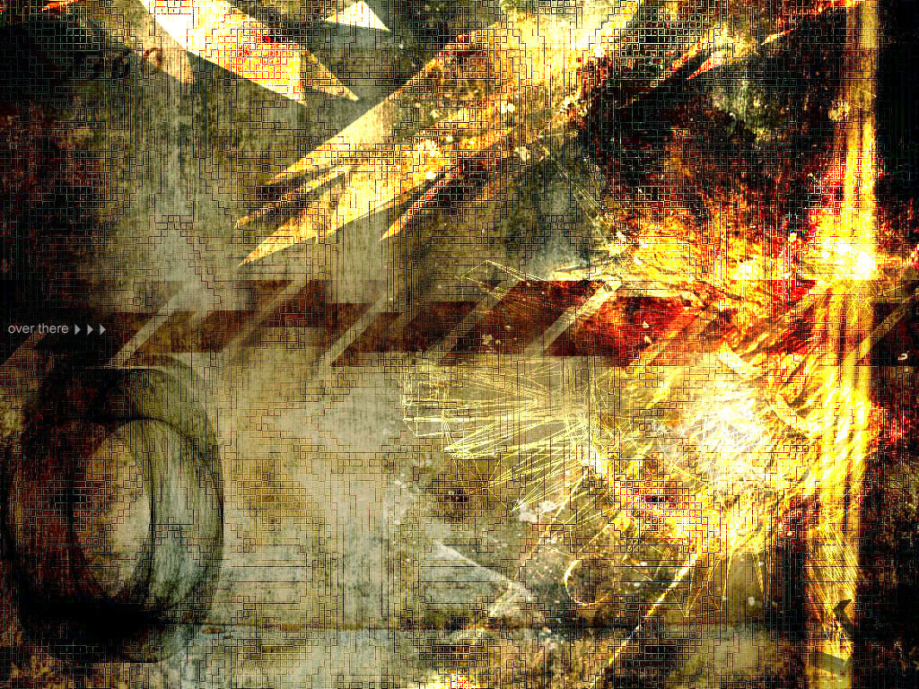
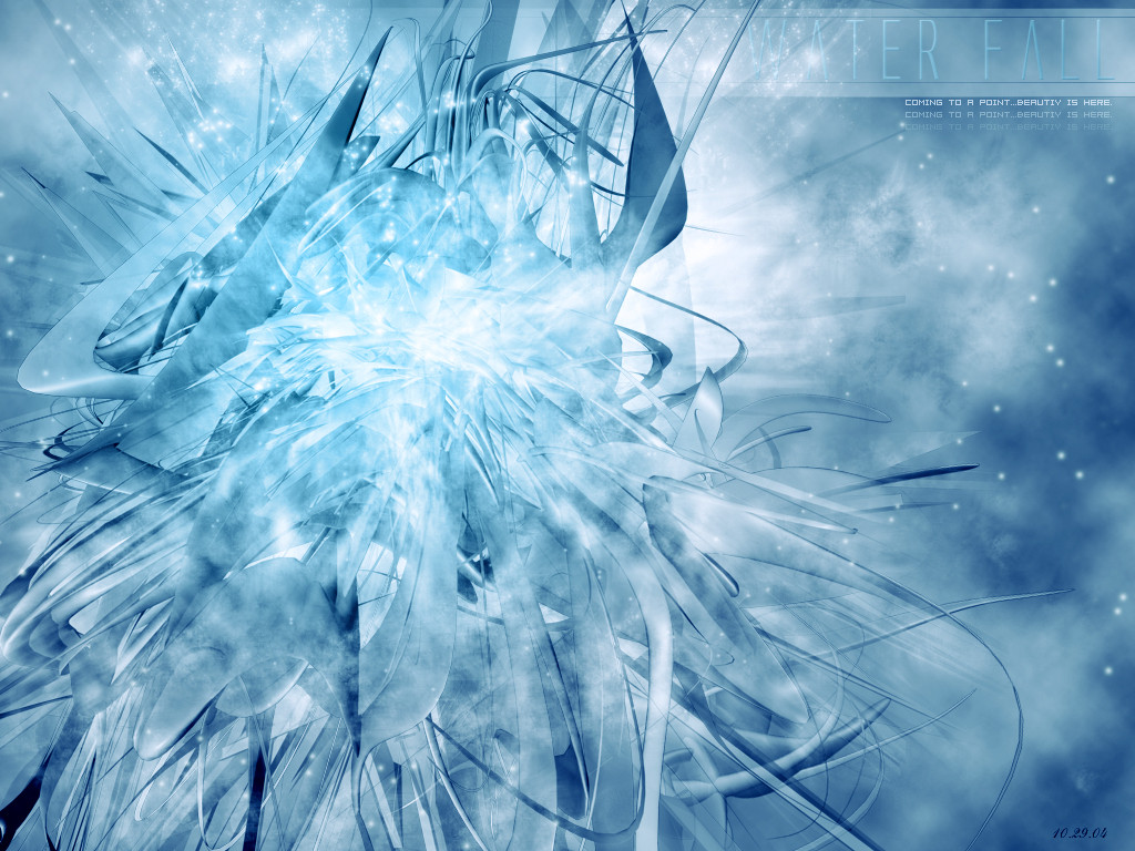
A remix of one of my older walls. For those who complained that I had too much empty space in the first one I tried to fix that. Also I know white backgrounds tend to be too bright for some people so I chose a color that is a litte off white so its not as bright.So thats it, did this to try to get back into a groove. Comments appreciated or just give me a
Related content


Comments: 55

love it love it cant stand the white but if u made it a softer color on the eyes.. ill give u a
c'mon.. u know u want my
👍: 0 ⏩: 0

Brilliant peice.
A bit ancient, as you said, but i can't push much better so i best not complian
Sorta reminds me of one of my desktops, Scry Blue .
But this, i like
good job.
👍: 0 ⏩: 0

Heh, i'm just going through my DevWatch and am commenting on a few pieces that I remember from awhile ago. This was always a favorite of your man. You've got incredible skills. Hope you submit something soon.
👍: 0 ⏩: 0


ice colors...great effect...i like it
-----
agoni alias mercyful [link]
👍: 0 ⏩: 0

It's nice, but ultimately confusing. I dunno if bright white is my color of choice, and the blue underneath is contrasted very harshly. Also, I still dont get the point of text in these kinds of wallpapers. Anyways, I can't deny the skill it took to create this though.
-----
-Halx
It is not easy being sticky.
[link]
Your comment should be longer than your signature.
👍: 0 ⏩: 0

Heya Arlee!!! How the @%$~! have you been? It's nice to see you still crankin' out the greatness while I'm away, although I've learned to expect nothing less from you. This is a great piece...blue's my favorite color A little too much white(or off-white - whatever) for me though. Doesn't go with my litestep theme too well, so it'll be set aside as my background for awhile. Anyways, i'll be checkin in later.
-----
.::SYNTH::.
👍: 0 ⏩: 0

wow. figured i'd come pop in and see how you are and you've uploaded an amazing piece of artwork that my devwatch missed, darling. i love the chaos, i just started using a different wall though so this one's gonna have to wait. damn. part of me wishes i had seen this one first. this is absolutely fantastic, so much detail, yet so little, and it's color rich even though most, upon seeing this, would just say "oh, another blue wall." not sure which i like better, this remix or the original, but this one most certainly gets a favorite.
beautiful work, ricky.
-----
when confronted with hate and ignorance, one must liquify.
👍: 0 ⏩: 0

Nice remix arl, I like this version more than the previous. Well done.
-----
sasso
metadream.com - deviantMAG.com - deviantSTOCK.com
👍: 0 ⏩: 0

great work!
-----
Lifes a bowl of punch go ahead and spike it. -Nick Hexum, 311 - Music -PLAIN
FROM CHAOS IN STORES!
NEW SINGLE AMBER!
👍: 0 ⏩: 0

Wow, I like that alot. The color is awsome. Boy some people cant accept things that they didnt make (hint hint to previous comment) Nice work
👍: 0 ⏩: 0

It seems a little blurry, but you gotta love the color! I feel shards are a way of just showing color without having to come up with some sort of main object. And I've seen plenty of blue ones, so it's kind of getting played out, and it's been called "trendy" for god knows how long. But this one is still spiffier than others. Great job.
-----
- psyfect
👍: 0 ⏩: 0

really awesome effects here! bles are awesome and so are whites. great job!
-----
::Visions are Deeper than Sight::
👍: 0 ⏩: 0


Very nice piece, I don't think there is too much white at all. In fact I think that is what makes it different and interesting.... but you should try not to be such an asshole in the shoutbox. Cheers!
👍: 0 ⏩: 0
Very nice man. Really bright and in your face. It almost hurts to look at it. Regardless I like the idea behind the piece. Excellent work.
-----
:: exy BrazenSix(Mathias) :: http://www.dfektion.org ::
:: The snowman outside my igloo tells me to burn things
::
👍: 0 ⏩: 0

amazing.. --> favorites
those colors are awesome
___++delicious>>__ _
👍: 0 ⏩: 0


You are spamming this for more comments why!?
if figured you would have already worked out IT ROCKS!
-----
[why?, why was i programed to feel pain?]
👍: 0 ⏩: 0

Beautiful..I love the typo. Very nic ework.
-----
-amphex (Dan)
👍: 0 ⏩: 0

Nice, I love pieces which don't show everything, and this is a perfect example. Some harder lines in your "non quite white" areas would have been nice but all in all I really like it
-----
[ hungrae for design ] https://hungrae.deviantart.com
Adopt a Deviant
[ hungrae for design ] https://hungrae.deviantart.com
👍: 0 ⏩: 0


Oh yeah more WP powah. Ah some good old eyecandy. Just what I needed. Thanks for my new wall man.
-----
CrazysunART
http://crazysunart.narod.ru/
--------------------------
How do i bust tha ill 3D shitz
👍: 0 ⏩: 0

Nice.
It has a swirling-emotions feel to it. I like that.
👍: 0 ⏩: 0

damn good as always. you are soooo good at what you do. great work.
-----
..:::[mimle02]:::..
👍: 0 ⏩: 0


Brrrrrr.. It makes me cold just looking at it.. I love blue and I like the smooth style you got going on here..
👍: 0 ⏩: 0

what are you using to make this?
-----
-shadow.stal king-
👍: 0 ⏩: 0

really cool, but you should get the text out
otherwise its great cool colors
👍: 0 ⏩: 0

like everyone else has said, i love it. the design, color, etc, just good all around, great job
👍: 0 ⏩: 0

ooooooooooooh,
lots of cookies for that one. Me likes much. wow.....that is super, if you could make a suite of like skins and stuff for that theme i would so use it.
-----
___________________
I like penguins named Josh.
Give me a break, im only 14.
👍: 0 ⏩: 0

Whoa.
*has heart attack caused by amazement of the imagery placed before him. *
Coroner's Report: This death was caused by viewing of awesome colours and shapes arranged in a pleasing way. He is happy now.
👍: 0 ⏩: 0


This is really cool. I like how the words are all in there and hard to read.
👍: 0 ⏩: 0


*gasps*
you should make more of these things
-----
:fuzzys:
http://www.absolutely-fuzzy.com
👍: 0 ⏩: 0

Sweet music for my ears... or rather sweet visions for my eyes. As usual you stun me with your images. You da' masta'
Take care bro
👍: 0 ⏩: 0

wow thats really hot! Shame I can't change desktop here....
-----
Simon
http://www.roadkillart.com
👍: 0 ⏩: 0

Badass man badass. i have always liked the whiteness of your walls
The bluehue works goddamn well with the dodging, a fine rmx indeed.
-----
||D.V.S||
👍: 0 ⏩: 0

nice layer effects man, the color dodge looks pretty cool here
-----
-
++The VS.: https://www.deviantart.com/deviation.php? id=204380
++The Colaboration: https://www.deviantart.com/deviation.php? id=191575
++TrickSoft:: http://www.tricksoft.net
++My Whore: https://ekud.deviantart.com
👍: 0 ⏩: 0

very nice WP, although the white is a little too brighht for me, Cant see the icons well enough when it's too bright.
-----
-Konador
👍: 0 ⏩: 0

Hot damn Wai Wai, I love this remix! Not as lopsided as the first, and slashed feel adds so much to the original theme. Such a icy-blue, with shards that complement the idea/emotion behind this. My new desktop, thankie
*leaves you a bag of cookies*
-----
.:they call me woozie:.
👍: 0 ⏩: 0

very nice!
-----
Lifes a bowl of punch go ahead and spike it. -Nick Hexum, 311 - Music -PLAIN
FROM CHAOS IN STORES!
NEW SINGLE AMBER!
👍: 0 ⏩: 0

yaaay! sweet looks cool bro! the off-wh ite really helped my eyes
-----
rince. noopy
👍: 0 ⏩: 0

This has the photonegatives look about it. And I like the look of the typo too. Great work!
-----
👍: 0 ⏩: 0

thats so great... eventho i haven't seen the original I think it's good and not too much white space... great stuff with the blue and stuff
-----
Even God would stop the world every now and then to fix his mistakes
👍: 0 ⏩: 0

i like it, im a dark person so i cant grace my desktop with this. still i just wish to inver it and call it a day
-----
::Come Back! Thats My Monkey::
::Home Of The Bad Monkey::
::http://PlayBuddy.Tripod.com Hey this is my Link!::
👍: 0 ⏩: 0
| Next =>