HOME | DD
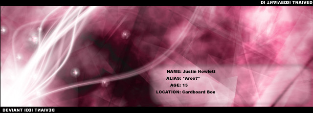
 aroo — Impliedinterface2

Published: 2002-05-01 23:57:14 +0000 UTC; Views: 842; Favourites: 2; Downloads: 52
Redirect to original
Description
Newer version... incase ur wondering about the chic... that would be Avril Lavigne...Pure ps6 btw
Related content


Comments: 9

omfg this is brill. You should have left out all the little white fonts and the box with all the things round it on the right.
THEN THIS IS A FAV. Thank Validus for me seeing this
👍: 0 ⏩: 0

the text makes things a bit hard to find, fix that and your perfect.
👍: 0 ⏩: 0

lol i happen to like those scattered text.. gives a little touch to the image iunno it just stands out
👍: 0 ⏩: 0


awsome-really good blast of light. ps6 is what i use 2, its the king of all appz lol.
-----
instead of thanking me for the comments why not be constructive and comment on one of my pieces?
👍: 0 ⏩: 0

Nice, I like the concentric rings at the base of the ray of light
-----
-------
[link]
I lub joo
👍: 0 ⏩: 0

i totally agree with kspear.
-----
help fight Cancer, volunteer your computer...Join team Deviant ART![link]
👍: 0 ⏩: 0

EVERYTHINg but the ugky scattered white text and that box thing looks GREAT!
-----
kspeaR--[link]
clonE--[link]
combustioN--[link]
infestatioN--[link]
wormS--[link]
distortioN inverT--[link]
thE inneR beasT V2--[link]
👍: 0 ⏩: 0
