HOME | DD
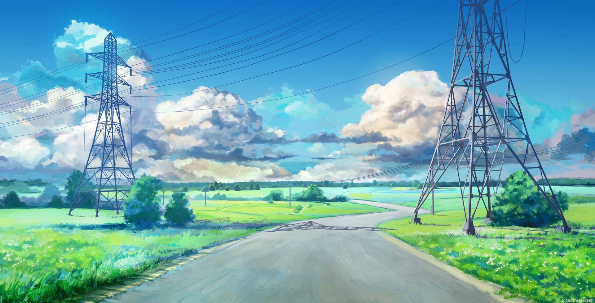
 arsenixc — Village

Published: 2010-07-18 20:38:53 +0000 UTC; Views: 62320; Favourites: 1730; Downloads: 3258
Redirect to original
Description
village landscape.4-5 hours.
Related content


Comments: 82


Looks like very nice still life. However the colours - especially the green of the grass - seem me too expressive.
www.environment-textures.com/?ref=de32
👍: 0 ⏩: 1

Amazing, the colours are very fresh and ...refreshing. Gosh, I need a better vocab list.
👍: 0 ⏩: 1

I really like this one...I have a soft spot for traditional landscaping...and this digital version is right up on that tier. Excellent use of color, and everything about the painting works well with all the other components. Very good!
👍: 0 ⏩: 1

Love all those bright colors, especially on the planks making up the structures.
👍: 0 ⏩: 1

lovely painting! I am thinking all these things I usually don;t consider outside of my art critiques
")
👍: 0 ⏩: 1

What a beauty!
Just so you know, in my computer I have a very personal collection of backgrounds that I use as references and Inspiration, this one went straight to it.
I would have made the goats on cell shading and added some FX, just as wind or smoke to add some life to the whole result, but that's just because I'm a cartoonist deep to the bone.
The composition is really good , as is the palette. What amazes me the most is the clouds. Most people kill the drawings by using photoshop cloud brushes. But you not only painted them, you painted them correctly and you made them help the composition and helped the focal point with them.
Congratulations.
👍: 0 ⏩: 1

This is really interesting because you've got all these colors you don't usually see on a building like this, but it looks *right*. It doesn't seem incongruous at all. Beautifully done.
👍: 0 ⏩: 2

Yup! You point this very accurately. Colors are great, overall this image brings calm and warm feelings  (Smile)")
👍: 0 ⏩: 1

Very nice and bright, I like all the colours in the wood too.
👍: 0 ⏩: 1
<= Prev |