HOME | DD
 asinineCompadre — Lollipop

Published: 2017-06-12 12:45:33 +0000 UTC; Views: 232; Favourites: 21; Downloads: 0
Redirect to original
Description
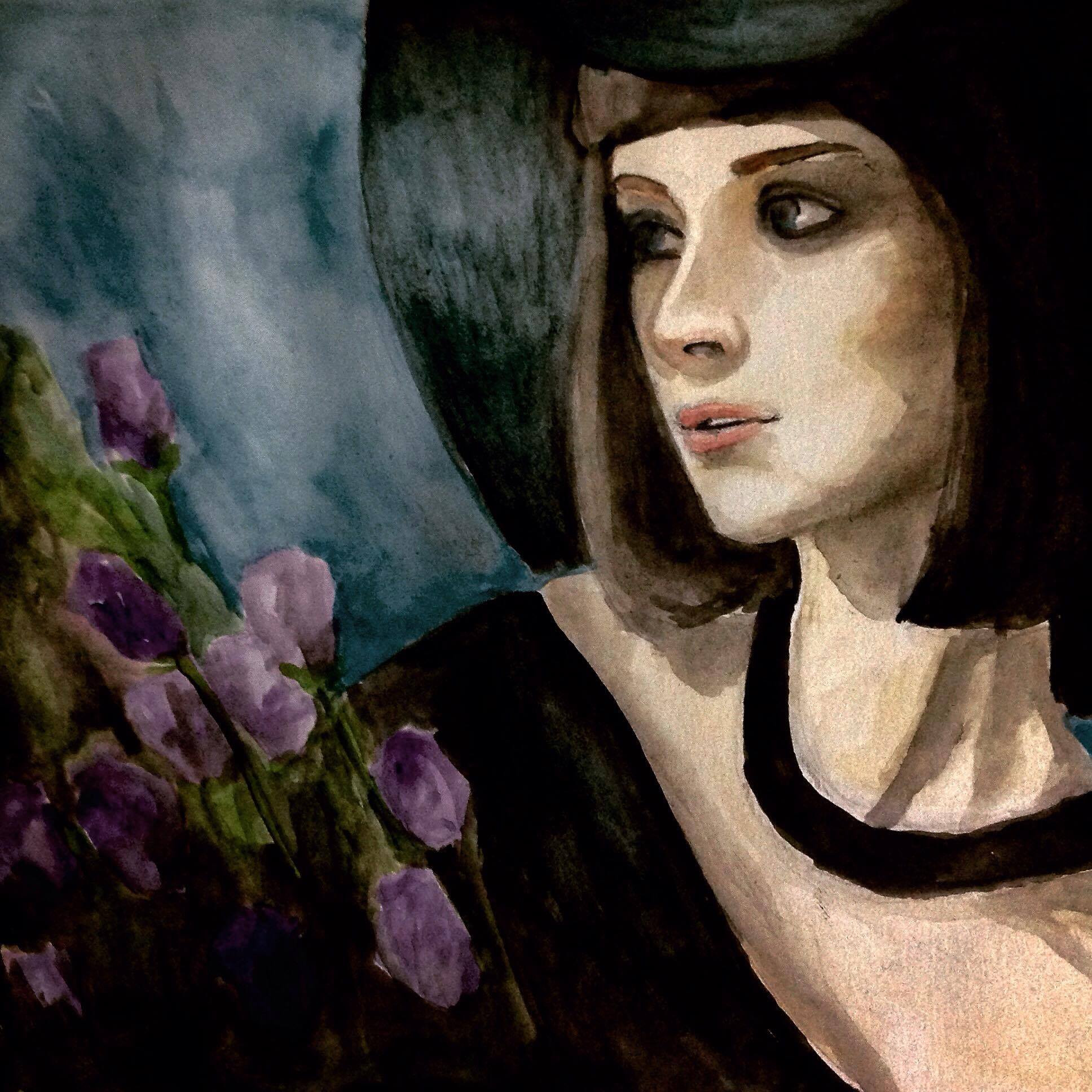
testing out new watercolor pencils right now!! ill try to do a serious painting this week haha hopefully school doesnt get in the wayRelated content


Comments: 9

Hello! I'm from ProjectComment and I'd like to review this piece if you don't mind!
The first thing that I'd like to mention is the wonderful attention to proportions of the face! I really like how you made it look realistic, despite the somewhat awkward facial expression. The only issues I have with the anatomy of the person is the neck in relation to the head. It seems somewhat thick and bulky, albeit well shaded, and looks just a bit large for the head. I also noticed that the lines are a bit inconsistent, and when there is linework, it appears to be somewhat sketchy, as opposed to smooth. But since you drew it with watercolor pencil, it makes sense that it would bleed just a bit. The other thing I would like to mention is the beautiful color choices! I really like how the colors look together, but the face in particular looks a bit dirty, or bruised. It still looks nice, just not very smooth. The expression, as mentioned earlier feels a bit off, but I can get an idea of the expression you were trying to create. The last thing I'd like to point out is the shading on the lollipop. It may be just a personal thing for me, but It looks very dull for a piece of sugar candy. I work with sugar, though, and the shading is otherwise gorgeous, so the thing to improve that would be maybe more intense shading on the highlights of the lollipop. Overall, I really like this piece and you are very talented and must've worked very hard to get where you are now!
Thank you, and have a good evening!
👍: 0 ⏩: 0


Hi there, I'm Klick from ProjectComment . I like water colours, but don't have much experience with them. I recently bought a watercolour pencil set but it was just a few basic colours. About a dozen I think. Not sure if you happened to have access to more colours or are just really good at shading and blending.
What stood out most to me was the colours used. The pinks and purples pop well against the simple blue background. Though, I may of chosen a different colour for the lolly or perhaps made the colours a tad more saturated to it stands out more.
Some of the brush strokes can be seen in places you don't want, like in the hat. Going over with clean water, either with a soft brush or some kind of sponge tool can help with that. Also, there are a lot of tinny white gaps in the picture, likely due to you not wanting to overlap the background with the person. I have no real advice on how to fix that other then practice.
The anatomy of the person itself over all is very good. I think you did a beautiful job on the face and general pose. However, as mentioned the neck is a bit too thick. Also, where the hair starts/falls looks a tad odd as her forehead is extremely big. Bringing the eyebrows up a bit may also help with that.
Anyway, it's a nice, elegant piece
 (Smile)")
👍: 0 ⏩: 0

This woman's having a much better day than me. I mean, SHE gets a lollipop.
nice art by the way, the watercolor looks really nice and I like the hat and how it looks so peaceful. <3
👍: 0 ⏩: 0

Heyo! I'm from project comment!
I saw your piece and really liked it. I like the small purpled highlights that accentuate the piece. The expression on her face and the general colors are really beautiful. The composition of the colors is really nice as well. Altogether a great piece, especially the precision on the eyelashes. I don't know anything about watercolor but this is a really light painting. Great work. ^_^
👍: 0 ⏩: 0

Hi, I'm came from
This looks pretty good for a watercolor test. It has a good variation of colors that go very well together. The perspective/anatomy of the face could benefit of a bit more practice and study but overal it's a nice 3/4. The "framing" makes the picture well balanced between interest area and negative space.
A few points to improvement: her neck is far too large for the head, and the muscles and bones doesn't seem quite right, I suggest to take a look on anatomy of neck and shoulders. I think her face could be a little more expressive, and also, the contrast could be raised since there's little difference between the values
I hope that helps!
👍: 0 ⏩: 0

this is amazing i love this piece so much its so beautiful
👍: 0 ⏩: 0

hey there, i'm from project comment!
this is a really nice piece. i love the use of warm colors on the subject, cool colors in the background, and the blend of both in the lollipop! i also think that the shading in this piece, particularly on the hat and the person's neck, came out well. a couple things you might want to think about here; the head is a bit small, proportion-wise. i would also recommend going back in with a wet, color-less brush and smooth/blur out some of the line that are surrounding certain aspects of this piece, like the subject's fingers and their collar. smoothing those lines will help this look more like a painting and less like a painted drawing, if that makes sense. nice use of cooler colors in the reflective shadows near their eyes and along their chin, though!
👍: 0 ⏩: 0

I love water colors they're great, and this looks beautiful, amaznig job!
👍: 0 ⏩: 0