HOME | DD
 ass-itch — constructure - dC

Published: 2003-08-27 03:08:31 +0000 UTC; Views: 3489; Favourites: 74; Downloads: 2254
Redirect to original
Description
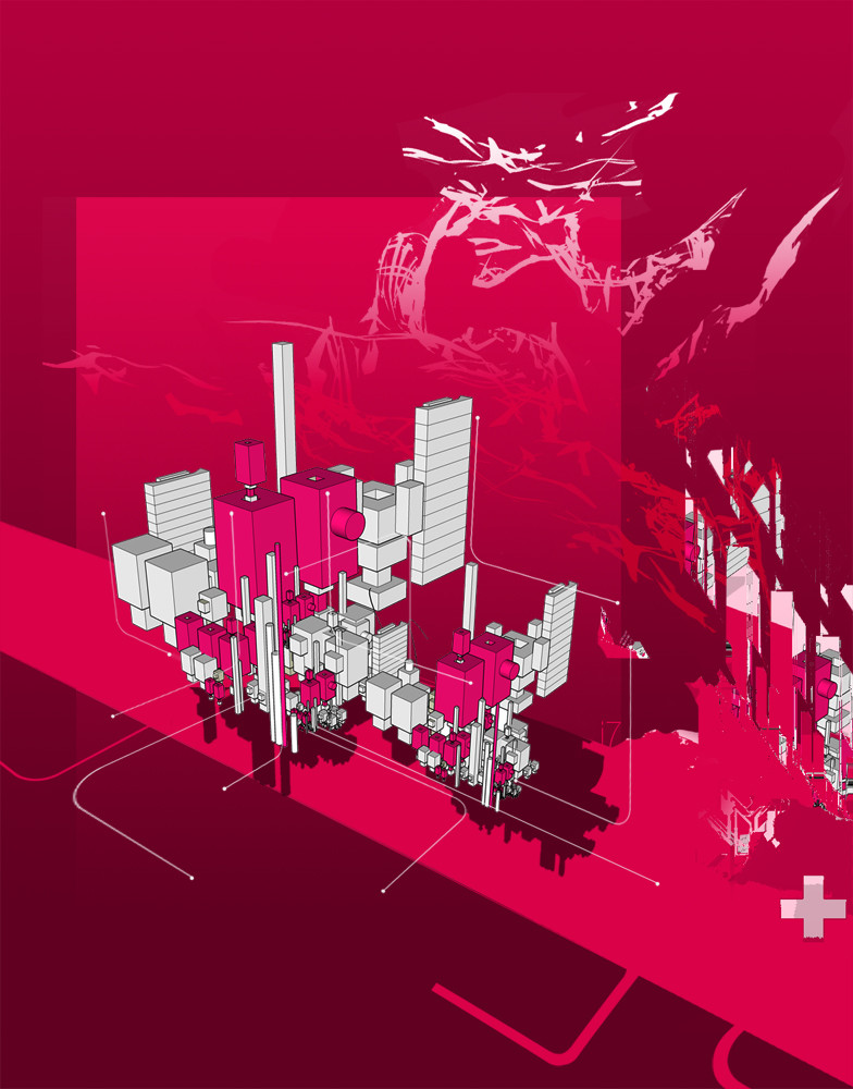
my one and only piece for depthCORE's 9th pack, Technica.enjoy.
Related content


Comments: 101


Fanatastic 2D work. Loving the colors and 2D work. Awesome renders too.
👍: 0 ⏩: 0

so simple, so clean! I really like this piece. Not overdone and not too trendy. Great, modern contrasts!
👍: 0 ⏩: 0


interesting.. 2ds are nice
I love the pink.. n purple

👍: 0 ⏩: 0


"an absolute killer
forms, colours and composition
quality."
Agree with Ekud.

👍: 0 ⏩: 0


ok this I like, the colors is a bit gay but I like them anyway ;o) *peace
👍: 0 ⏩: 0

Solid structure, and nice 2d and colors man. great piece.
👍: 0 ⏩: 0


I like it, I think the colors are very nice, and the way the picture is put together. Its very artistic, and very well created, nice work
👍: 0 ⏩: 0

I like the use of the unusual colors and cool forms.

👍: 0 ⏩: 0


its a good pic .. just a bit to off balance for me .. colors are new and different  (Smile)")
 (Wink)")
👍: 0 ⏩: 0


Awesome!!!! Very nice work. Simple but Detailed.
Great use of colors. Overall Great Piece!
👍: 0 ⏩: 0


looks like some unfinished buildings all swimming around in the netherworld between concept and applacation.
👍: 0 ⏩: 0

Boom there go the scales 
👍: 0 ⏩: 0

It's simple, but that's what makes this piece good. When a piece is too complex, it takes away from the things that should most be seen. good work.
👍: 0 ⏩: 0
It's simple, but that's what makes this piece good. When a piece is too complex, it takes away from the things that should most be seen. good work.
👍: 0 ⏩: 0


i really like this! your use of colours, everything O_o; awesome work man, keep it up
👍: 0 ⏩: 0

interseting use of that gradient .. looks quite spiff. like the way the 3d element fades out into the open. 2d is perdy as wel -- all in all, fantastic experimentation.
👍: 0 ⏩: 0

interesting style from you, the only porblem with it is the contents. Sounds like it needs more elements to form a better composition rather than just some planes
👍: 0 ⏩: 0

I think its perfect... i love the 2d and i love the colors...
👍: 0 ⏩: 0

Excellent piece. I think the 2d fits in great with the piece. I would have liked to see the render a bit more sharp is spots but it's still great.
👍: 0 ⏩: 0


The whole thing seems to small and compessed. but i will still +fav it.
👍: 0 ⏩: 0

nicw work man! i like the colors.
i wish i could do sumthin like that.
👍: 0 ⏩: 0


I REALLY LIKE THESE KINDA STUFFS >>>ROCKS
cheers,
shan
👍: 0 ⏩: 0

| Next =>