HOME | DD
 atari — Halfway Descent Failure beta

Published: 2002-02-26 05:06:46 +0000 UTC; Views: 719; Favourites: 2; Downloads: 68
Redirect to original
Description
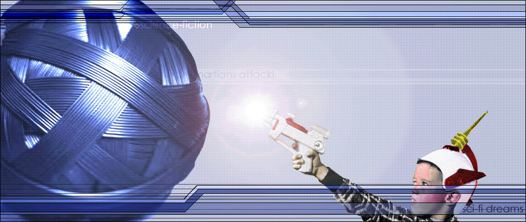
Yes. It's been a long time since I've submitted a wallpaper. But, here's a new one, it's definantly not done though. Just want to see what people think so far??? This one is basically inspired by a song about being a guy trying to get a girl that's way out of your league. You all know what I'm talking about. Everything in the image, suprisingly, relates to this, Failure, Time, Communication, etc. But yeah, I'll shut up now.Yes, I did spell "decent" wrong on purpose. I'm not gonna go into why, because I'll be leaving that out of the final version.
Related content


Comments: 10

These colors are really cool. They look awsome together.
-----
.caustic.
I hate numbers.
👍: 0 ⏩: 0

Oh if you had this in a larger size i'd use it,
-----
[.iji._.elle._.slave.]
👍: 0 ⏩: 0
pixelhunter [2002-03-05 04:36:49 +0000 UTC]
Impressive work dude.
I just think the colors are a bit contrastive.
-----
---------------
+Pixelhunter+
+Shadowness Staff+
+http://www.shadowness.com+
👍: 0 ⏩: 0


the textures and colors are good
and i usually don't like typography
but you pulled it off nicely here
-- D
👍: 0 ⏩: 0


i agree with digismack. The right side is great. Text manipulation and whatnot. I dont like the lines seperating the sides. 4 lines just seems like overkill.
I wont comment to in depth on the left side since i assume thats the unfinished portion, but the clock thing looks great. Whatever is behind it...looks sorta blurred but its not really a smooth blur..anyways, i would change that.
Looks good though
👍: 0 ⏩: 0

the right side owns.. the left side is too wierd for me lol
👍: 0 ⏩: 0

Nice use of color and visual interpretation. I've always enjoyed looking at interpretations of music through imagery.
I also think the placing of the text is good, as well as its crisp, clean appearance.
Nice overall work.
-----
__________________
L Í Q Û Ï S Õ F T™
Viva La Revolucion!!!
👍: 0 ⏩: 0

This is very cool! I love the contrast of colors and everything, I really love the image blend on the left. Good work!
-----
Beauty is truth, truth beauty, that is all
ye know on earth, and all ye need to know
Keats
👍: 0 ⏩: 0