HOME | DD
 b-c —
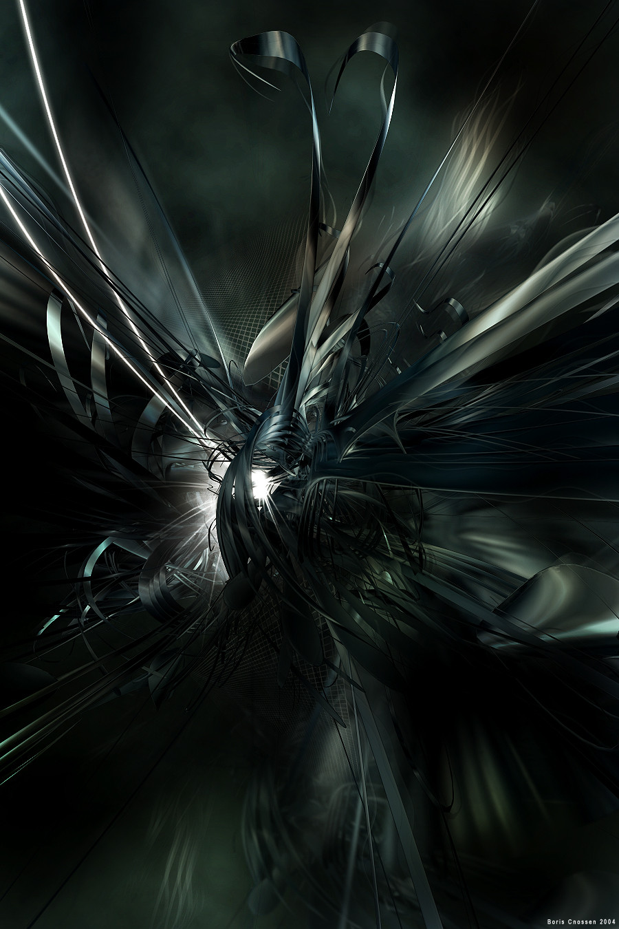
Cold Storage
b-c —
Cold Storage

Published: 2005-02-01 13:43:05 +0000 UTC; Views: 23699; Favourites: 655; Downloads: 4754
Redirect to original
Description
Boris Cnossen - 2005made some small adjustements, keep giving those critics
Related content


Comments: 132

Brilliant, and definitely inspirational. Still staring at it  (Smile)")
👍: 0 ⏩: 0

it sorta reminds me of how they put dead ppl in the hospital in those freezer things. A long time ago I watched this show where they put this one dead guy in one of those, and then they took him back out later for an autopsy or something and he came back to life. Later in an interview he said he sorta remembered being dead, and they showed like neurons and stuff zinging around like this, but it was in BW. That's what this reminds me of, but not as scary as that
👍: 0 ⏩: 0


i have no idea how youve done it... but is amazing...
👍: 0 ⏩: 0


Wooow.................what is it?
no i am just kidding...great job....like the colors
👍: 0 ⏩: 0
toshimarise [2006-03-30 17:00:18 +0000 UTC]
What sets this apart from others of its style is the rythm and repitition of the curves and the bubbles... the curves lead your eye all around the piece and then direct your attention always back to the "fountain" in the upper right quadrant. Beautiful. Especially the "foreground" arch and just behind it in the upper left, which remind me of angel wings (and not in the cheesy bishounen-with-wings sense- like a real, powerful abstraction of the wings of angels). The ghostly white "clouds" are perhaps a bit busy in places, but I do like how they seem to be the light source.

👍: 0 ⏩: 0

it look very beautiful i love this! i added it to my favorites
👍: 0 ⏩: 0


Excellent picture, i think you could improve it by adding a red element inside, perhaps giving it a frozen aspect to keep the idea of cold given by color.
Congratulation for it

👍: 0 ⏩: 0


Awesome work!!! what can I say
..Keep up the excellent work
"Life is not about how many breaths you take,
but about the moments that leave you breathless"
👍: 0 ⏩: 0


needs to be a print...I waaaaaaaaaaaaaaaaaaaaaaaant....
👍: 0 ⏩: 0


wow.... dont usually like shiny look, but wow.... whatd you make it in? its so cool

👍: 0 ⏩: 0


from compositionla point of view,the piece is wrong...It's much much too loaded with detail you get lost into and the message it supposedly sends is in conflict with the piece itself.Another thing I find very disturbing at it,is the fact that the composition is spread out over the whole page,making it seem very messy and random.I'm sure this wasn't made according to the laws of composition,arranging the "objects" over interest poins or power points.However I like the crispiness of the image and the good render quality.And by making that remarke,I think I covered all of this image's + points.I just don't understand how everybody gets excited when they see just another 3d mixed media work.It's a trend that everybody feeds with remarkes like wow or amazing job...Art is not all about randomness and chaotism... it has parts linked to math,philosophy and religion (and by saying that i'm not talking about a piece's subject,but by the way it's composed).I hope you won't hate me for not beeing part of the big "flock"...
👍: 0 ⏩: 1

Quite agree with most of the part I also think it could be carried out a little better. I am also that type of person that will speak what I feel when I see a art piece with a flaw or at least something that is not clicking my head. I think there a very few people like us on deviant art but hey is all good for the constructive critique here.
my crtique on the art piece:
The color works well but the overall structure and overview just seems to fall a part. If you focus on certain areas you can see many mistakes and how the lightning is wrong and just dosen't fit. But hey good job on it.
👍: 0 ⏩: 0

w00+
thats reallly awesome
&& it looks chaotic,
i love chaos
👍: 0 ⏩: 0


Shiny! ")
👍: 0 ⏩: 0


 (Wink)")

no offense or anything but this style is getting really redundent.
it might be even as redundent as all the anime art on this website.
anyways nice job i really like it.
reminds me of a 1000x zoom of some slimy grimy spit in really dirty water
congrats on your dd too
👍: 0 ⏩: 0


that is totally beautiful. wow. congradu-freaku-lations... yay.
👍: 0 ⏩: 0


I love the flow of this picture!!! the forms seem to really be living!!
👍: 0 ⏩: 0


i love the top of the render, it is awesome, with great colour scheme but perhaps u should put depth to make it mroe interesting, anyway that is just my opinion, gj^^
👍: 0 ⏩: 0


absolutly beautiful!!
i dont know about the green though...
any way - beautiful!
👍: 0 ⏩: 0


!!!! WOW !!!!
Realy great. Thats fantastic. How did u made it?
Greetings 2B1
👍: 0 ⏩: 0

i love the color in this piece....kindalooks like in a swamp...a very nice peaceful clean swamp..")
👍: 0 ⏩: 0

| Next =>