HOME | DD
 Balsamique — Before and after
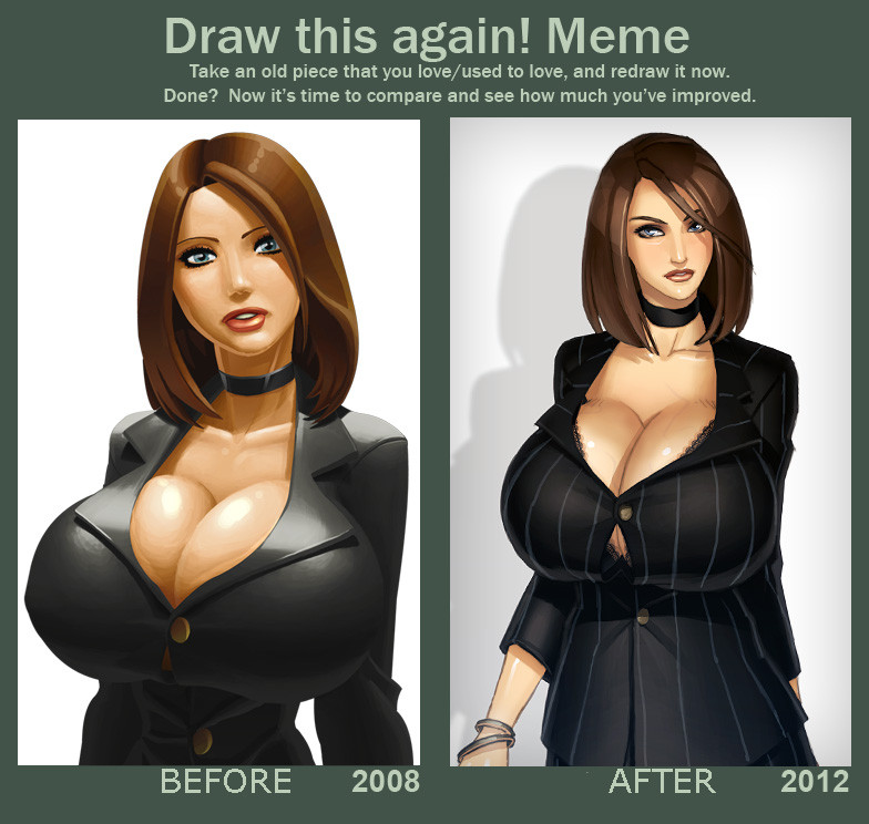
Published: 2012-08-17 13:15:31 +0000 UTC; Views: 158213; Favourites: 2606; Downloads: 2783
Redirect to original
Description
had fun with the boobs of one of my old draws, with his smartphone : www.dailymotion.com/video/xsuc… . (Dailymotion Link Broken)I laughed.
But it's a draw I don't really like anymore, easy to understand why. So I have drawn it once again.
It's so strange...
Related content


Comments: 133

thanks for the critique. I quite agree. I have been a little bit fast for the last draw. I'm sure it will be better in 2016
👍: 0 ⏩: 1
Planning four years ahead? I'm lucky if I can manage one(!). However, if you can still be improving in, and for, another four years, more power to you.
👍: 0 ⏩: 0


like the new look, it gives it a sense of...i don't know, style? anyhow, nice improvement! ^^
👍: 0 ⏩: 1
Thank you... Yes, "style". I look for a good mix between the artists I like.
👍: 0 ⏩: 1
lol, you're welcome. Haha, good idea. I cannot do that because...I just suck. xD
👍: 0 ⏩: 0

Much better details on the 2012 one, but the older one still looks damned good too.
DA
👍: 0 ⏩: 0

the only area that i can see you not improving in is the breast veins. not sure if that's a kink of yours or you injecting some realism in your art, but it's kinda strange.
👍: 0 ⏩: 0

XD yaay. I like the 2012 ver but to be honest I'm not a fan of the stripes. If it were a true pinstripe suit with thinner lines I would like it better. Also, while I like the style of the new one I prefer pose and breast shape of the old one. This is because you can see her figure more, and to me the boobs to waist ratio is very important to see even if the breasts are super ginormous. Other wise you may get the impression that she's a bit chunky behind the boobs. but other wise I love it!
👍: 0 ⏩: 0

I actually like them both every much.
👍: 0 ⏩: 0

Both are fantastic, but the overall Finnish of the newer one shows good improvement. Gorgeous!
👍: 0 ⏩: 0


Ooh, I love both of them, but I do think the new one is better 

👍: 0 ⏩: 1
yes, you're the first to mention the bra. I like lacework.
👍: 0 ⏩: 1
I love lacework too
👍: 0 ⏩: 0

Well... we can tell which one paid a doctor for theirs...
👍: 0 ⏩: 0

Je trouve que tes deux styles se valent très bien, celui de 2008 est plus orienté comix alors que le 2012 est plus réaliste.
Cependant, on voit clairement que ta technique n'est pas la même sur leurs "arguments" ")
Quoi qu'il en soit, chapeau bas  (Wink)")
👍: 0 ⏩: 0

nice, I like both version. But I'll admit the 2012 is better.
Plus the smartphone version made me laugh my arse off.
👍: 0 ⏩: 0

I like the really dark black on eyelashes giving contrast on the before picture, but otherwise the after pic is way better. Especially I love the color & coloring on hair  (Smile)")
👍: 0 ⏩: 0

This is the best "Before and After" thing I have ever seen!
👍: 0 ⏩: 1
Thanks. This one is pretty funny too : [link]
👍: 0 ⏩: 1

The right is a lot better with the colors. I like the actual shape of the left one though a lot better. The left one... the tits are nice, but the face as well draws you in. Whereas the right one it's just 'DEM TITTIES!'. Since you made her head and shoulders so much smaller and thinner compared to the older one and didn't give her much of an expression.
Unless you were aiming for the 'DEM TITTIES' look. Then it's perfect.
I really like that left one though has it's own attitude to it.
")
👍: 0 ⏩: 1
I have corrected her sight and some details to makes the 2 draws more comparable.
👍: 0 ⏩: 0


I actually prefer the doll-like quality of the original, rather than the new one. The disconnect makes it more comforting. As a woman, I know that no one should ever have tits that huge.
👍: 0 ⏩: 0

Okay, there are definitely places where you improved, but I gotta say man--the comparison is made a little hard by a couple things
1, you added more detail, but you changed the expression. The fact that she's looking away from us and no longer smiling with wide open eyes makes her less appealing. A less than intuitive fact is that our brain perceives a subject as more beautiful if they give the facial clues of liking us, ie, smiling mouth, smiling eyes, eye contact, pupil dilation... In spite of the breasts I find myself drawn to her face.
2, you made the hips broader, which makes it more realistic that the breasts would fit on the frame, but you shrank the width of the shoulders and gave her a super skinny face. The face particularly on the first one was more naturalistic, and IMO made the older one look more cohesive.
3, subdued tones do tend to make people think "sleek," or "professional," but the vibrance of the first one was really nice... It really feels like more a different style than a straight improvement in that aspect.
Now with all that said, I feel it worth pointing out that there are significant improvements lest ye misunderstand me.
1, the details and texturing are better and give the picture a less plastic look.
2, if you were going for comic style, you nailed it.
3, not just her hips but her waist are also significantly wider, and I think this is a good thing--part of the reason the old one looks good in spite of the tiny waist is that her right arm blends into it and makes her waist look wider until you look closely.
4, her facial features are more delicate and more refined--particularly her lips are more accurately done and look less awkward when you look closely.
I hope this was useful. ^^
👍: 0 ⏩: 1
Thank you for the critique. I have corrected sight (she now look at us) and some details to makes the 2 draws more comparable. It's the purpose of this "meme".
Yes, i was aiming to be less plastic look, and more realisitc.
👍: 0 ⏩: 0

really cool but can we see the new and old version as a single image? pretty please! please! that would be so nice of you! thx man!
👍: 0 ⏩: 0

- be me
- click link in description
- Age Restriction blah blah blah, click anyway
- watch video
- LOL that's so funny! How great.
- see porn vids on the sidebar
- *rolls eyes* The stuff I put up with, I swear... *unzip pants*
- Fapfapfapfapfap
???
Profit?
I have no idea.
👍: 0 ⏩: 0

Is normal prefer a real proportion and shape after have a lt fun with ridiculous unreal ones 
👍: 0 ⏩: 0

For some reason I am reminded of Haruka Gracia. No idea why though
👍: 0 ⏩: 1
Maybe it's just the suit, and her size
👍: 0 ⏩: 0

hachi machi isnt there a safer place she can store those watermelons? o___o''
👍: 0 ⏩: 0

I don't see it. I mean the AFETER is more pro than the BEFORE, obvoislly, but I kinda like the simplicty of the old one :/
They both look great though
👍: 0 ⏩: 0


Definitely better, especially with the new skin tone and stripes on the clothes.

👍: 0 ⏩: 1
I'm glad to read it. A lot of people are near to prefer the old one 
stripes are useful.
👍: 0 ⏩: 1

")
TransDimentroPolitan [2012-08-17 18:03:21 +0000 UTC]
I feel bad for saying it but i like the painting style in the old one better.
👍: 0 ⏩: 0

Je préfère les proportions de l'ancienne mais la nouvelle est plus réaliste ce qui n'est pas plus mal
👍: 0 ⏩: 0


Face is improved, but I like the 2008 boobs better. 2012 boobs are a bit saggy for my tastes.
👍: 0 ⏩: 0

Personally, I prefer the rounder/firmer look from 2008 but the shading and texture work on the 2012 version is definitely better.
She also looks a cup size or two bigger in the new version which is always a plus.
👍: 0 ⏩: 0

| Next =>