HOME | DD
 Benjigarner — Photoshop Icons
Published: 2008-04-16 12:50:08 +0000 UTC; Views: 67672; Favourites: 415; Downloads: 20474
Redirect to original
Description
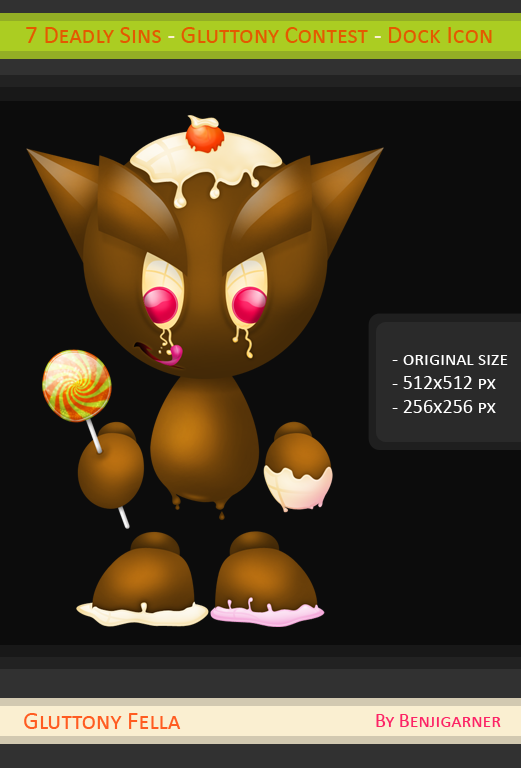
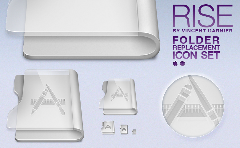
Remake of an old work.
Photoshop
Colors : Original / CS3 / Pink / Fresh Green
Files : ICNS (with resource–fork) / ICO (Compatible Vista) / PNG (512x512 px)
Sizes : 512 to 16 px
Hope you'll like it
")
Related content


Comments: 201


Wonderful as always . Great Job mate.
👍: 0 ⏩: 1

Travail Impressionnant Bro
Original and New
👍: 0 ⏩: 1

Le style est coule  (Smile)")
👍: 0 ⏩: 1

Really really nice, thank you for the art.
👍: 0 ⏩: 1

they look nice, but to glossy for me.
if you could add some textures, probably even noise - that would me supergood
or if you coould share psd that would be superpupergood
👍: 0 ⏩: 1

I will try some other effect on it when I don't know what to do.
Not the .psd for the moment
👍: 0 ⏩: 0

Très joli,
L'effet "glossy" est très réussi
👍: 0 ⏩: 1


Très belles icônes, moi je trouve ça original.
A quand le portfolio?

👍: 0 ⏩: 1
Content qu'elle te plaise
Ba le portfolio, j'y pense, j'y pense
👍: 0 ⏩: 1
Tu devrais, car tu as fait beaucoup de chose
En tout cas je t'y encourage
👍: 0 ⏩: 1
depuis longtemps j'ai envie mais bon jamais je me suis lancé
👍: 0 ⏩: 1
Il te manque peut-être les idées? moi aussi j'ai mis le temps avant de le faire
👍: 0 ⏩: 1
Non les idées m'en manques pas faut juste que je concrétise
👍: 0 ⏩: 1
Alors fonce quand tu pourra et voudra
👍: 0 ⏩: 1
Je pense que pour les vacances d'été j'aurais mon portfolio
👍: 0 ⏩: 1
Ah oui, tu auras plus de temps pour toi
👍: 0 ⏩: 1

Il a une forme bizarre mais c'est propre et j'aime les couleurs
👍: 0 ⏩: 1
Héhé oui forme bizarre
Merci zep
👍: 0 ⏩: 0


Fine!
You can give tutorial on which did an icon?
👍: 0 ⏩: 1
Thanks
I've no time to make an icon but there is some nice tuts and nice methods to do icons, like this one > [link]
👍: 0 ⏩: 1
You know still what tutorials on creation icons Photoshop CS3?
👍: 0 ⏩: 1
No ")
👍: 0 ⏩: 0


bravo pour la forme, super
les effets sont superbes, et sinon moi aussi je préfère la version principale
tu ne t'arrêteras donc jamais de progresser?
👍: 0 ⏩: 1
Merci Alex
Ba là c'est pas vraiment moi qui ai progressé, c'est plutôt que j'ai essayé d'améliorer l'ancienne icône. En effet sa forme plaisait beaucoup, on m'a demandé récemment une version en 512 et j'avais depuis longtemps l'envie de la refaire
Mais en tout cas j'espère ne jamais arrêter de progresser, la vie est faite pour ça
👍: 0 ⏩: 0

Au contraire je préfère l'icône principale, très bien imaginée cependant je n'aime pas trop la forme de la pointe...  (Wink)")
👍: 0 ⏩: 1
Moi aussi la version principale est ma préféré
Pour la forme quelque chose m'avait inspiré à l'é
👍: 0 ⏩: 1

J'aime bien les 3 versions en bas mais pas les couleurs de l'icône principale qui sont celles de l'icône d'origine et que je n'aime pas
")
👍: 0 ⏩: 1
C'est pour ça qu'il y a le choix
👍: 0 ⏩: 0
<= Prev |