HOME | DD
 BillyNunez — Disturbing Tha Peace Contest

Published: 2007-08-07 21:50:50 +0000 UTC; Views: 24055; Favourites: 650; Downloads: 2381
Redirect to original
Description
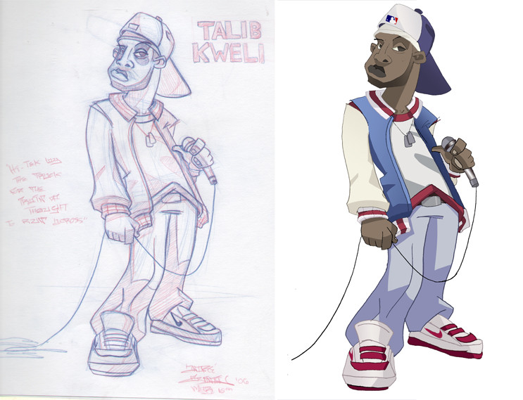
This is what I did for the Disturbing Tha Peace album cover contest...Heres a link to the winner....[link]
W.T.F.
X(
Related content


Comments: 146

I love the way the blue lines cut through the warm tones. It really sets off the entire piece. I think your art would fit in more with a group like Jurassic 5, anyway.
👍: 0 ⏩: 0

yeah yours is dope.
i wouldnt look twice at the winning illustration.
great job!
👍: 0 ⏩: 0

B-but...THE CHAINS REPRESENT THE STRUGGLE!
Oh my goodness...the nerve of some contests.
👍: 0 ⏩: 0

I guess the winner still has to wash cumstains after giving blowjobs to all the judges.
👍: 0 ⏩: 0


looks like you were robbed, obviously didnt have ludacris judging that one
nice job!!
")
👍: 0 ⏩: 0

yeah i feel you some times they just don't respect a artist point of view, You got a hundred on my count! Keep it up winner!!
👍: 0 ⏩: 0

fuck that winer your work is better i think!!! Amazing!
👍: 0 ⏩: 0


SON! Fuckin SPEECHLESS yo, UNBELIEVABLE! We need to figure out a way to collab on some KILLA PIECE!
👍: 0 ⏩: 1


man thats highway robbery! bet money its cuz of the purple and green. its freaks some people out. I just tried the same color scheme on a mixtape cover and it didn't fly. fuck'em though, I would've bought the album just cuz of the cover, but at least you got a badass portfolio piece from it.
👍: 0 ⏩: 0


Man,you got ripped off! Sorry I haven't been in touch,I've been in hospital cos of my asthma. I'll message you soon hopefully
👍: 0 ⏩: 0

I would like to say that this cover art is more exclusive and interesting than the winner...whatever floats their boat...keep up the good work!!! TITE!
👍: 0 ⏩: 0

i cant believe that you dident win.
they could have made the winner cover themself.
def a fave from me
👍: 0 ⏩: 0


FROWN. Yours is far superior. They have no taste.
 (Smile)")
👍: 0 ⏩: 0

should've thrown some chains and bricks on your shit. totally would've won ahahha. this is ill man!
👍: 0 ⏩: 0

Isn't it obvious why you didn't win. You have African Americans on your entry. The winner has chains!
Your work is far better than that insipid photoshop thing. Boggles the mind....
👍: 0 ⏩: 0

Are you serious.How did he(or she when).That shit sucks!.When i look at yours it make makes me feel good.
👍: 0 ⏩: 0

you shoulda got that one...that winner looks like some Photoshop bullshit
👍: 0 ⏩: 0

Ah man! I feel your pain! Yours is waaaaaaaaaaaay more pleasing to the eye! Plus, not to down talk the winner, but theres nothing that signifies the NUMBERS part of the title!!! Anyway, your pieces are full of life and any recording artist would benifit with your take on thier album cover!
This reminds me of the contest for Janet Jacksons 20 YO album cover! lol I didnt win either!!! o well.
👍: 0 ⏩: 0

same thing happened to me bro....
and yo your cover would have sold more than the winner
👍: 0 ⏩: 0


mAN forget those who keep it WACK!!!
YOU did what they asked for and conveyed the message much better than that other piece. This is so much stronger. PLUSFAV for me.
Peace.
👍: 0 ⏩: 0

Nicely done. This would look amazing on a 12" vinyl record cover.
👍: 0 ⏩: 0


Man, brother peace to you and realize that everything happens for a reason!! The fact that yours is better on all points is not even remotely in question!! But I guess you never really know what the client wants! I'm sure you could do what won in your sleep!! But at least this gives you an excellent piece in your portfolio and the adulation and praise of your fans!! The work that won is forgettable while yours is timeless!! Keep ya head up and doing what you do bro!! Your stuff is amazing!!
👍: 0 ⏩: 0


wow man that is an amazing peice. It is so sad they chose something so lame. Seems like they went with what they probably thought was safe or they probably over looked yours cause this is so well done.
👍: 0 ⏩: 0

lol WHAT?? how in the hell was the winner chosen.. by raffle???? that'd be the only possible explanation for that contest.
👍: 0 ⏩: 0

Sad that Ludacris was a judge and that other one won. Awesome work anyways man.
👍: 0 ⏩: 0

I think they must have forgotten to give yours to the judges - the winning entry is garbage.
👍: 0 ⏩: 0

It looks awesome!! I definetly prefer your design to the winning one. I don't know what the group's concept is, but.... I still like your's better. For whatever that's worth.
👍: 0 ⏩: 0


Pretty, it would be possible still to work at least on the typography.
👍: 0 ⏩: 0

yo that's BS man, yours is more relevant to the album's title AND it's done better......but it's over ain't too much you can do about it now. but hey you got a bad ass piece out of it
👍: 0 ⏩: 0


shit pimp you got bamboozled on this one.
did DPT vote with their eyes close or just go eeeny meeny miney moe...
👍: 0 ⏩: 0

omg...this work is simple fantastic...i don't get it...why you didn't win and why they choose so creepy project ?
👍: 0 ⏩: 0

That's tight, fam. They definately chose the wrong one. Cats probably thought they were too gangsta to be a cartoon.
👍: 0 ⏩: 0


 (Wink)")
| Next =>