HOME | DD

blackice — deviantUNITE Elevation header

Published: 2002-06-12 05:59:54 +0000 UTC; Views: 2344; Favourites: 12; Downloads: 77
Redirect to original
Description 
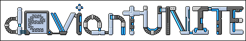
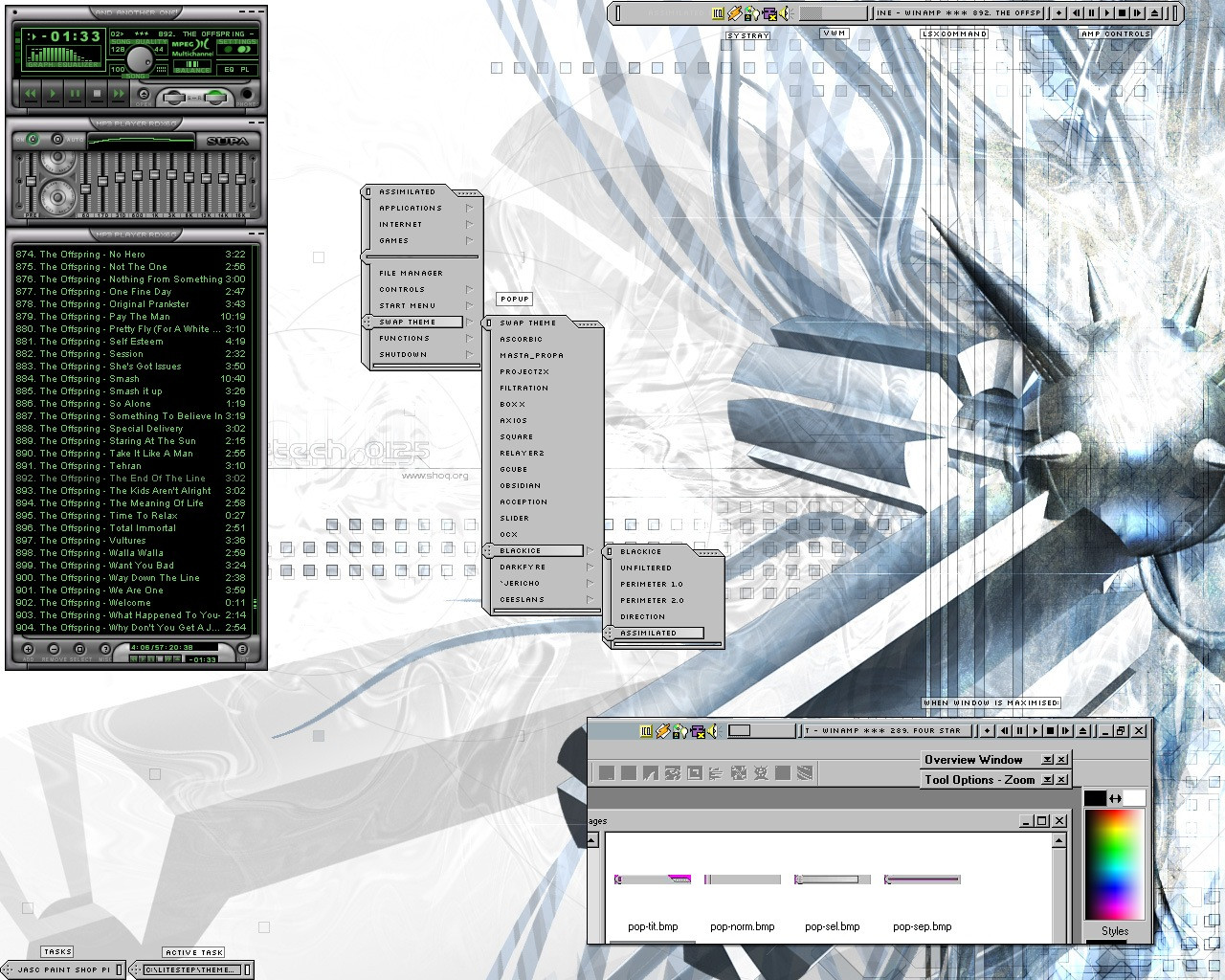
a header for a project. some of you will know what it is, the others won't.
if you don't, be patient; you'll find out soon enough.

mm I love sounding ominous.

full view for full sexyness.
Related content
Comments: 25

pyrogene [2007-05-25 21:38:34 +0000 UTC]

great, the 'e' especially

👍: 0 ⏩: 0

Scorpiogal [2004-08-21 03:21:09 +0000 UTC]

veery sexy

👍: 0 ⏩: 0

ciudadlejana [2002-11-25 18:35:03 +0000 UTC]

this is looking very good

👍: 0 ⏩: 0

paroxysm [2002-10-08 08:19:03 +0000 UTC]

i was wondering who made this. nice...

👍: 0 ⏩: 0

halfliquid [2002-10-04 18:10:44 +0000 UTC]

Great idea and spiffy (as always) pixel work.

The different styles in the letters .


👍: 0 ⏩: 0

alness [2002-09-27 22:54:09 +0000 UTC]

fuck me add a f inbetween the i and the t :[

👍: 0 ⏩: 0

alness [2002-09-27 22:53:21 +0000 UTC]

nityness

👍: 0 ⏩: 0

laura [2002-08-27 00:28:42 +0000 UTC]

mmm, 1.5 header.

seriously, this really is quite good.

👍: 0 ⏩: 0

yawn2oo [2002-08-24 10:56:43 +0000 UTC]

mm .. awaits the day this will be used by millions. .. mmm.

..

👍: 0 ⏩: 0

werdna [2002-07-24 16:41:09 +0000 UTC]

ooh nice, just looking kinda small though..

👍: 0 ⏩: 0

angelsfaith [2002-07-12 01:25:24 +0000 UTC]

looks great. love the 'e'

👍: 0 ⏩: 0

id7 [2002-06-29 15:20:33 +0000 UTC]

looks cool, stylish

just don't know what it's for

👍: 0 ⏩: 0

tash [2002-06-20 16:52:28 +0000 UTC]

cool
looks a little like a jigsaw puzzle
*huggles and chocolate*

👍: 0 ⏩: 0

grandenaboverde [2002-06-17 13:43:04 +0000 UTC]

w0w, beuty!
really really c00l

👍: 0 ⏩: 0

liquify [2002-06-14 10:22:45 +0000 UTC]

this looks absolutely great, love. each pixel dropped in a perfect spot, looks gorgeous with the theme, as well. when you showed me the beginnings of this i had no idea where it was going but now that i have i'm glad the train stopped here as this is fantastic.

👍: 0 ⏩: 0

al3xis [2002-06-12 21:51:51 +0000 UTC]

one by one, damn, this is pretty good! looks like five months

👍: 0 ⏩: 0

fab [2002-06-12 17:28:38 +0000 UTC]

very good, your pixel art is BAD ASS

👍: 0 ⏩: 0

w00zy [2002-06-12 17:14:43 +0000 UTC]

=]

awesome!

👍: 0 ⏩: 0

xehirut [2002-06-12 16:36:46 +0000 UTC]

Seksi smooth Ice, I see you corrected the A up a bit... it looks a lot better. Nice job.

👍: 0 ⏩: 0

moshi [2002-06-12 11:28:05 +0000 UTC]

i really like this. your pixels are getting better each time i see them. especially the round edges are very well done. i hope i will see that in your next theme, but some oldschool 32x32x8 icons would be nice also.

👍: 0 ⏩: 0

five [2002-06-12 11:24:08 +0000 UTC]

SEXY!

👍: 0 ⏩: 0

zkreso [2002-06-12 10:24:39 +0000 UTC]

Looks great... I wonder what the project is...

👍: 0 ⏩: 0

luxy [2002-06-12 07:20:26 +0000 UTC]

Nifty cool.

👍: 0 ⏩: 0

voodoochild [2002-06-12 07:16:36 +0000 UTC]

that totally rocks, love it.

👍: 0 ⏩: 0

mojomonkee [2002-06-12 06:13:18 +0000 UTC]

nice BI, it's totally your style and i like it!

👍: 0 ⏩: 0