HOME | DD
 blake8086 — header03

Published: 2001-06-16 12:59:12 +0000 UTC; Views: 141; Favourites: 0; Downloads: 34
Redirect to original
Description
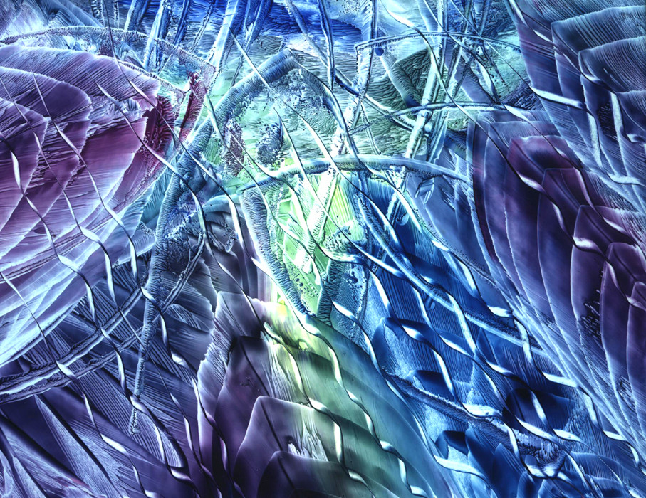
the new header for me.Related content


Comments: 4


Kind of .. um.. .. the font is no good, the mosaic effect is pretty screwed up and I don't like the scribbely stuff in the background..
Perhaps you could polish it up a bit and use a different font? But then it wouldn't be very original now would it Anyone can write "deviant art" in photoshop and stick it up here...
Get some visual content to make it look a bit more intersting.
👍: 0 ⏩: 0

Horrible use of texture and font. Ilegible. Terrible Technique... Not Clean.
No sir, not for me.
👍: 0 ⏩: 0

a bit weird but cool looking and 'phat'
sure kid, knock yourself out
unconcious
👍: 0 ⏩: 0