HOME | DD
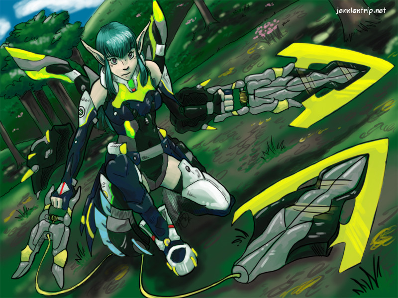
 blazef — Space Elf

Published: 2002-09-17 23:50:38 +0000 UTC; Views: 2593; Favourites: 41; Downloads: 203
Redirect to original
Description
I am just going to withdraw this picture from the contest... any vote on here can just be disqualified or whatnot...It really does seem stupid for us to battle this out... :/ It was just this whole stupid thing with Mana and I let him get to me. Well... whatever like I told that one other guy who keeps challenging me (which I think may be Mana) that I really don't like art contests... but this contest did drive me to finish a picture... which I really never do
I feel ashamed of my actions in dealing with Mana. It was very disrespectful of me... Sorry everyone.
But to Mana... all I can really say is that you really need to get past your Ego... for some reason you have a good idea of how to infect others with this Ego trip... or some friendship bonds... because in the recent weeks a few really big idiots popped out and were harassing me.
Anyway people... I withdraw this colored CG and I forfiet from the contest. It is really stupid to post something for something as stupid as this. I really enjoyed making this picture though... and I thank everyone that supported me.
Ja
Related content


Comments: 34

I was sitting at a seminar at my university when they talked about genre and I thought of mixing sci-fi and fantasy. My idea? Space Elf! I love what you've done and I'm gonna do something similar when I get my thumb outta my behind.
👍: 0 ⏩: 0

uhm all i can say is ..."Wow!" (almost got in trouble for lookin at nipples) Please don't respond to that which is in parenthises...
👍: 0 ⏩: 0

Wicked awsome art! So clean and kick ass! ^^ Her eyes are great also!! that is so sweet! great work!!!
~shorty
👍: 0 ⏩: 0

That's probably your best pic so far from the gallery... yes I don't like contest either... but sometimes they do help me to reach to another level because they inspired me to do my best.
👍: 0 ⏩: 0

Pretty... I love her hair, and all the armor/gear looks neato!
Anyways, just my opinion on things - I don't know anything about any of this, but judging just on behaviour that I have seen by your post and -their- posts within this Deviation's comments, I think you did the more mature thing. Go you! At least you can spell and use full words and sentences.. c_c; Draw for yourself or your friends, not to prove a silly point.
👍: 0 ⏩: 0

your CG style is really nice, i love the way you coloured this pic.
👍: 0 ⏩: 0

Wow. My head just exploded from the awesomeness emanating off this pic!!
👍: 0 ⏩: 0

That's sosuperfantasticallyawesome!!!!!!!!! @_@ *faves*
👍: 0 ⏩: 0

Wow... *starestarestare* Really and utterly amazing coloring work, and the picture in general - wow. I have to favorite this.
Thanks incredibly much for your comment on the Taurus pic I colored!
But man - when you can do work like this, why would you need me to color anything? O.o (I have no coloring skillz to compare with this.)
👍: 0 ⏩: 0

I am just going to withdraw this picture from the contest... any vote on here can just be disqualified or whatnot...
It really does seem stupid for us to battle this out... :/ It was just this whole stupid thing with Mana and I let him get to me. Well... whatever like I told that one other guy who keeps challenging me (which I think may be Mana) that I really don't like art contests... but this contest did drive me to finish a picture... which I really never do
I feel ashamed of my actions in dealing with Mana. It was very disrespectful of me... Sorry everyone.
But to Mana... all I can really say is that you really need to get past your Ego... for some reason you have a good idea of how to infect others with this Ego trip... or some friendship bonds... because in the recent weeks a few really big idiots popped out and were harassing me.
Anyway people... I withdraw this colored CG and I forfiet from the contest. It is really stupid to post something for something as stupid as this. I really enjoyed making this picture though... and I thank everyone that supported me.
Ja
👍: 0 ⏩: 0

Oh no, I didn't mean to say as if you had friends or something bias. it was just when attitude and such gets into it and not just the artwork... things get unfocused very quickly. Like that feces comment and other crap.
If you didn't care about the contest, why mention it in your post? heh
👍: 0 ⏩: 0
Thank you all for your comments, they are greatly respected and honored.
This CG was more on the side for just being its own piece but I put it in the contest just... for fun. It may be childish or whatever you may think but thats because I am pretty much a child
Anyway the whole contest I don't even really care about... this was just a really fun piece to color. There is no bias here, Vegeta2711, I don't know anyone whos posted on this art cept Firekitty... so... its not bias at all.
Anyway, thanks for the comments. Lataz
👍: 0 ⏩: 0

The competition was only given because blaze wanted it. . But of course his pic is a finished one. Mine is still in the process of background. Oh yea Aaegon you speak like a true artist! For that your comment is respectful.
👍: 0 ⏩: 0

Very nice! But why the competition? I'm sure everyone is very good at art in their own way!
👍: 0 ⏩: 0

Well, what can I say? This has both good, and bad aspects. Firstly, I'd take points off of both of you simply for the childish nature of this contest. There is no 'better' or 'worse' in art. There is only preference.
That said, you're asking for opinions, I'll give one.
I kinda like this picture. It was okay before you CG'd it, and looks good now. I think the eyes need a little more detail... in manga or anime, eyes are very important, and yours look a little too... simple?
I do think that the picture could have done with being a little larger. Kinda... a little less elf, and a little more background. A little setting would have gone a long way, and right now, simple space doesn't really add too much.
Out of the contect... I have to say I prefer your work, but I still think it's silly to draw to compete with someone else. If not for the contest, I'd give you a 'like', as it is, I can only say somewhat...
👍: 0 ⏩: 0

I really like this one, a def +fav, !knightofmanas can't compare. For instance; I invite you to look closely at his characters faces. #1 they look more like feces, #2 they also look like they were scanned and pasted. I rest my case
Kadias out.
👍: 0 ⏩: 0
Manaknight and Blaze.
Simply put, this contest can't be judged fairly at least by dev art people. (I've seen a lot that are biased for the most part) If you really want to settle it, I can set you up two up at another art board where no one other than me will know who either of you are. You can then see who would win in a non-popularity contest and simply off your respective skills.
Would that work?
👍: 0 ⏩: 0

looks like ryoko changed from tenchi muyo. But it is still are really cute picture
👍: 0 ⏩: 0

I like this peice, It's downright beautiful, the colouring is wonderful, the background is superbly done, and I don't see anything wrong with it right off! You are an Excelent artist. My Vote goes to you.
And it is unfortunate that you had to put this in that kind of contest...
👍: 0 ⏩: 0


Like i said blaze this competition cannot be judge fairly. One guy says my line art is better. Another says my line art sucks. Now you tell me. Oh yea, if u think you have won think again. Most of your deviants arent a month old. So they do not count. . But the competition is still going.
👍: 0 ⏩: 0

U peoples think that space efl is kool because u all fucking suck-ass.....now except this challenge......and dont be pussy.....
...u dont know what the hell u are talking about....I want a contest with all of u too....maybe u guy should refuse....since u guy suck any way....so shut ur hole if u allsuck ass...stop putting comment on other people work if u guy suck-ass....if ur good then prove it to me by beating me at this contest...other wise shut the hell up.....If u guy win I will say sorry to you.....and even call u or who ever win master......So dont chicken out look forward to ur challenge
This look like shit
👍: 0 ⏩: 0
Why u 2 bother fighting is beyond me. But, anyways I happen to like your pic better. His line art is slightly better, but your Cg is awesome.
👍: 0 ⏩: 0


This is a wonderful piece!! The proportions are really good and the cg effect is absolutely awesome *.* all bow to drawing... worship drawing *bowbow*
👍: 0 ⏩: 0

Love would describe it better, the cging on this is gorgeous and the style is very nice. I agree with firekitty on the jewels, they look great. It's a shame this had to turn into a competition piece, but it blows the competition away. Wonderful work, this is going in my favorites.
Your lineart, coloring, proportion and dynamic are far better than the piece you're in competition with. Also brownie points for not seeding insults and bias into the description, it makes the picture much more appealing.
👍: 0 ⏩: 0

Hmm... I really like this piece. I think I like yours better than the other guy's because yours looks more professionally done. I really dislike his coloring. I also think his line art could use some improvement. Yours is definitely the better anime. Good job.
👍: 0 ⏩: 0

this is much better then the other guys...his characters heads and body's are too far out of proportion...plus it looks like he colored it with crayola markers...this looks really good man...great work
-tank
-=don't fear to imagine=-
👍: 0 ⏩: 0

Oooo...the work ya did on the jewels is pretty. So shiney...
You were right tho...she does look better with the black suit.
👍: 0 ⏩: 0

WHoa...dude..that looks really awsome. She's a very cute elf. I like the coloring for it too. I especially like the hair. Very well done my man. I hope you win this contest.
👍: 0 ⏩: 0

hmm...kinda confuse about that up there...but I like the art...great job
👍: 0 ⏩: 0