HOME | DD
 bob1305 — Web Design -Richard Lewis Com.
Published: 2007-05-05 15:52:20 +0000 UTC; Views: 61374; Favourites: 362; Downloads: 5848
Redirect to original
Description
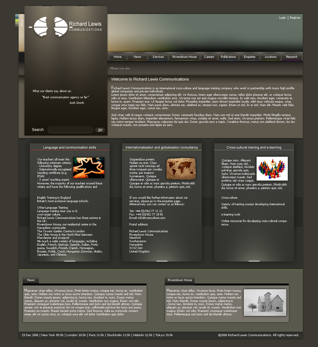
Unrealized design for Richard Lewis Communications.Related content


Comments: 111


very nice. I really like the lights coming from the bottom module areas. kudos!
👍: 0 ⏩: 0

Nice elegant design,nice touch with that light effects
👍: 0 ⏩: 0

")


I like your usage of the different levels of blacks, very nice.
👍: 0 ⏩: 1


I like your design. Really professional work ! Gratz
 (Wink)")
👍: 0 ⏩: 0

Every time I look at this, I like it more. A definite favorite.
👍: 0 ⏩: 1


Love the colors, its a bit wordy though. really like it... +fav
👍: 0 ⏩: 0

I read "Richard Lewis" had me looking all over that page like hummmm this don't seem like a comedian's page.
👍: 0 ⏩: 0

There are only a few small things I would suggest for this site. I would end the page under the three columns of text in the middle of the page (keeping the copyright bar at the bottom, of course). You already have links for "News" and "Riversdown House" in the navigation at the top. I understand that it's nice to have a couple bits of news on the front page so maybe include News with your "Welcome..." paragraph at the top. The line length in the "Welcome..." section is a little long already, imo, so dividing the information into two columns (one column for welcoming people and another for news) would help.
My second suggestion only has to do with the leading (space between each line of text). There's not much space between each line and it makes it hard to read. I also understand that you need to fit a lot of text into each section, but compacting that much information into each section contradicts the smooth, clean-lined quality of your design. The text makes a pattern which distracts from your design, imo.
The only other suggestion has to to with hierarchy of type. "Language and Communication Skills", "Internationalisation and Globalisation Consultancy", and "Cross-cultural training and e-learning" need to be larger, imo. As is, they visually get lost with the text that goes into each respective section even though a line separates each header from the text.
I really like the colors of this design. The accents just enough to add interest but not overpowering the dominant color scheme. I also like how each color designates a section of the web site, too. I think this site has even greater potential once the things posted above are addressed.
👍: 0 ⏩: 2

and thank you very much for comments. I will think about them next time
👍: 0 ⏩: 1
You are right about text size, is should be bigger. It's really not comfortable to read it for a longer time.
"Language and Communication Skills", "Internationalisation and Globalisation Consultancy" are small because the box is not wide enought to make the type larger.
Maybe "Language and Communication Skills", "Cross-cultural training and e-learning" can be larger, but "Internationalisation and Globalisation Consultancy can not be. And it would definitely dont look good to make 2/3 titles bigger then the central one.
👍: 0 ⏩: 0


")


nice, really a great work .. love the clean style and the color sheme
👍: 0 ⏩: 0


hey awesome template man
very sleek and specially like the dark theme
👍: 0 ⏩: 1


Looks really good. I've seen that little light effect with the white boxes before somewhere... still looks very nice and professional. Very clean. Logo is defiantly creative. Good job man!
👍: 0 ⏩: 1
Thanks, yep that light effect isn't very original
and thanks for
👍: 0 ⏩: 0


Looks very pro! Love the logo and the header as well
👍: 0 ⏩: 0


looks very pro. hope to see more of your works.
👍: 0 ⏩: 1

glad you like it  (Smile)")

👍: 0 ⏩: 0

| Next =>