HOME | DD
 Bobsmade — What should i print on white?
by-nc-nd
Bobsmade — What should i print on white?
by-nc-nd

Published: 2011-01-12 16:30:58 +0000 UTC; Views: 21546; Favourites: 333; Downloads: 359
Redirect to original
Description
hi friends (Smile)")
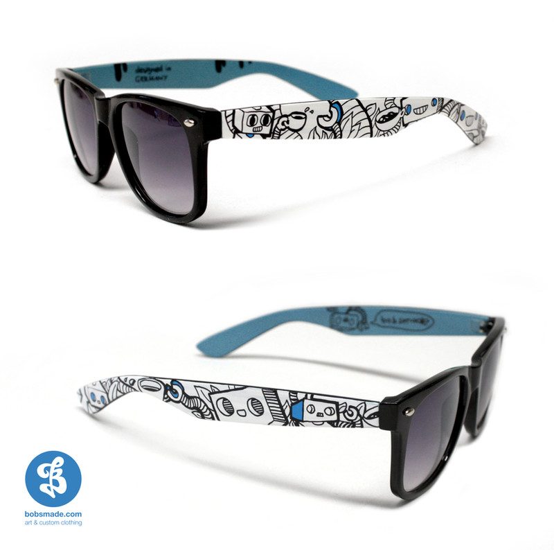
I question myself what design i should let print next time. Like you can see on the photos i tried to print the second design, but at home, so made just to many faults.
Now we going to print them by pros, and its the questions what shirt design would be the COOLEST, the HIPPEST and the One you would wear too?
please tell a number ^ ^
and big thanks for your opinion
LOVE- bobsmade
PS: all shirts we use are Fair Trade and Organic Cotton
and the Screen-print firm is our neighborhood
Related content


Comments: 297


ich würde die 2 und die 4 anziehen also eins von den beiden
👍: 0 ⏩: 0

1 is ver typical even though the design is very intricate and beautiful.
2 should be either printed on a different color or be re-sized, in my opinion
3 is amazing! I like how it connects at the bottom end. It would add a little touch if one subject was lightly colored, like the robot.
4 is unique and retro. LOVE IT.
All your work is great. Keep up the good stuff.
👍: 0 ⏩: 0

1 and/or 3! I especially like these as opposed to 2 & 4 because they seem more "free" and open! Though, all these designs are awesome
👍: 0 ⏩: 0


i like all of them but i like coloures of the 1 shirt
👍: 0 ⏩: 0


They're all amazing, but the ones I think look cooler on white are 3 and 4
👍: 0 ⏩: 0


👍: 0 ⏩: 0


2 and 3. people could colour them in if they wanted...
👍: 0 ⏩: 0


I 
👍: 0 ⏩: 0


Number 1 would be my pick for myself ")
👍: 0 ⏩: 0

Childhood and Material World look especially good on white, but they all look fine to me.
👍: 0 ⏩: 0


| Next =>