HOME | DD
 BoffinBrain — [Obsolete] DA Navigation Icons
by-nc-nd

#da #deviantart #header #icons #menu #navigation #dadeviantart
Published: 2008-03-25 00:20:29 +0000 UTC; Views: 11692; Favourites: 106; Downloads: 112
Redirect to original
Description
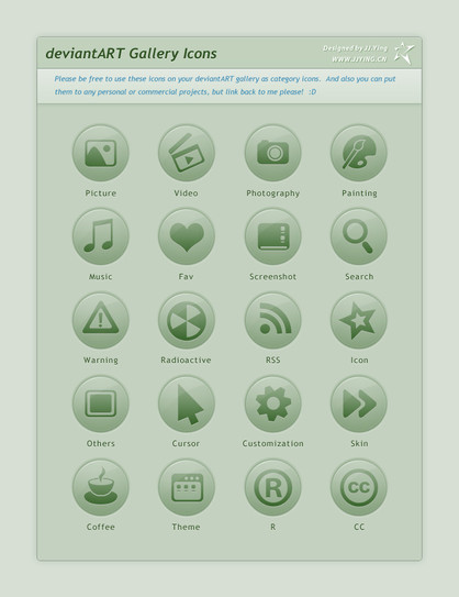
This style is now obsolete.I mentioned in a journal that the standard dA icons along the top, above the search box, weren't exactly to my taste. Well, I made my own. So, if you want a change of scene, give them a try for yourself!
I tried to go in a completely different direction, just for the sake of it. These icons are smooth PNGs, made mostly from vector shapes. Subtle Web 2.0 gloss also adds to the goodness.


Note: It appears that the Collections link in the header is currently only visible to Beta Testers. This will probably change soon, and the style will not need to be updated when it happens.
Related content
Comments: 140

She has inspired a lot since her creation!
👍: 0 ⏩: 0

love this. thanks for this work of art
👍: 0 ⏩: 0

Much better looking than the original icons! 
👍: 0 ⏩: 0

Interesting, but you've got so compotition.
👍: 0 ⏩: 0

These are wonderful...the default icons are so ugly and I was hoping someone would come along ans spruce them up a bit
👍: 0 ⏩: 1

Great job! Im loving the glossy web 2.0 effect. But i think the Mona Lisa is a tad to REALISTIC to suit dA.
Just my humble opinion
👍: 0 ⏩: 1

It probably looks realistic because it's a scaled-down version of the original. 
👍: 0 ⏩: 0

Ah, you make my deviantART experience so much better every day! even this little simple kind of thing is cool!
👍: 0 ⏩: 0

Ahh, that looks better
Two points :
a) shouldn't "Chat" be chatting 
b) have you ever seen a "Today" icon that actually said "Today"
👍: 0 ⏩: 1

I had a try at making the emote look like he was chatting, but it just ended up making him look goofy instead, so I left it as it was. 
👍: 0 ⏩: 1

Oops, wrong point - I should have said implied "Today". I was just thinking that in about 20 years of working with WIMP interfaces, I've yet to see an icon that universally implied "Today". We normally arrive at something calenderish (which could normally mean "any old day") or clocky (which to me means "Now"), but I yet to see one that truly represented Today.
👍: 0 ⏩: 1

I think the best way to represent to day is, as you say, the calendar. Just to emphasize Today, mark a day on the calendar in some way. And still, the fact that icons are not always 100% specific is also a great advantage to people using them for similar purposes.
👍: 0 ⏩: 0


👍: 0 ⏩: 1

Stunnin'. 
👍: 0 ⏩: 1

This is pure awesomeness, as usual, and they really should do the trade, the old ones look... old...
👍: 0 ⏩: 1

I think some of those icons have been around since before 2005.
👍: 0 ⏩: 0

the change is significant, love the new visual feeling putting this on top
👍: 0 ⏩: 0

dude ! you made dA a better place.
👍: 0 ⏩: 1

It amazes me how much better dA looks with such a small change.
👍: 0 ⏩: 1

Me too! 
👍: 0 ⏩: 0

There much better and makes dA more Stylish
👍: 0 ⏩: 0

Wow, they look really good
Make the whole DA experiance more enjoyable
Thanks for this
keep up the good work
👍: 0 ⏩: 0

hmm.. they look good but they are really in the same style as the rest of deviantART. I think i'll stick with standard icons for now.. nice work though.
👍: 0 ⏩: 1

In the same style as what exactly? I tried to make them as new-looking as possible. 
👍: 0 ⏩: 1

eg, the friends and collections menu icons, the profile icons ect.
👍: 0 ⏩: 1

But all those icons are pixel-art!
👍: 0 ⏩: 1

it's just not the same style. IT ALL ABOUT STYLE
👍: 0 ⏩: 0
| Next =>


